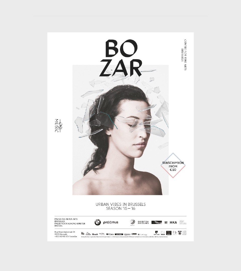
BOZAR
— Creating an original voice for Culture
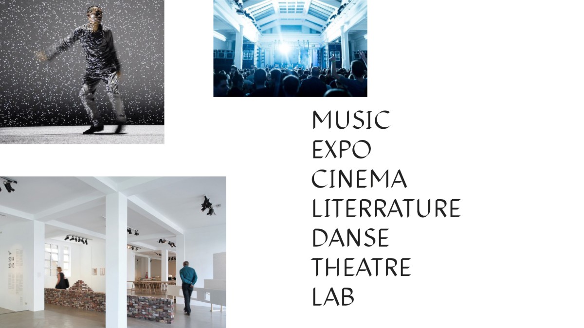
The Beaux-Arts Center For Fine Arts, also known as the Bozar brand is a mecca of culture in Brussels. A multidisciplinary space designed to bring together a wide range of artistic events : be it music, fine arts , theater, dance, literature, film or architecture. We have rebranded Bozar in 2015.
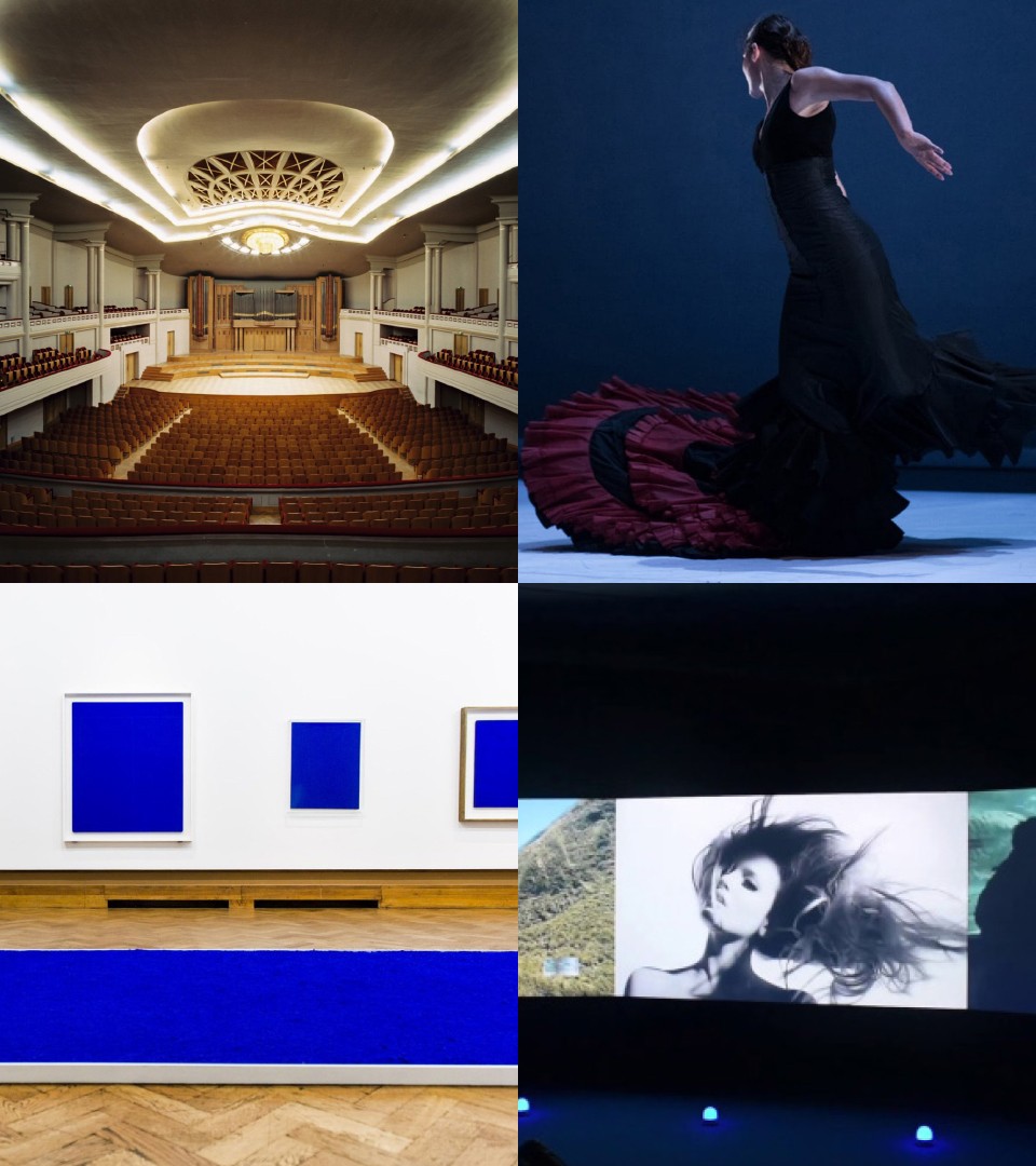
A prestigious institution with an eclectic program.
Built by Belgian Art Nouveau architect Victor Horta in 1922, Bozar contains a large concert hall, a recital room, a chamber music room, lecture rooms, and a vast gallery for temporary exhibitions. BOZAR is home to the National Orchestra of Belgium, which invites the world’s major orchestras and performers to appear at Le Boeuf Hall. The finals of the Queen Elisabeth Music Competition are also held there. Up to 10 exhibitions a year are organised at BOZAR, with major retrospectives of artists such as Jeff Wall, Luc Tuymans, Picasso, Yves Klein, Gilbert & George, Wim Delvoye, Venetian and Flemish Masters, and Keith Haring.
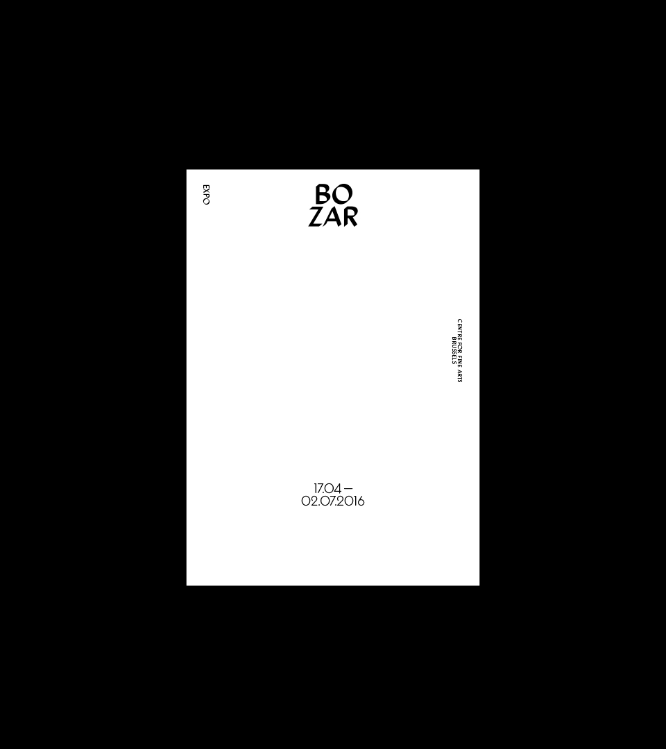
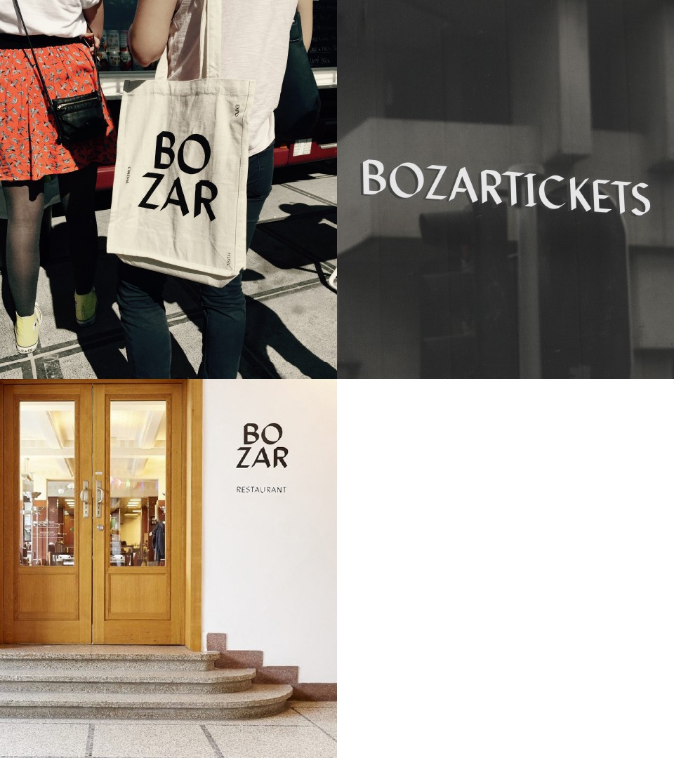
The logotype : arts from another perspective
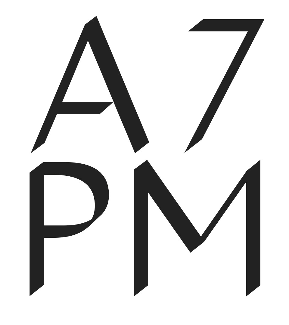
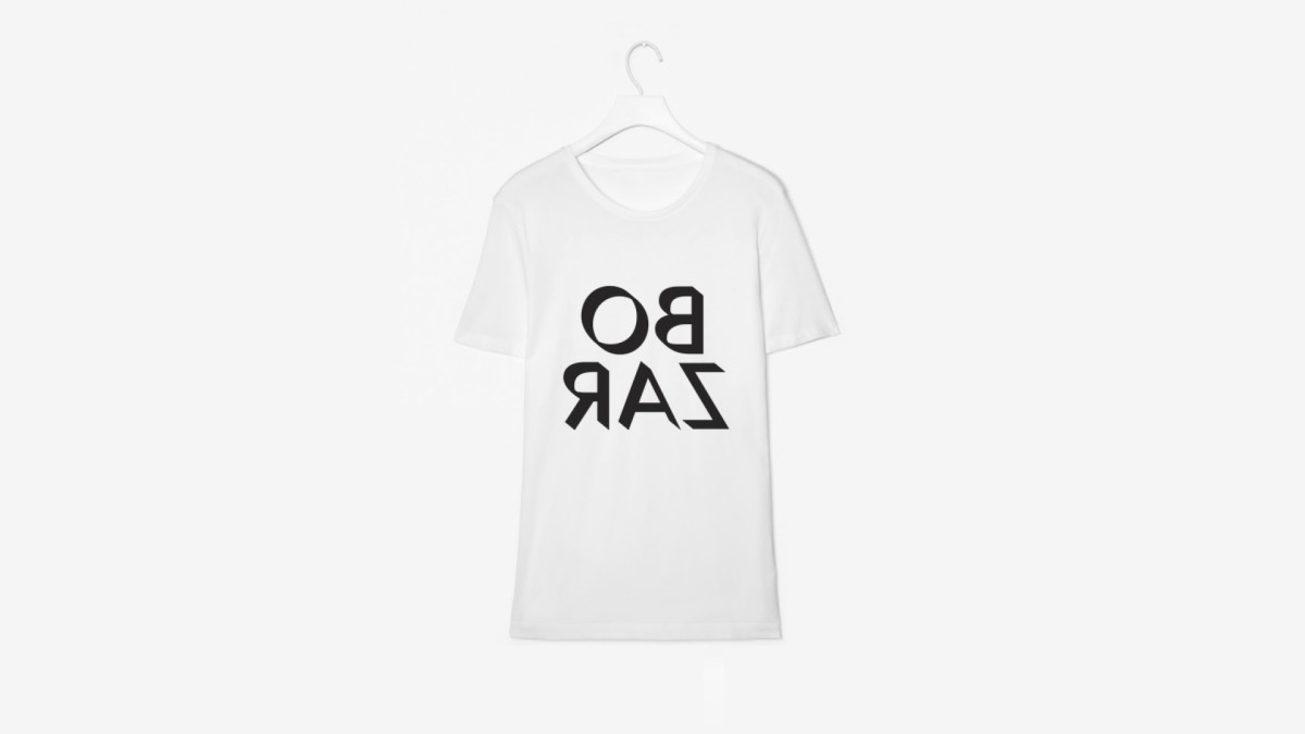
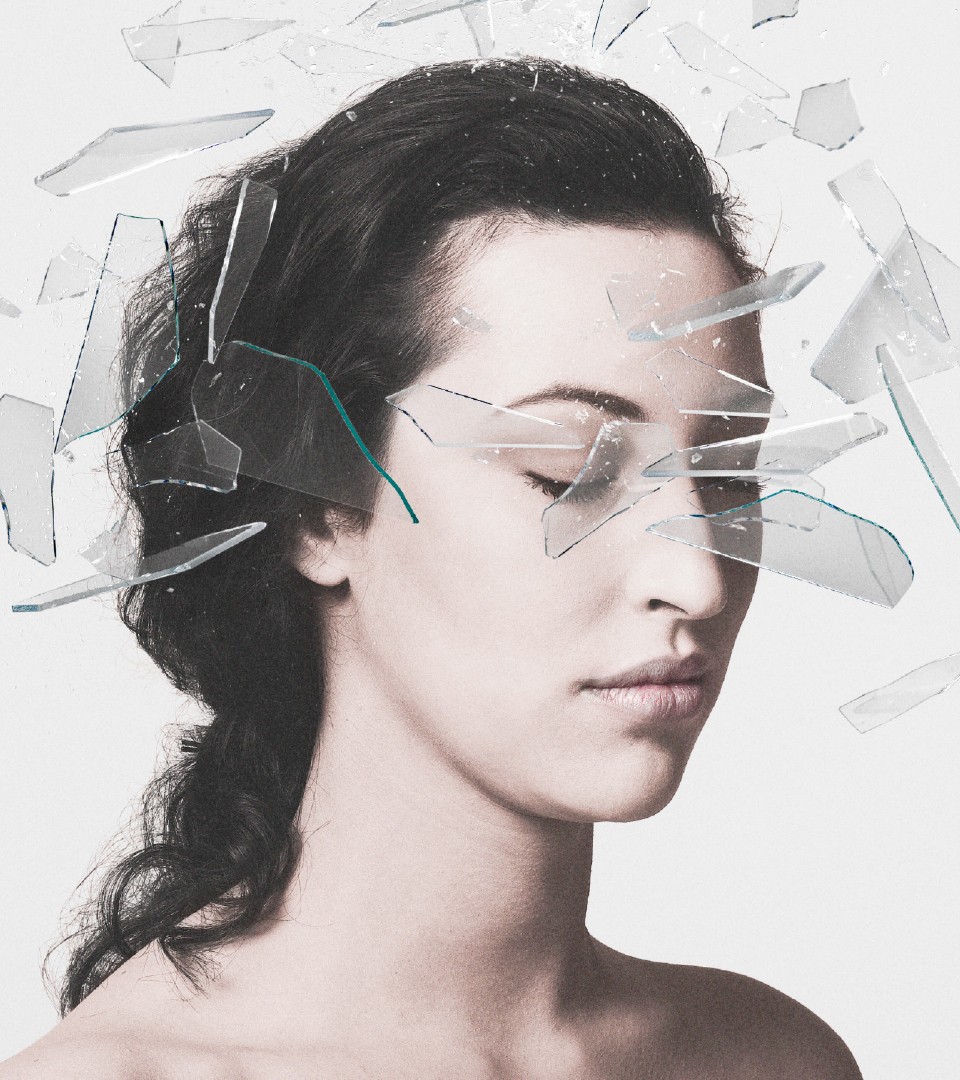
Representing Bozar using one strong logotype as a message was one of our goals. It had to reach a level of originality and at the same time reveal all different styles and disciplines involved within the institution. Our visual concept was to create a new perception, which was at the same level as the identity and informative level. We choose to look at things differently, from a different angle. The result is our concept of perception. The logotype is about looking at art, from a new perspective.
New perspectives in Art means what Bozar is all about, a mecca of culture where all disciplines are shown without barriers. In the same idea we have created a full set of two custom typefaces : Bozar AM and Bozar PM. Like a spotlight on a sculpture, The Bozar PM is revealing a shadow, a new perspective.
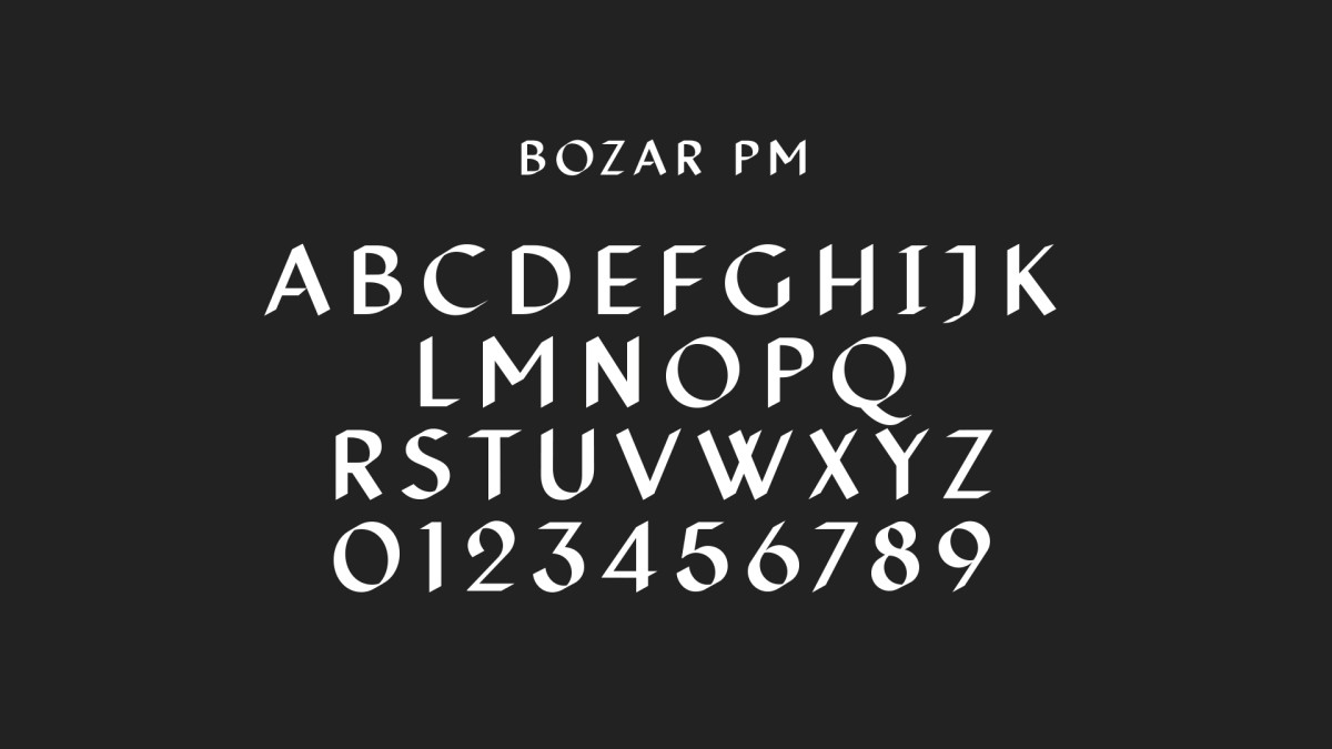
A custom typeface about new perspectives
The font design was conducted by our team to highlight the institution's purpose : create a space for creation, inspired by the past and looking into the future. The design is subtle and at the same time strong.
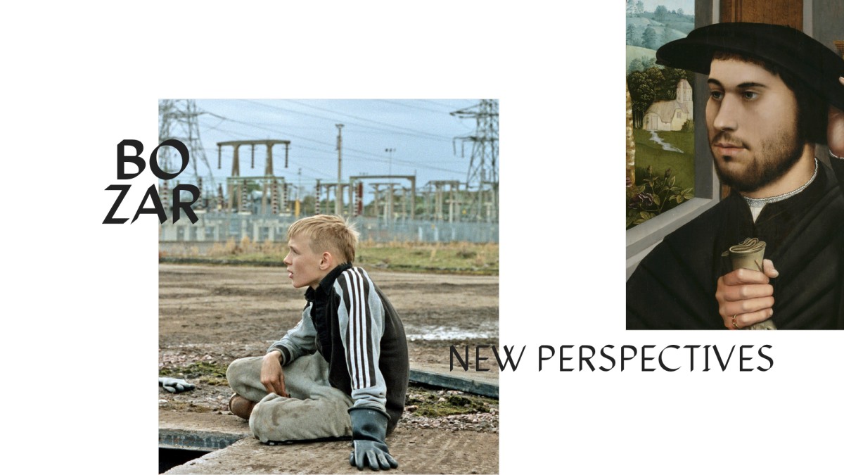
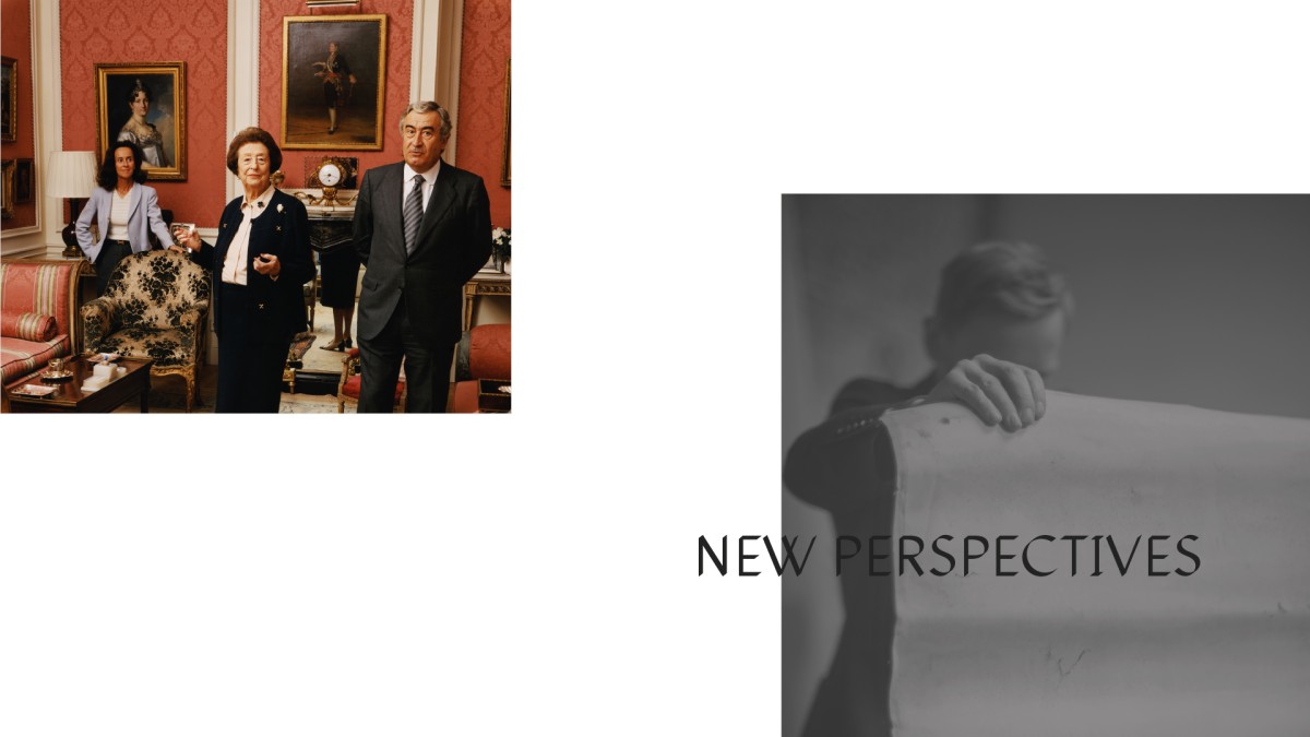
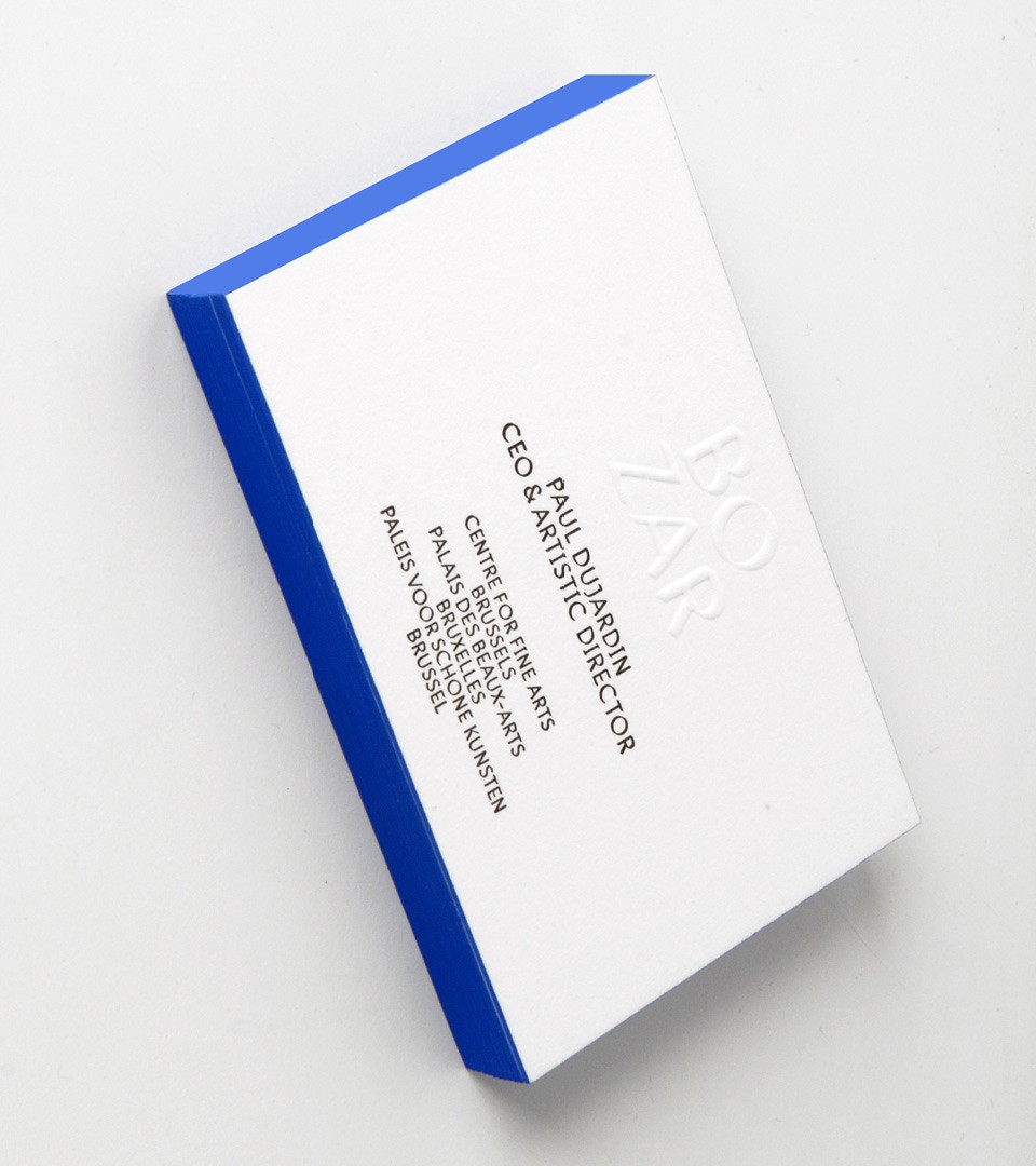
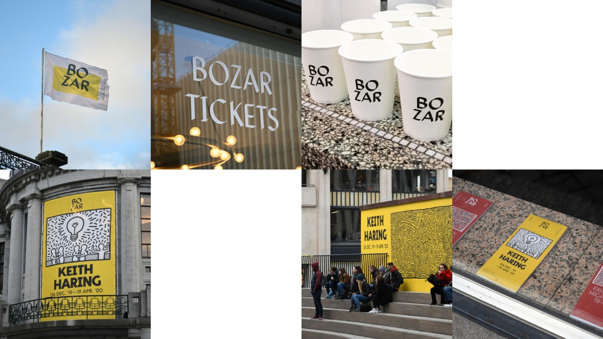
We have created a brand layout at the center of culture in Belgium
The second step of the work was to create an identity system translating the power of the institution. The system needed to be very recognisable and clear, easely adaptable to all use : print and signage, communication & digital. The result was the central layout, using white as the main colour.
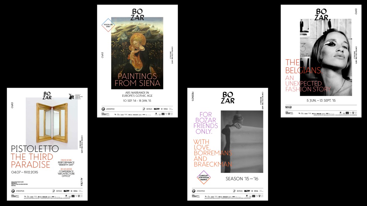
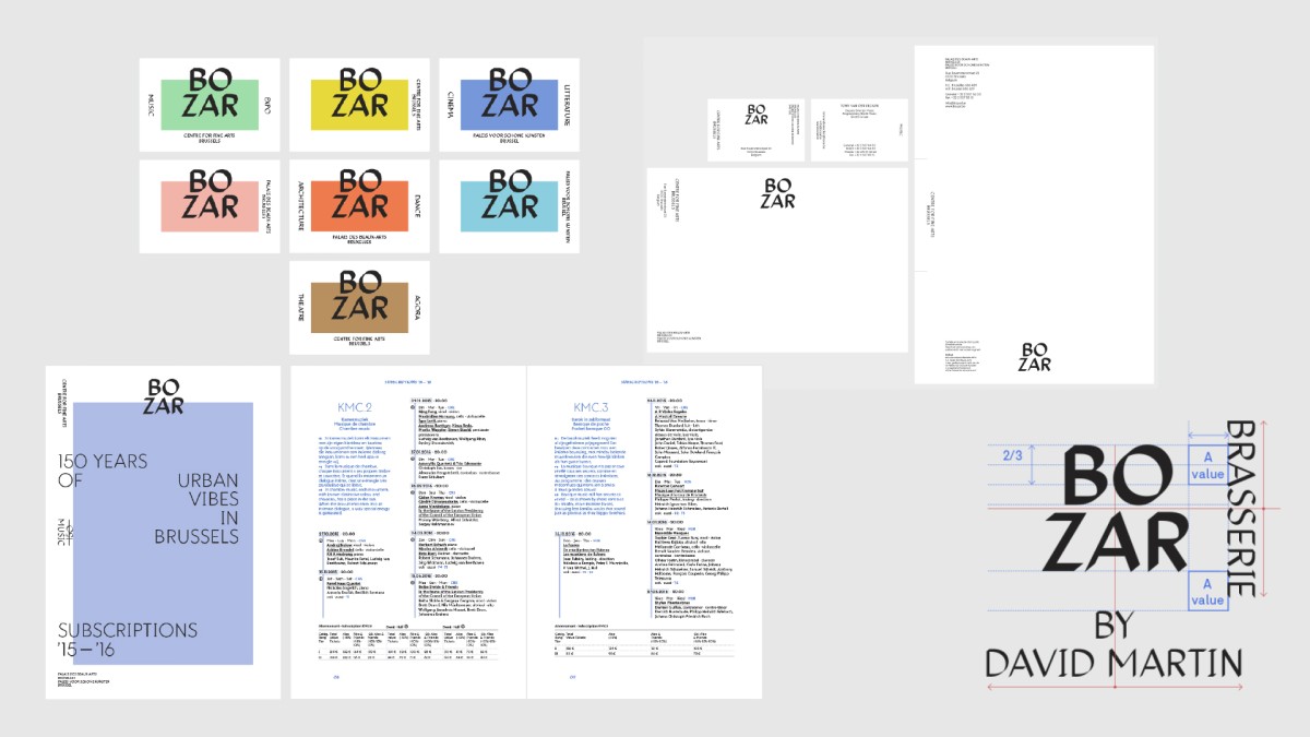
The system was developed accordingly to the venue multiple use : from postcards to posters, from print to screen, from exhibit to performances. All together, the system works organically with a simplicity in mind.
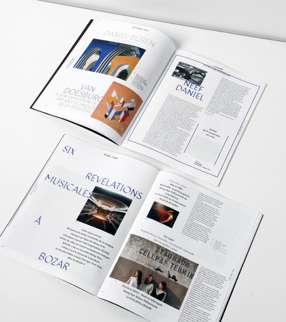
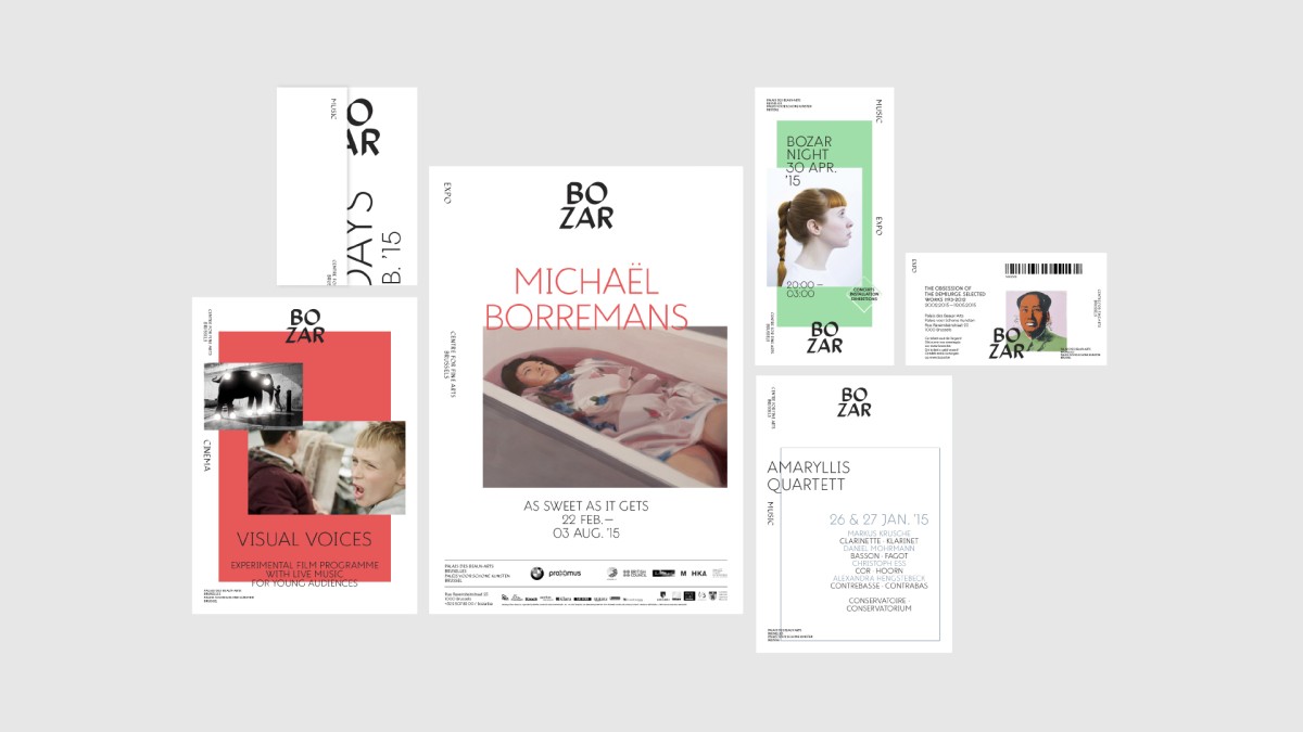
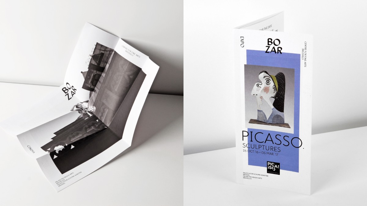
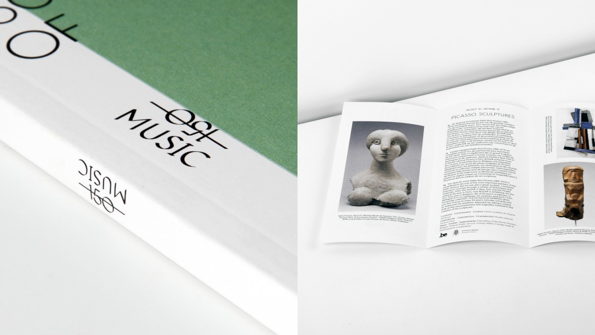
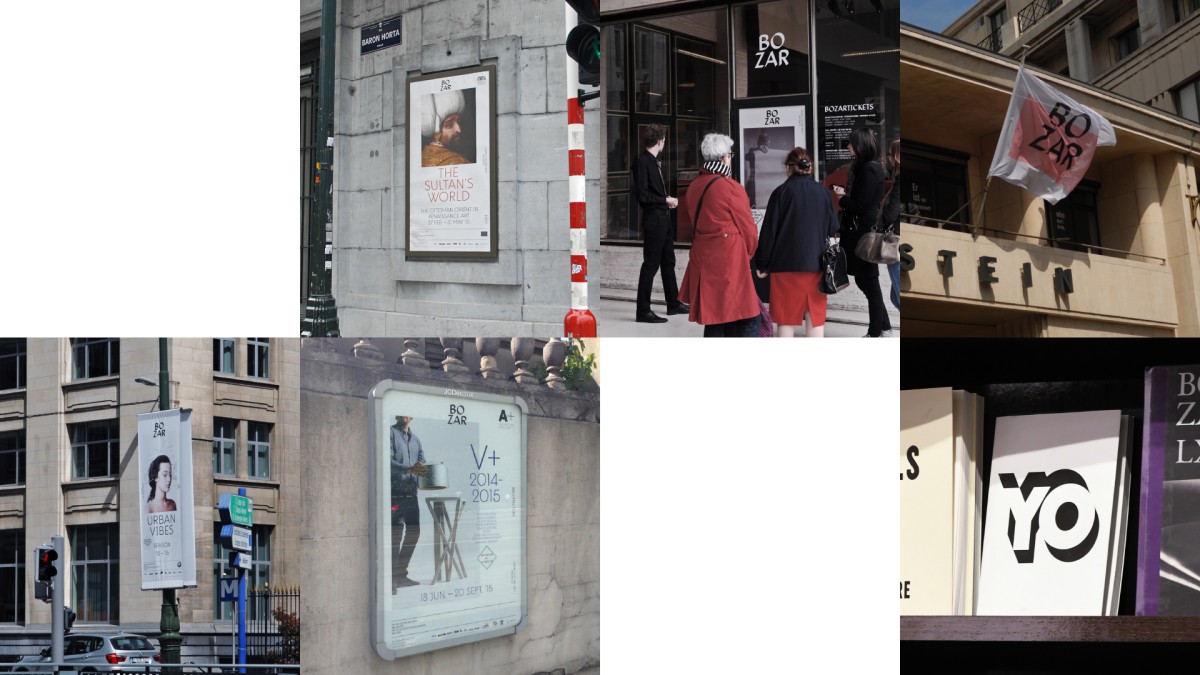
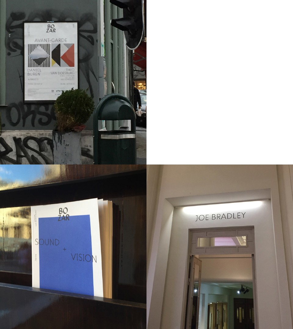
Publications
Many different publications were to be looked out. From programs to catalogues, Bozar is producing an impressive volume of communication items. These were all designed using the brand guidelines as guides for consistency.
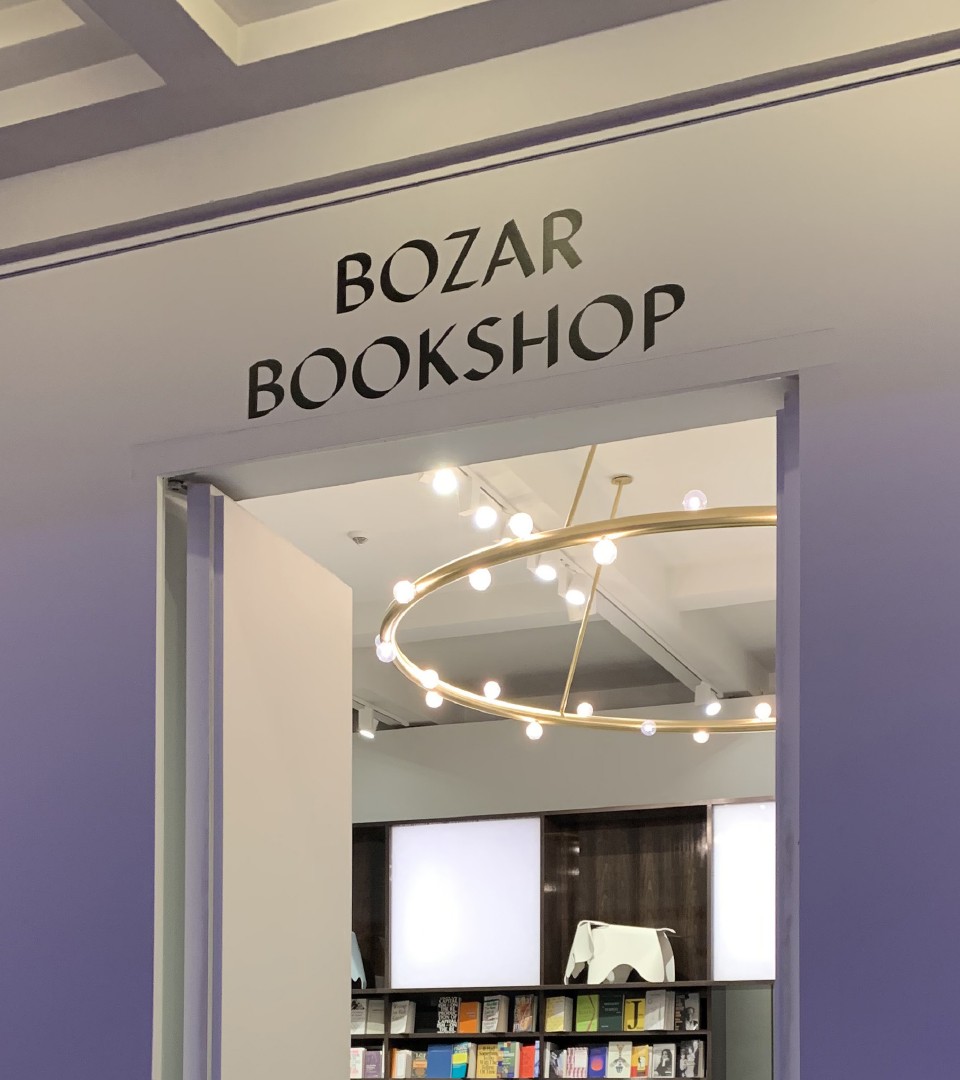
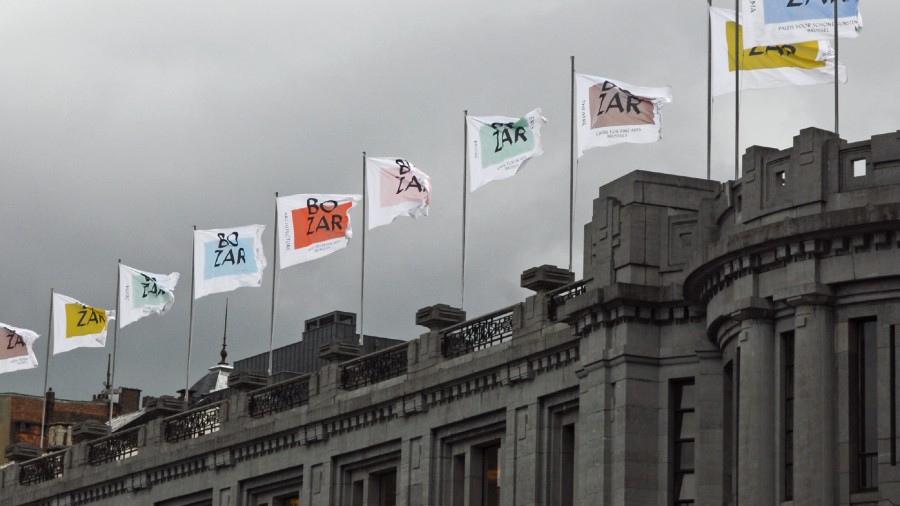
Signage
Our Typeface system works seamlessly in all of Bozar main features. The exhibition spaces, the cafe and restaurant, the different corridors or directional implementations.
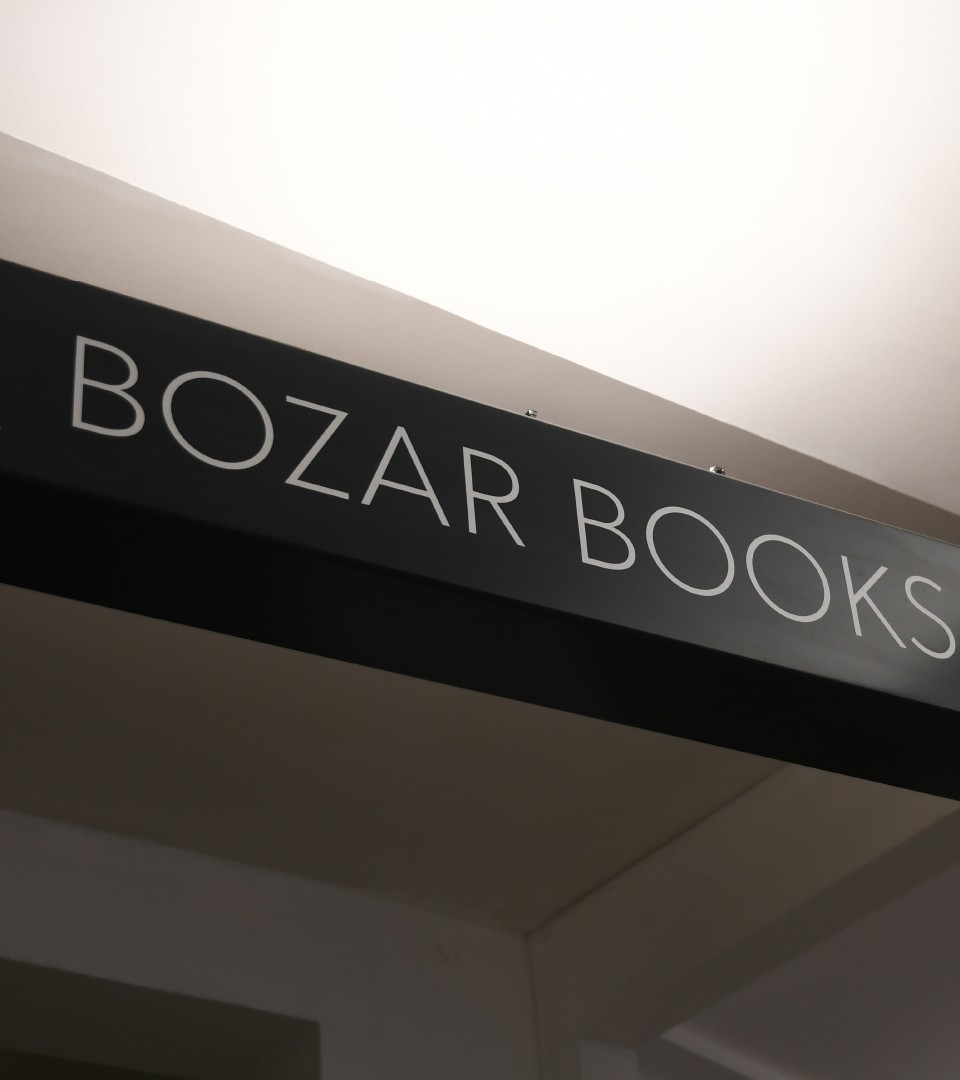
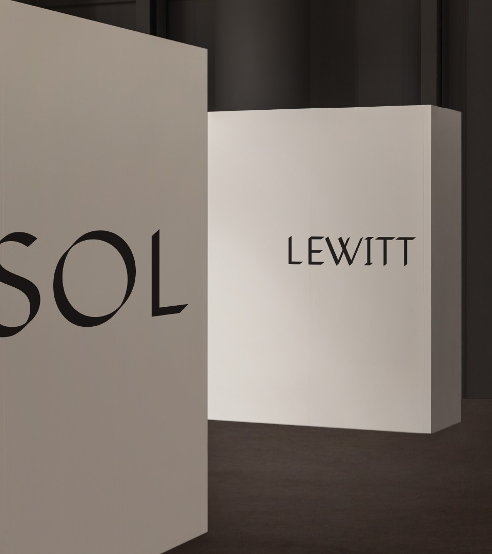
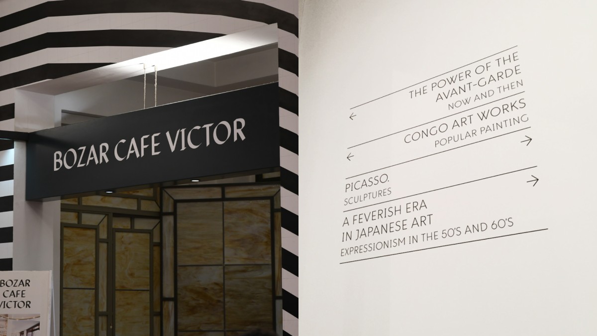
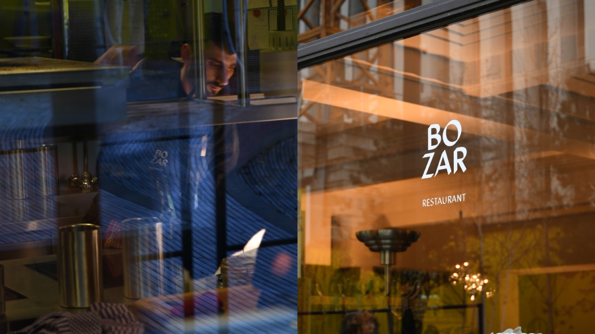
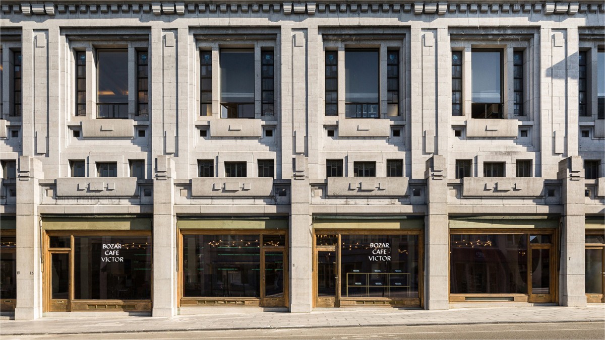
A vibrant identity as seen in the streets : strong enough to support exhibitions and performances and in the same way shy enough to leave space for the artists.
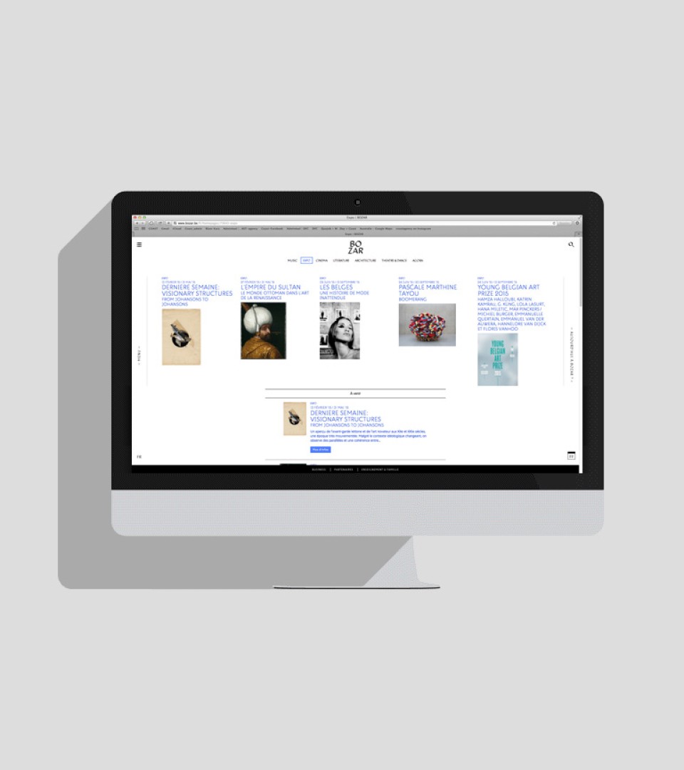
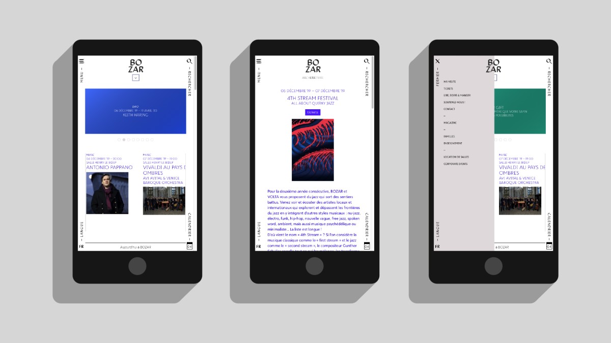
The digital experience
Build by web agency Tentwelve, the website is a representation of all of what Bozar has to offer : with a clear calendar and the full program available, information was conceived with a respecful eye on the rebranding aspects of the work.