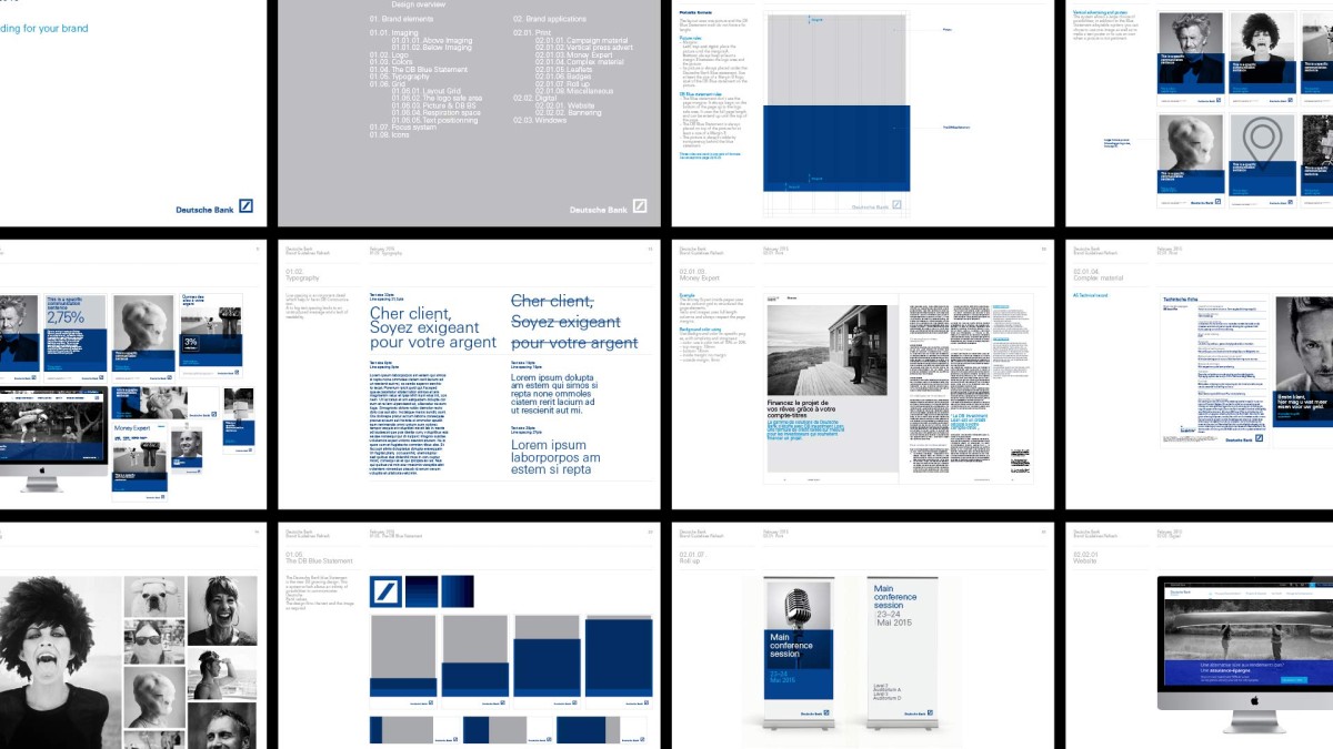
DEUTSCHE BANK
— Visual alignment & Communication
In Belgium, Deutsche Bank is a leader when it comes to traditional banks to challenge and defend the interests of savers and investors. Deutsche bank Belgium mission is about client protection and leadership. Its more direct and results-oriented approach is a statement based on people making choices and making independent decisions. To move the brand towards greater recognition in public space and networks, Deutsche Bank asked Coast to move these graphic codes to a more personal, recognizable and dynamic language.

The growth concept :
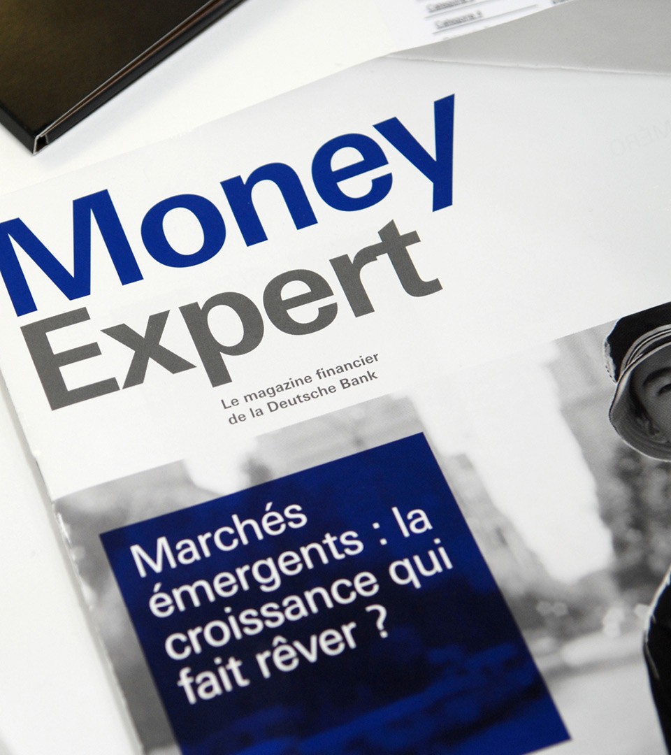
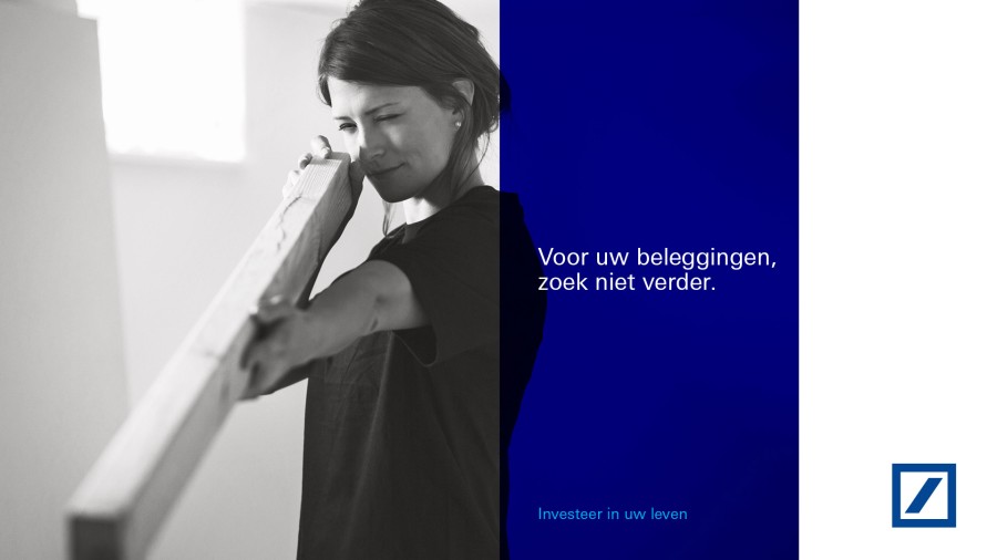
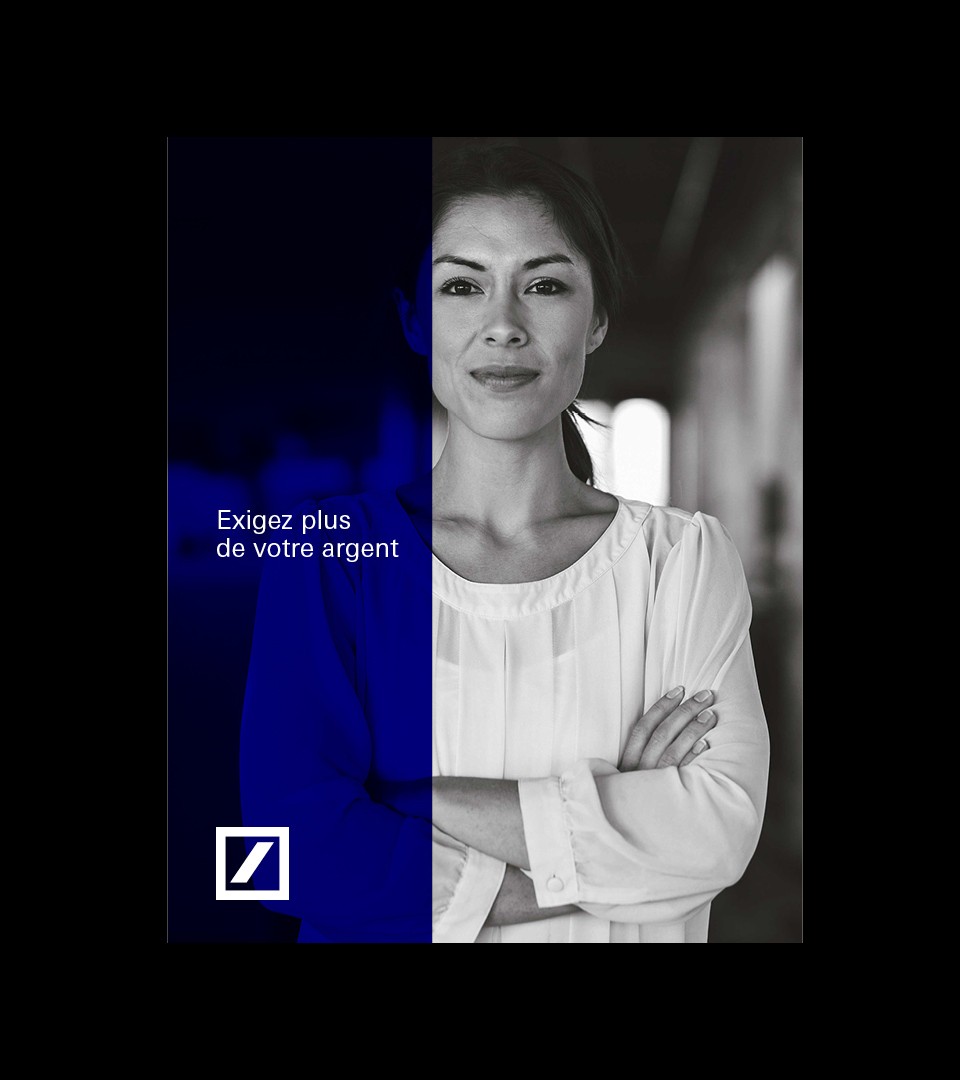
Deutsche Bank blue statement Among branding and positioning projects, we have translated Deutsche Bank guidelines for the Belgian market. The positioning exercise was developed at Coast to bring the brand to a more personalized and specific design language. We worked with two of the most recognisable assets of the brand which are their black and white photographic approach and their original blue color. Combining these two elements, we have created the concept of “Growth” communication.

The “Growth” identity line was created to identify the brand messages in an over exposed banking competitive environment. Expressing the brand message with the blue statement allowed the communication to be more recognisable, more powerful and more straightforward.

All in a guideline
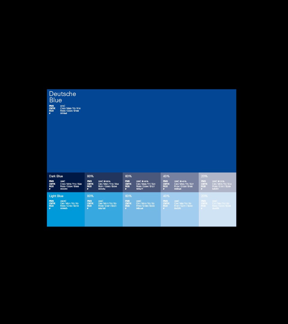
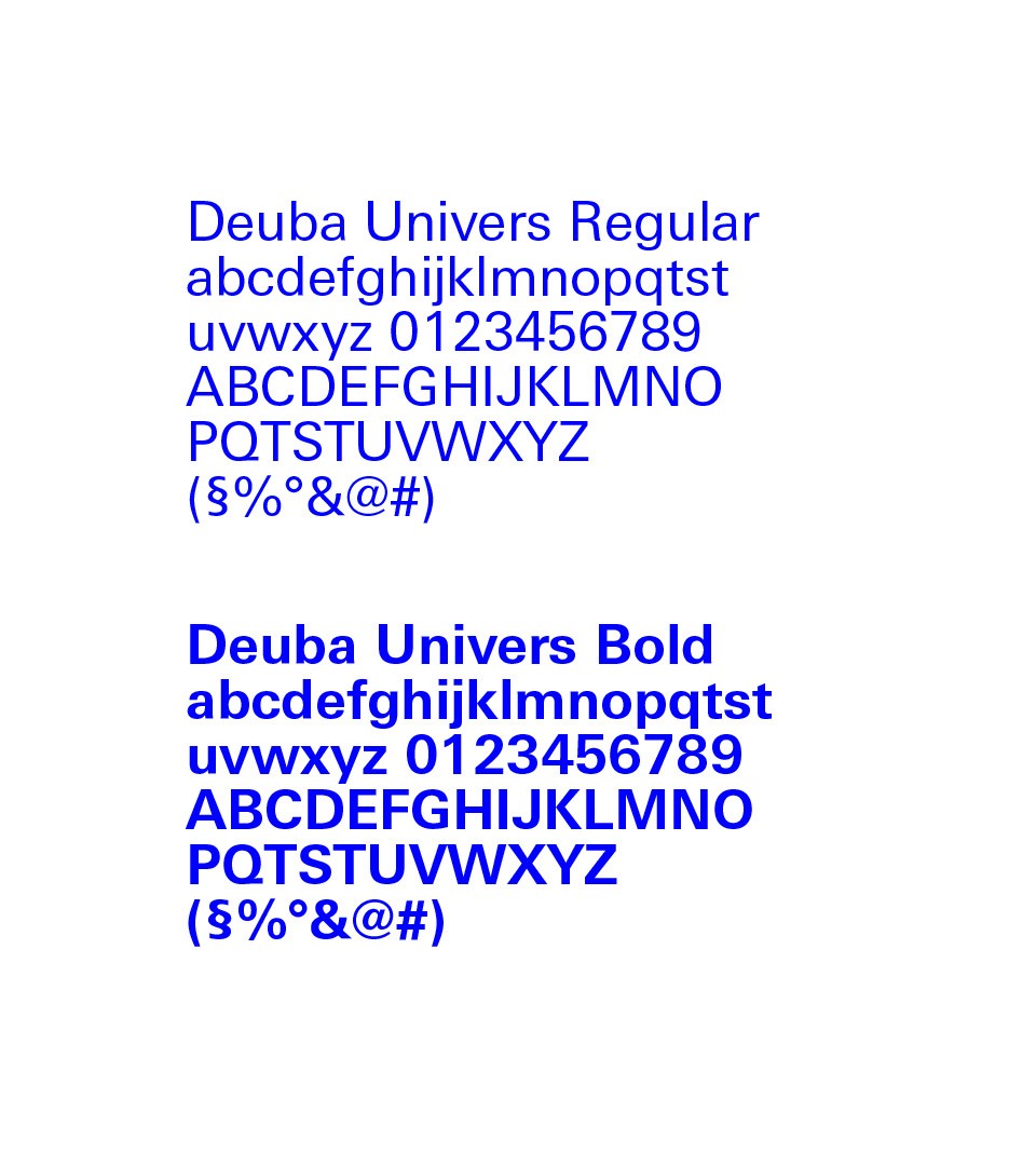
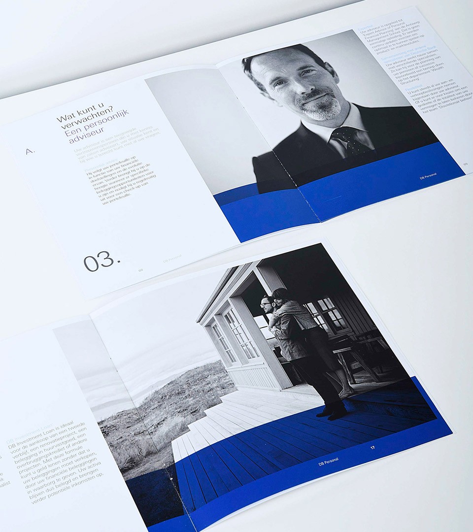
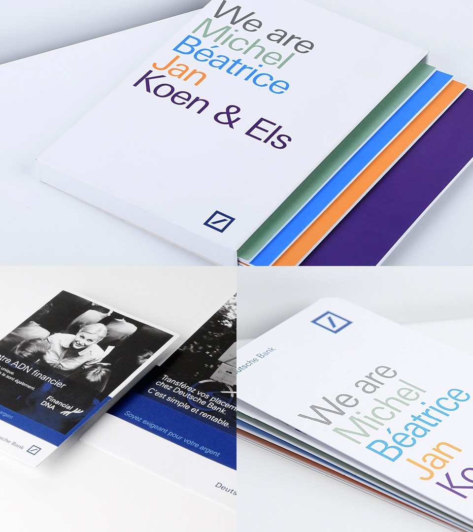
Communication at Deutsche Bank enrolls multiple channels & services. From internal communication to external communication, the brand should address the same seamless impression to all. The guidelines we’ve created summerized all necessary elements to showcase the brand “growth” statement on all documents. From low blue impact for private banking clients to retail, all rules were integrated in a brand guideline.

The new visual line to inspire
Allowing the brand team and communication partners to use the brand guideline as a tool for expression was our main concern. With its flexible scheme and limited usage rules, the creativity could be concentrated on key messages and essential visuals. The stopping power of the brand visual language is a key asset for the brand who has a limited communication budget.

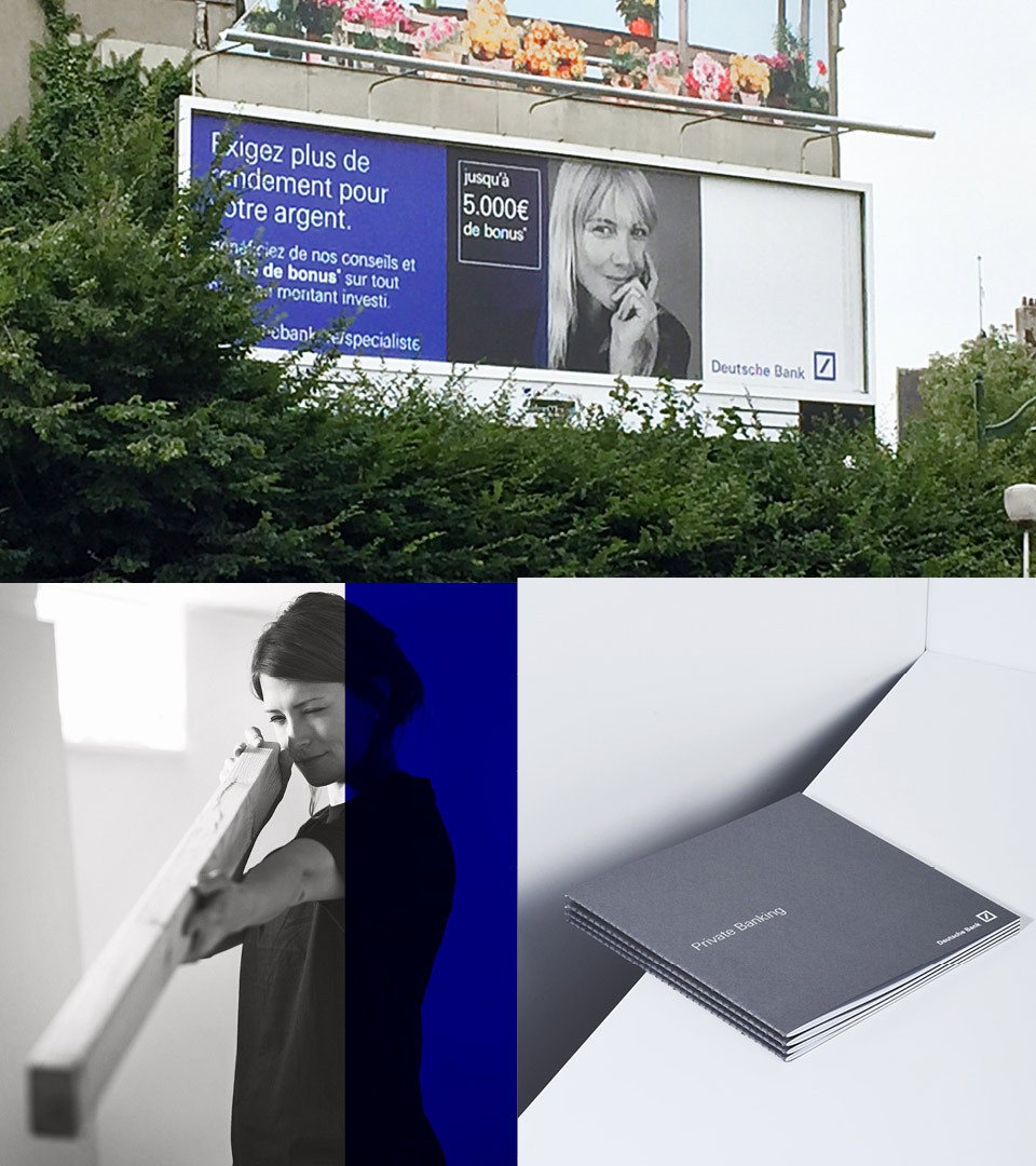
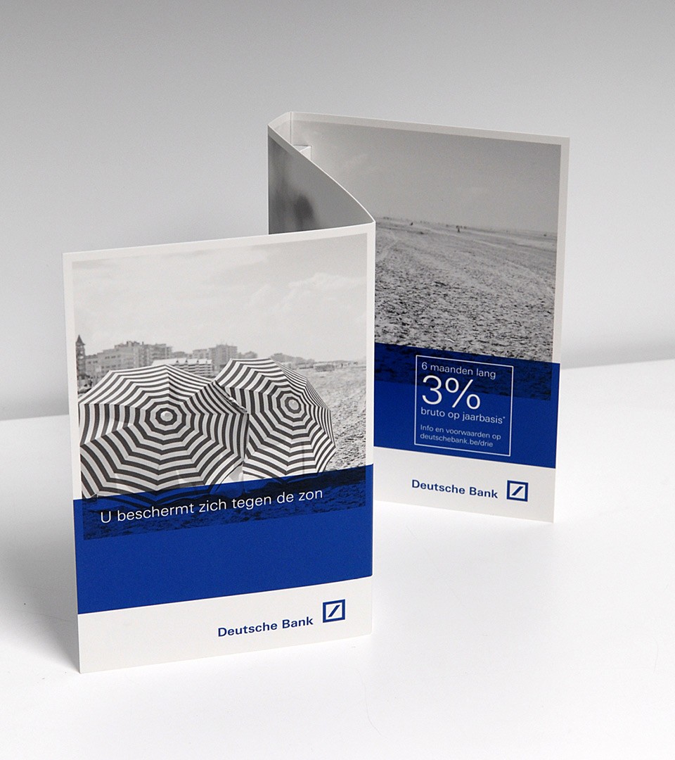

The “Growth” identity line was created to identify the brand messages in a over exposed banking competitive environment. Expressing the brand message with the blue statement allowed the communication to be more recognisable, more powerful and more straightforward.