MYA—BAY
— Repositioning for Jewellery Brand
Mya Bay is a belgian Jewellery brand with a collection of playful, feminine and affordable pieces. We worked on their positioning and visual universe.
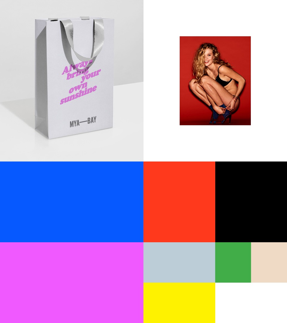
The Bay as logotype
We have restructured the identity and created the new logotype as an interpretation of “Mya Bay”. Composed by two falling rocks into the ocean, the line between the words represents the horizon.
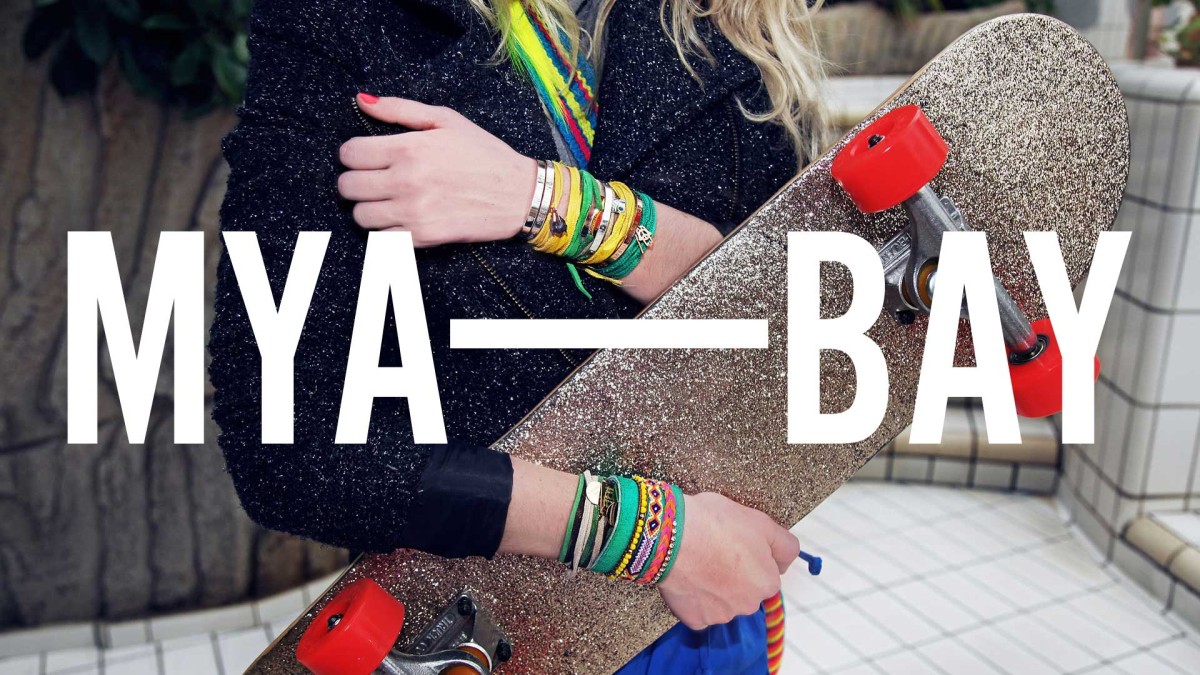
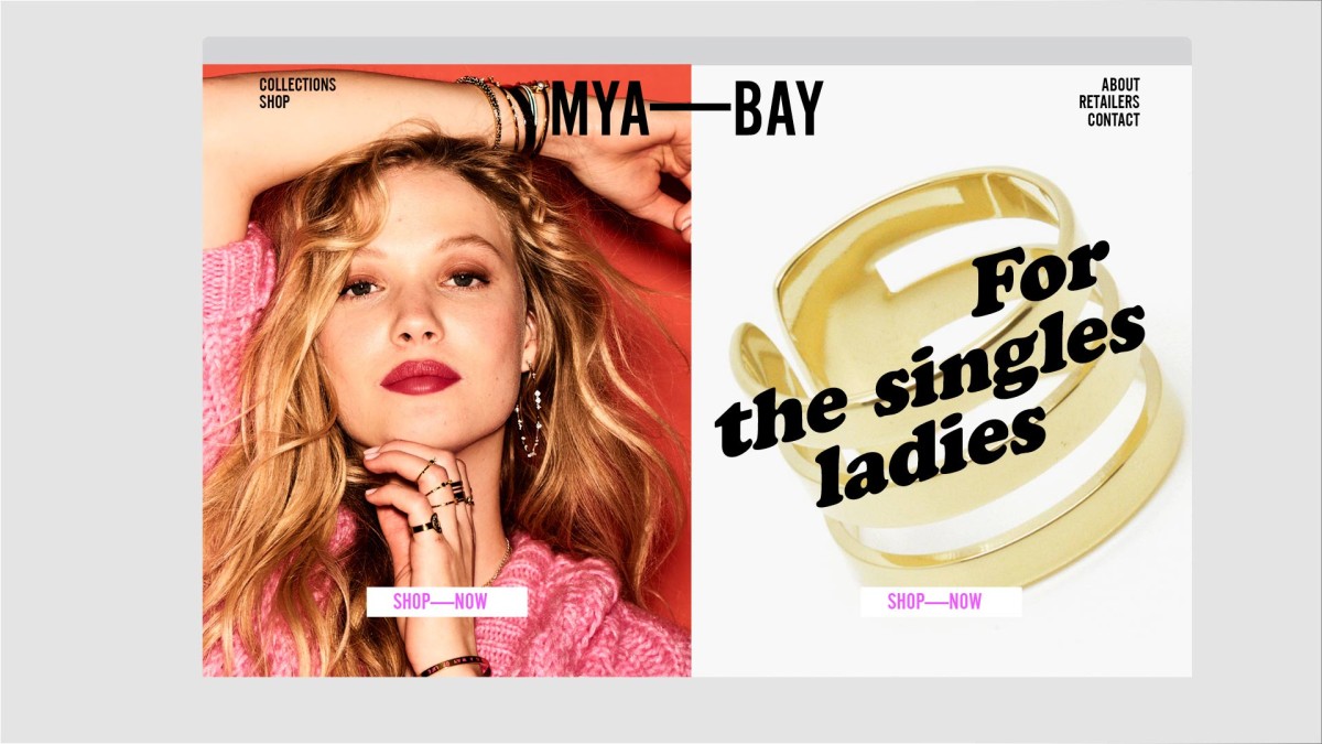
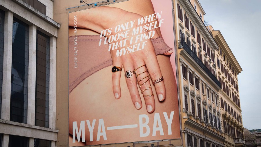
From creative concepts through to art-direction and visual representation, we applied our “Unconventional women” narrative strategy. Defined at the start of our collaboration with the brand, it resulted in a fresh and colourful approach, a typographic playground and a dynamic tone of voice.