
Smets Concept Store
Branding for 4500 sqm concept store
The Smets store is a city in its own with an editorial approach to retail. Under one roof, they select the best fashion and design brands, feed the crowd with a star restaurant and bar. For them, have have created a full identity system. Smets Branding has won the awards of “Best Branding” & “Best of Show” at The Brand Impact Awards 2014.

A concrete ship
As big as two football pitches, the location is a 4500 sqm space on 3 floors. A large façade, a three floors parking lot and a restaurant terrace, the Smets store was open in 2014 and won best retail awards in 2014.


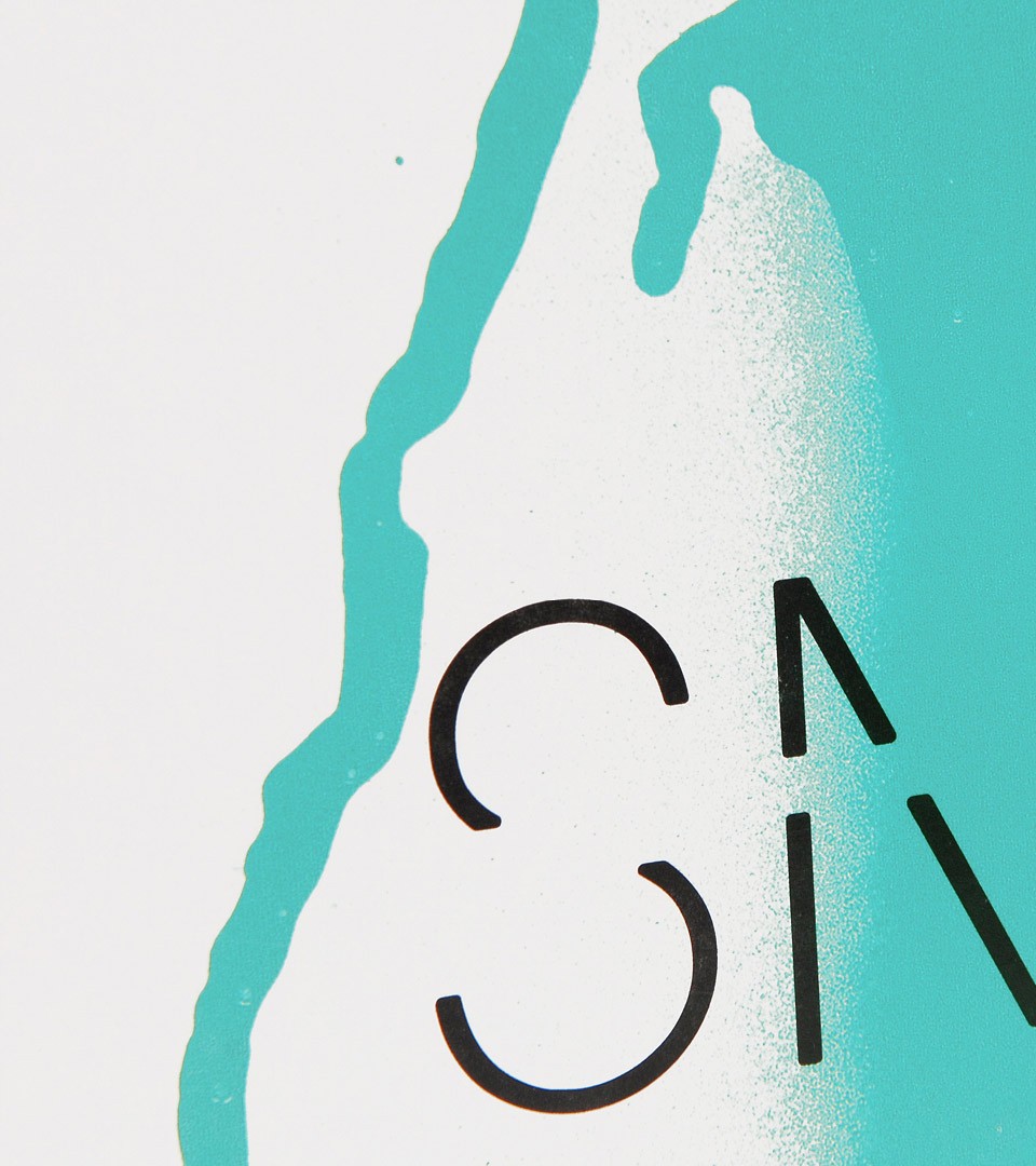
To bring the retail concept offer under one identity, we have created the SMETS typeface. Applied to all of the shop floors and services, the typeface is an ode to understated luxury.


One Typeface, multiple solutions
The Smets Typeface is identified by its sharp edges and erased style. With this typeface, everything is possible. talking about food, talking about design, talking about fashion, talking about art. It's a state of style.


Fashion, Design, Food, Icons
A set of icons, accompanying the typeface system was created to work as a signage across multiple channels.
From business cards to restaurant menus and signage, everything was conceived under the strict control of simple rules.


The signage is made of metallic laser cutting and spray painting on concrete.


The result won best branding for retail at the Brand Impact Awards London 2014.


