
COME CLOSER
— Art festival building bridges
With COME CLOSER, Middelheim Museum and DE SINGEL international arts centre jointly explore the space between sculpture and performance art. This collaboration gathers international artists building bridges between installation/sculpture and performative arts.
Our Work : Naming and Branding for cross-disciplinary Art Festival
The naming and branding of international cross-disciplinary arts festival COME CLOSER that merges outdoor sculpture and performing arts required a thoughtful understanding of the different types of locations and types of media, as well as the importance of the festival to serve as a platform of expression for artists and the general public. Our work was to encapsulate, on multiple of platforms, the dynamic strategy behind the festival. A showcase for Middelheim Museum and deSingel art campus.
Naming Creation
The name needed to encapsulate the festival’s essence, blending the physicality of sculpture with the dynamic energy of performing arts, all combined with the message to bring people together through art experiences.
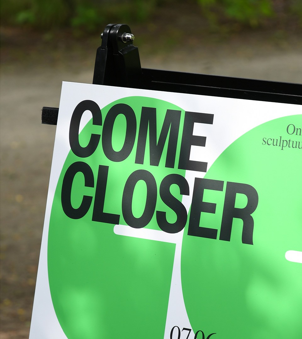
Coast came up with the festival’s name COME CLOSER: an invitation using the imperative to push spectators to experience art & performances “in-situ”.
New relations. What do the artists share in this creative project? They all explore possible interactions of the artist-artwork-audience triangulation. COME CLOSER blurs traditional boundaries and invites to (re)connect and exchange. It’s a place where bronze and stone sculptures go through the same living processes as performers’ bodies and where spectators help to create/are part of the artwork.

Motion & Static : Performing Arts & Sculptures
Our branding strategy emphasized the festival’s unique blend of static and dynamic art forms, combined with the theme of closer relationship between arts and the general public. To blend both disciplines, we have created a motion identity with a flexible system to bring life to the festival theme wherever it shows.
The COME CLOSER launch film narrates the interactions of the double C concept. Letters are in a permanent duality of movement, attracting or taking distance from one another.
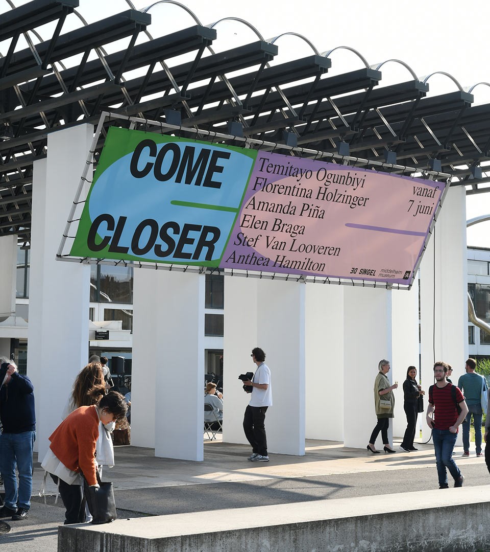
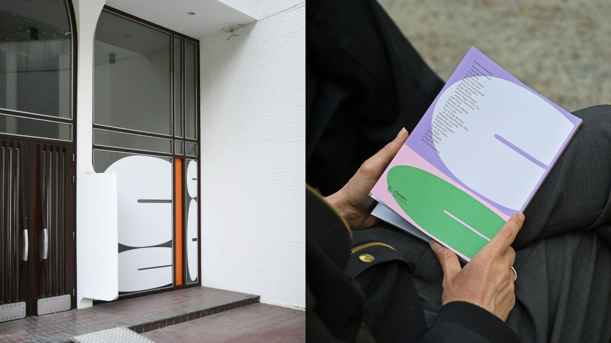
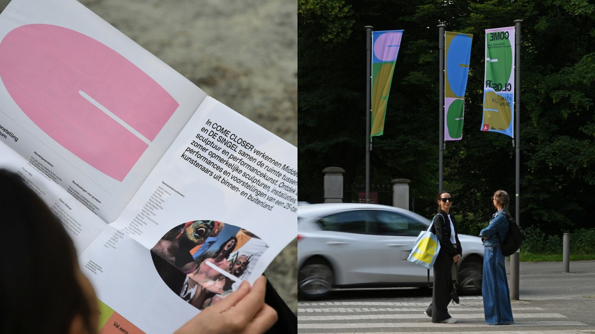
The COME CLOSER identity is a playful one, keeping company to and informing visitors while they stroll around the green alleys of the Middelheim Open Air Museum. The responsive double C shapes adapt to all sizes and surfaces.

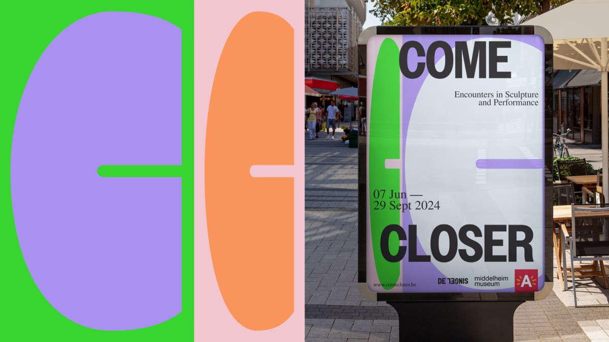
The “Double C” identity refers to the “getting closer” concept and movement, while keeping it fresh and adaptable on all subjects. The convergence of design elements, epitomized by the rapprochement of two letters, metaphorically encapsulates the thematic essence of individuals gravitating toward art and performance. This subtle yet profound visual manoeuver conveys a cultural narrative, wherein the diminishing spatial separation between letters symbolizes the intimate connection between the audience and the artistic experience.
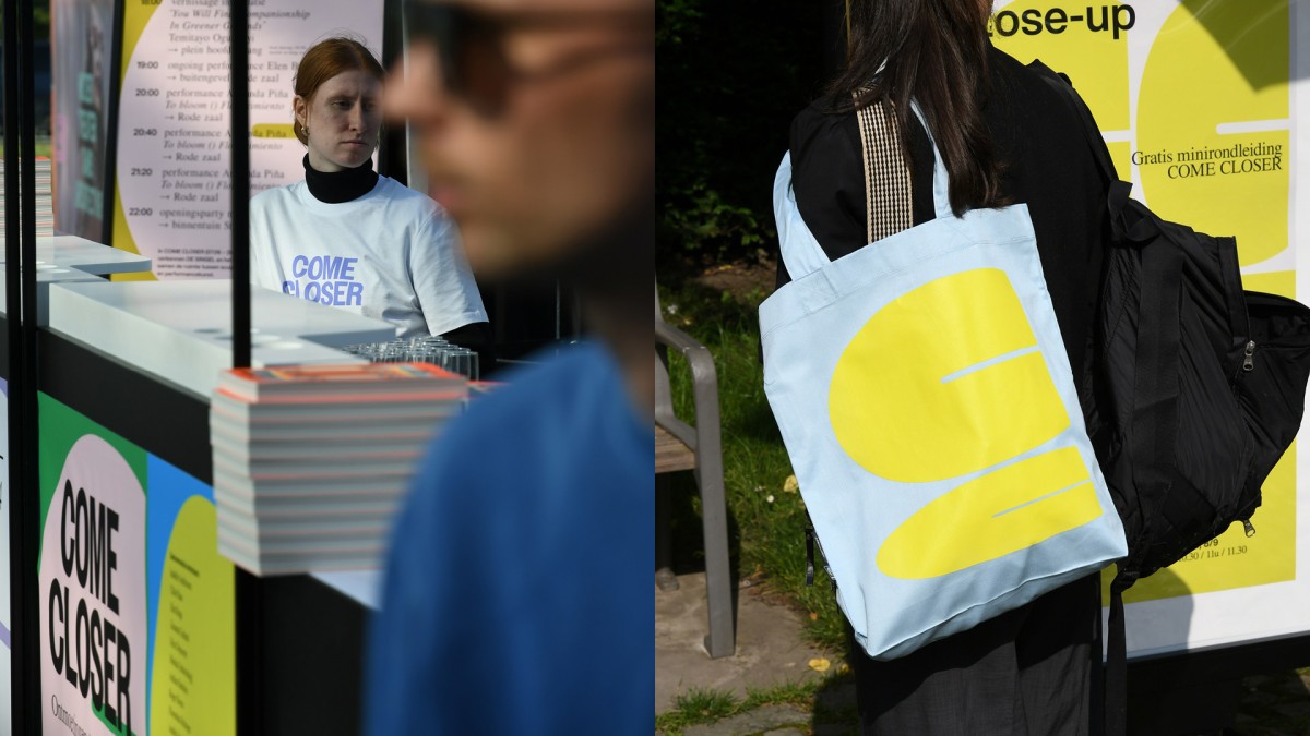
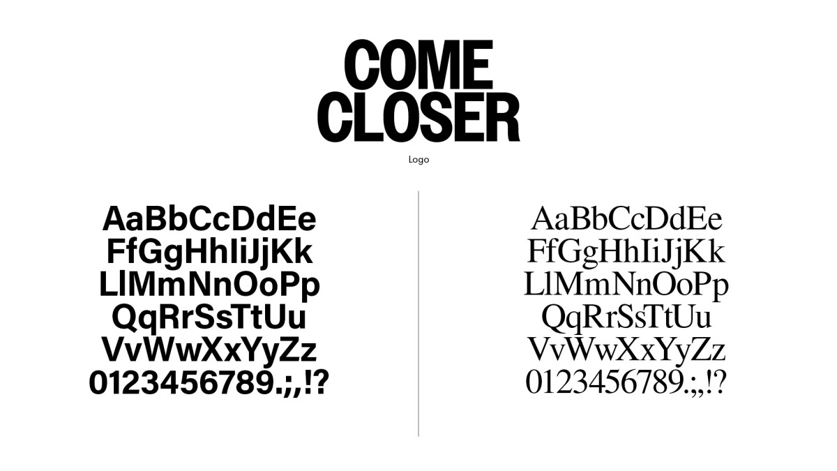
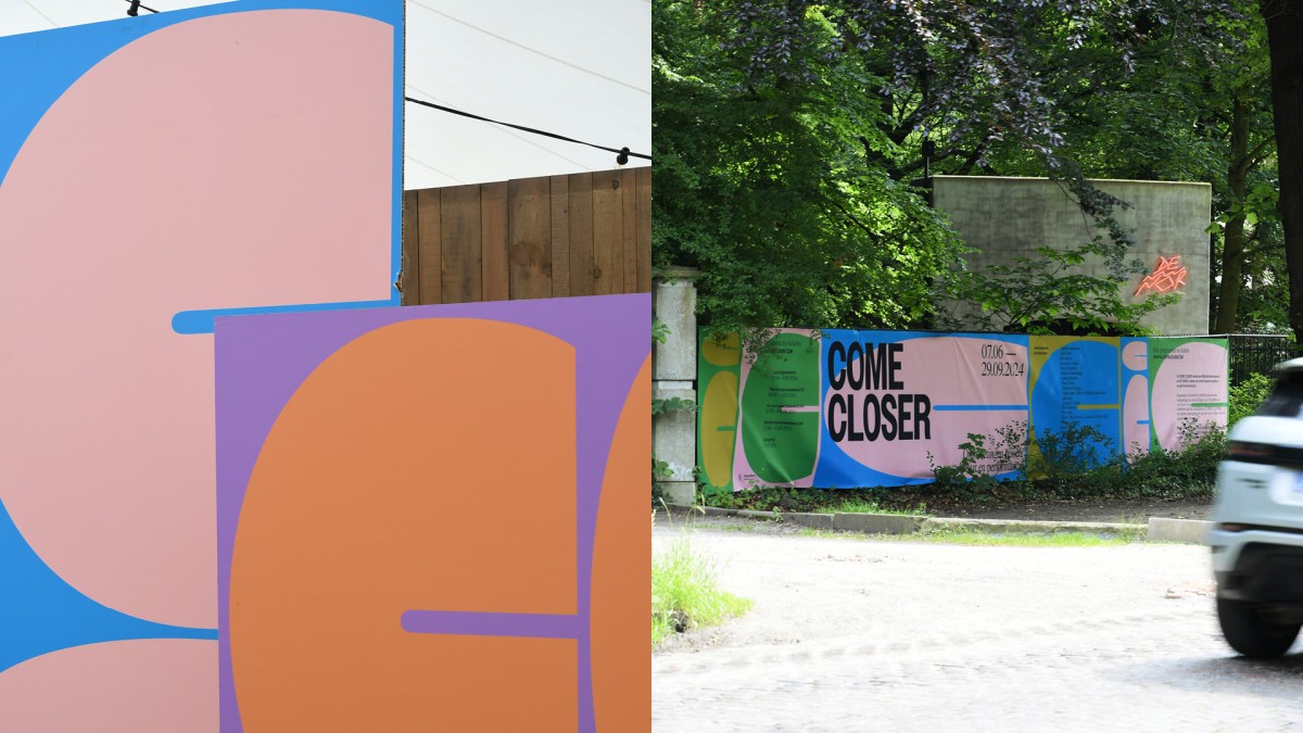
Constructing a simple yet highly recognizable graphic system for the COME CLOSER Festival is a key element of the brand identity. By synergistically combining typography, a diverse color spectrum, and a meticulously balanced info-content ratio, the identity permeates all channels seamlessly. This intricate design methodology ensures a cohesive and pervasive presence, enhancing brand recall and engagement.
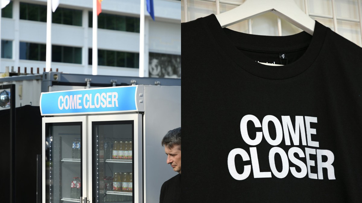
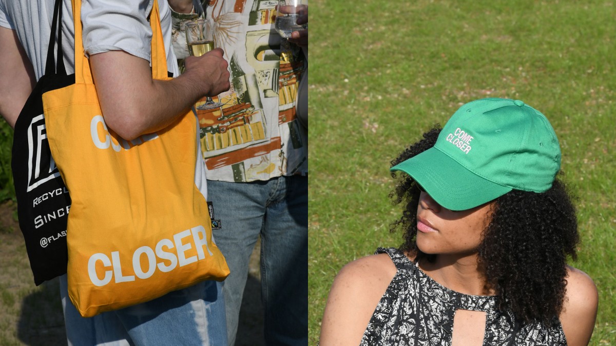
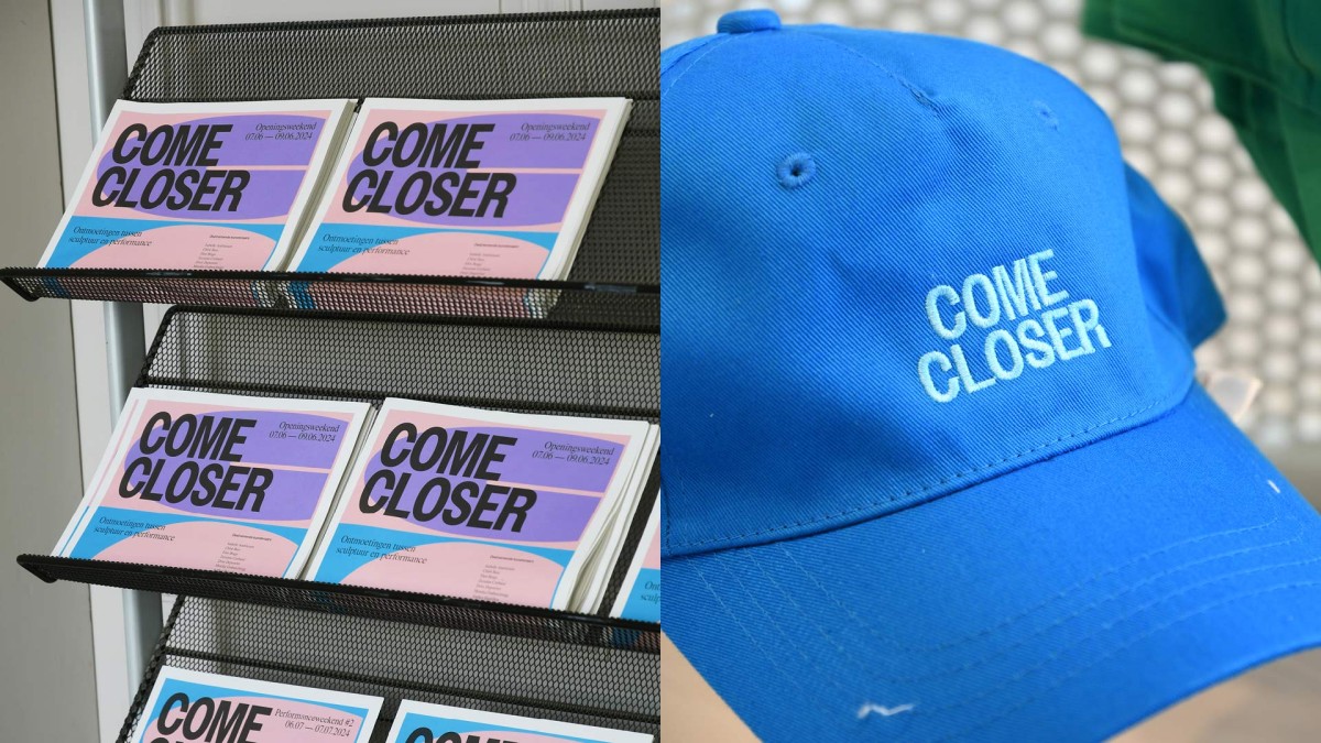
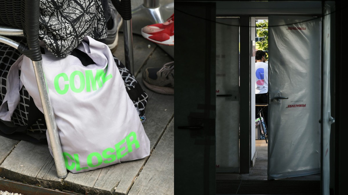
The COME CLOSER identity is consistently used as a background for communication: street posters, flags on location, furniture and signage, film and goodies.
COME CLOSER is a playful invitation to step out of our role and try out a new one.