
DOURBIE
— Redefining the future of a heritage wine estate
Le Domaine de la Dourbie’s rebrand is part of a repositioning strategy to highlight a new vision of the domain. Still very proud of their 200 year heritage, the repositionning is a projection into the vineyard future, appealing to new generations of drinkers. A legacy to kick start something new.

Le Domaine de la Dourbie,
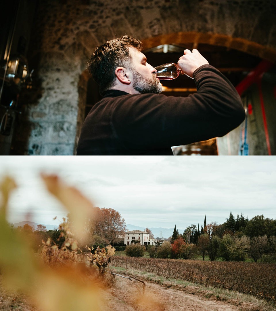
a 200 year old estate in south of France The estate was created in 1781 at the foot of the Causse du Larzac, on the right bank of the Hérault. It takes its name from the Dourbie, a small river that crosses the vineyard and flows into the Hérault. After acquiring it in 2003, the new owners invested in other plots, notably the exceptional valley of Rouveyrolles and the slopes of Aspiran. Their approach is based on authenticity, and symbiosis with the land, the vines and local production.

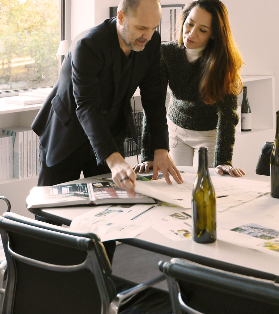
Our first steps in the repositioning process : to analyse, visit, taste and confront the Domain with the current trends in the food sector. The way wine is consumed today and how the sector is evolving pushed the studio to articulate the strategic work around new behaviour and consumer forecasting.
Strategic positioning
For le Domaine de la Dourbie, the new brand needed to look, sound & feel ready for the next 20 year chapter. The new strategy of the estate is about creating the new link with the changing consumer behaviour, extending its offer to more than wines, and welcoming at the domain visitors in search of food & culture experiences.
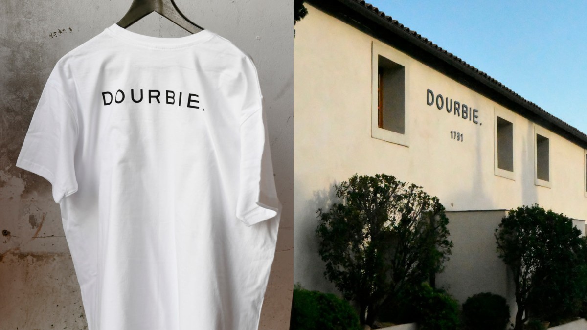
“Le Domaine de la Dourbie” becomes “La Dourbie.”
The affirmation of its name and location (La Dourbie is the river running towards the vineyard) as multiple advantages : first it defines the domain not only as a wine producer. The domain is producing wines, but will also produce olive oil, honey & a panel of experiences for their visitors. Second, the short name is a modern take on a traditional wine estate. Third, its graphic form with its final dot is an affirmation of its DNA : we stand for what we are.
The strategic repositioning will help the domain to achieve its controlled growth strategy. By translating the new modern & authentic values of La Dourbie into tangible brand assets, we’ve created a brand in line with the new reality of the target audience.
The domain is located in Hérault, in the middle of a rich and natural environment. With an approach based on authenticity and symbiosis with the land, the vines and local producers, la Dourbie is guided by the attachment to the Hérault valley.
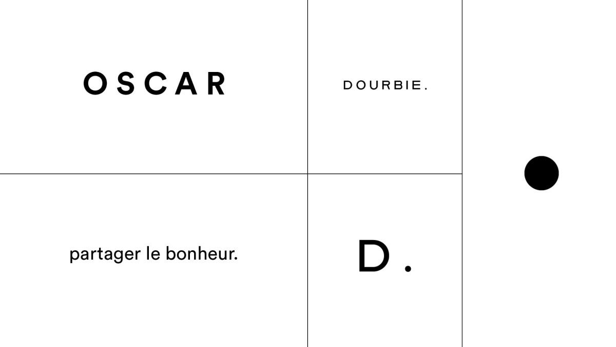
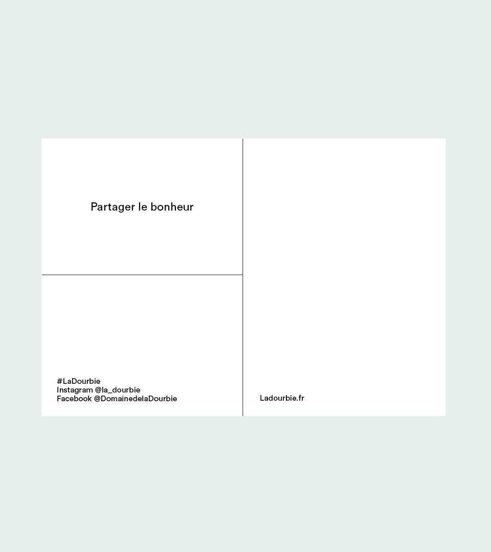
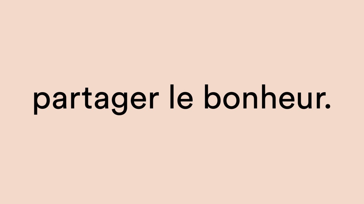
The design grid is devised on the sharing aspects of the experience. “partager le bonheur”, “sharing happiness” is the Dourbie manifesto to redefine the connection between consumers and their wines.
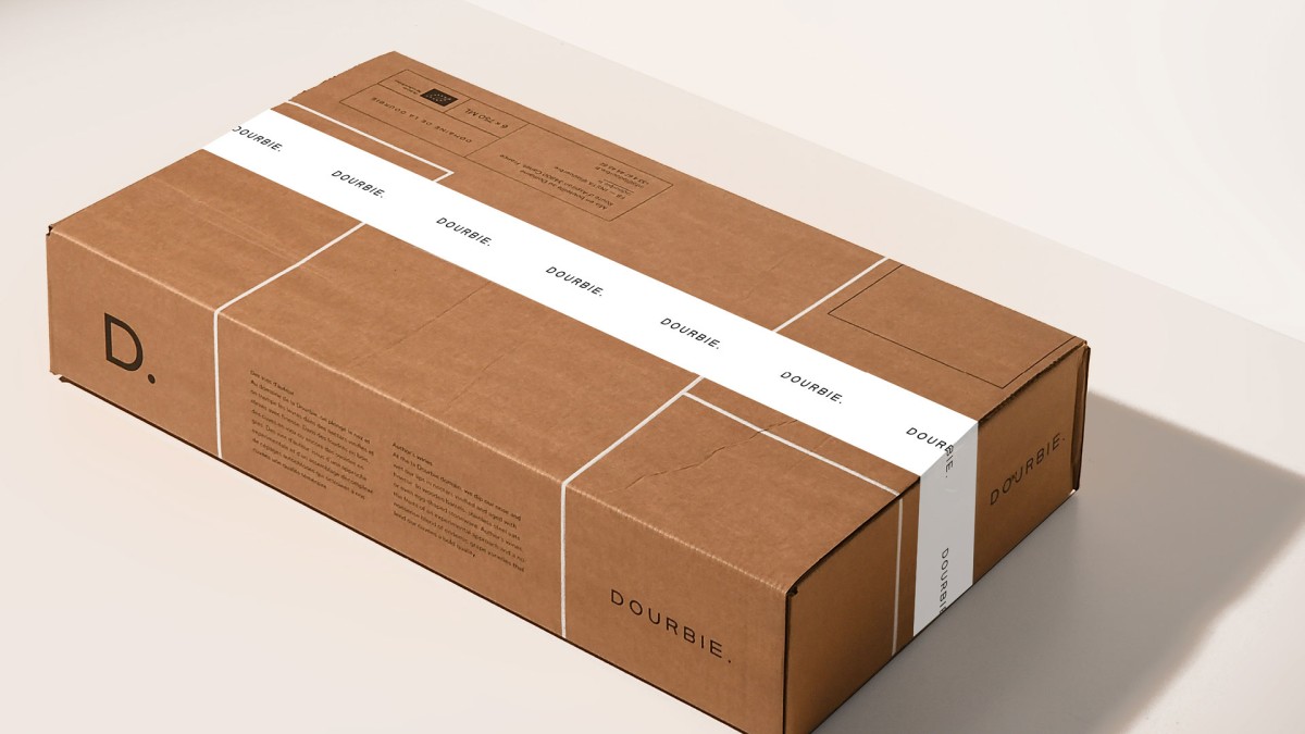
The creation of the brand identity enabled the brand to make its presence felt on all appearences with a new voice : a new future for La Dourbie, enabling the brand to express itself with their own rich personality.
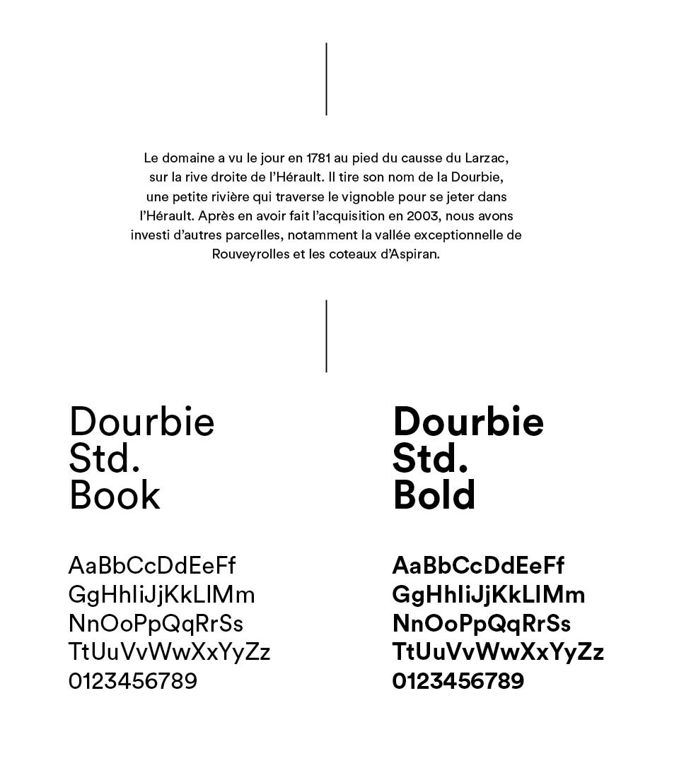
A branding alignment was elaborated using the grid system and a mutual typeface for all of the estate production.
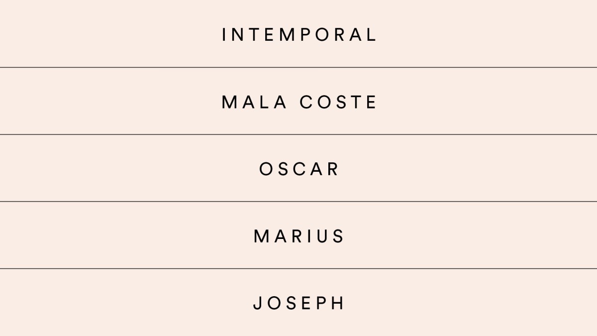
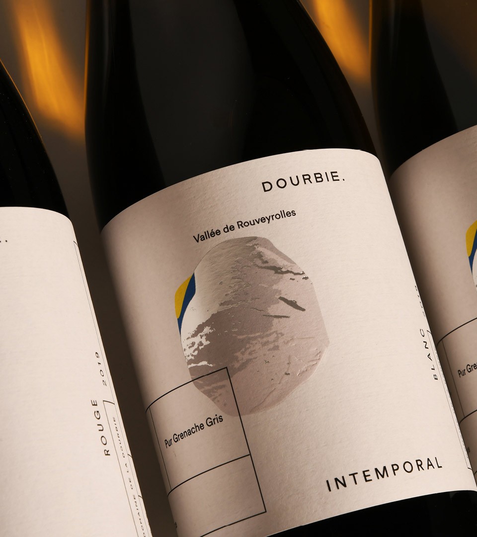
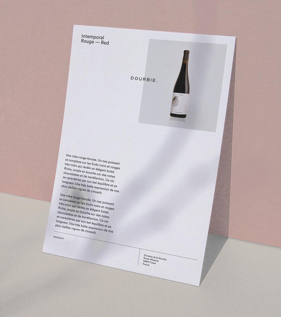
The two major wines have been totally re-labelled. Intemporal & Mala Coste both stand as the ambassadors of the estate.
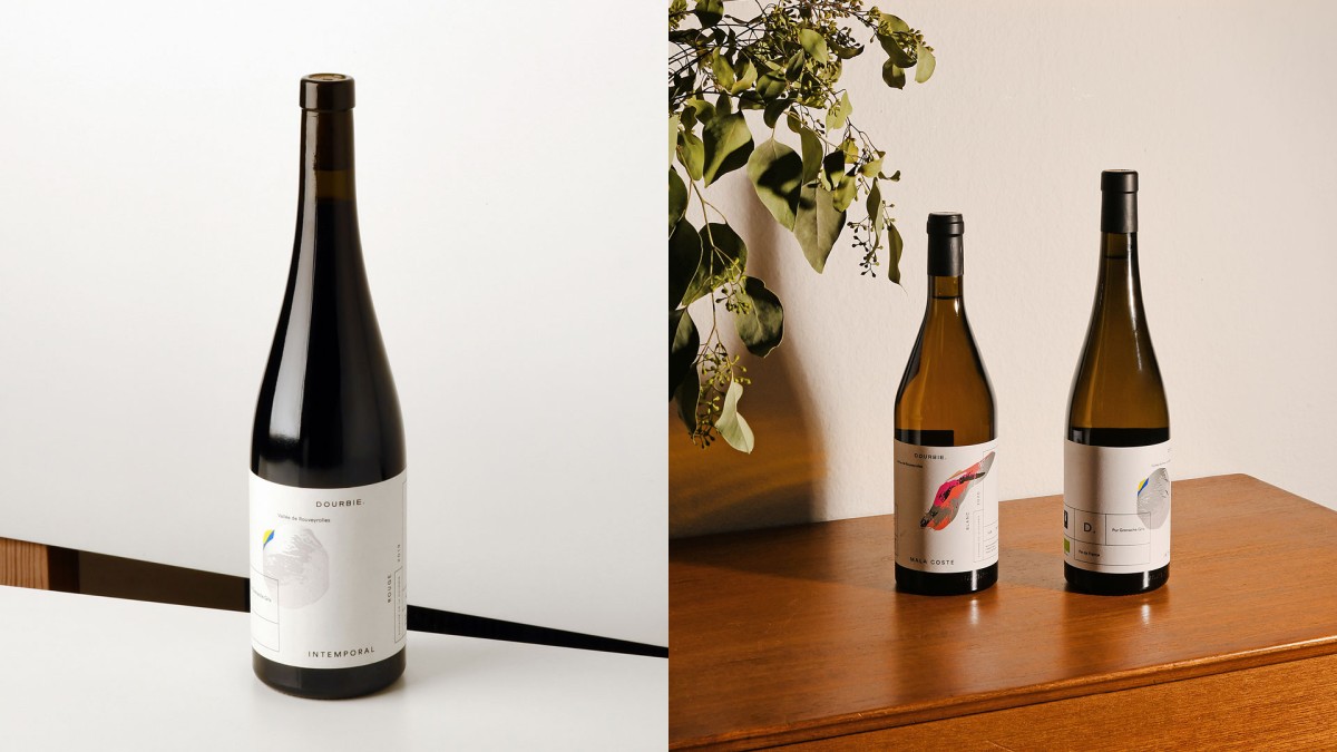
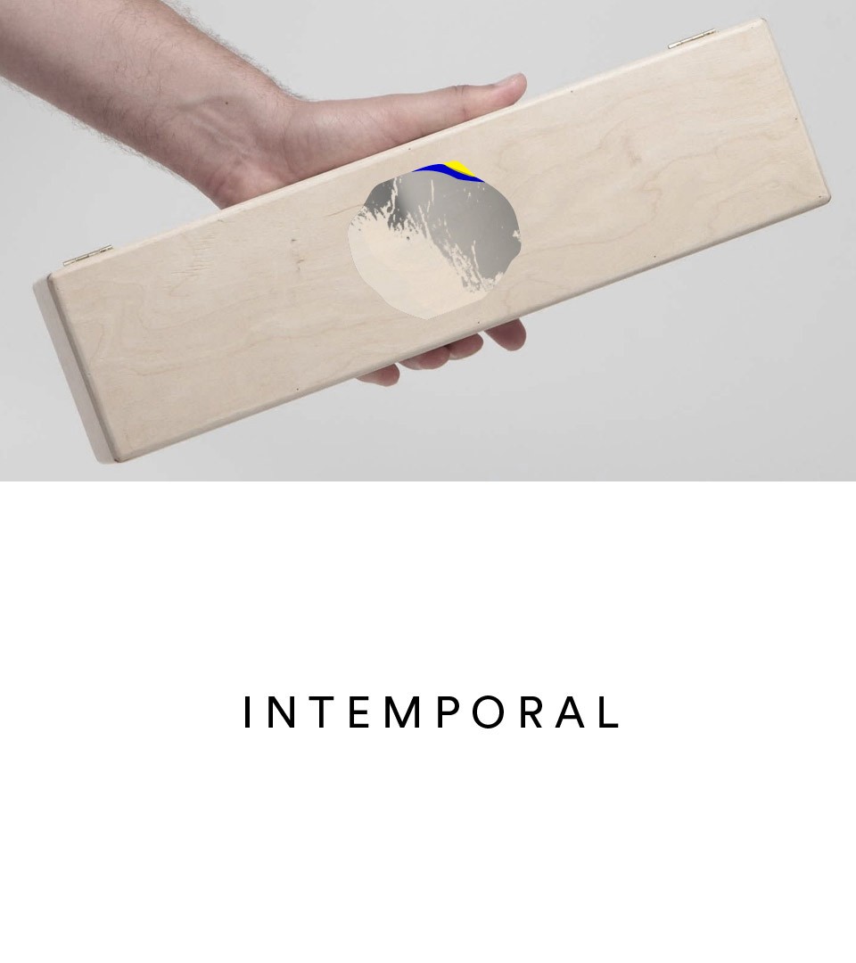
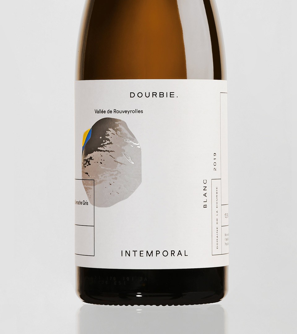
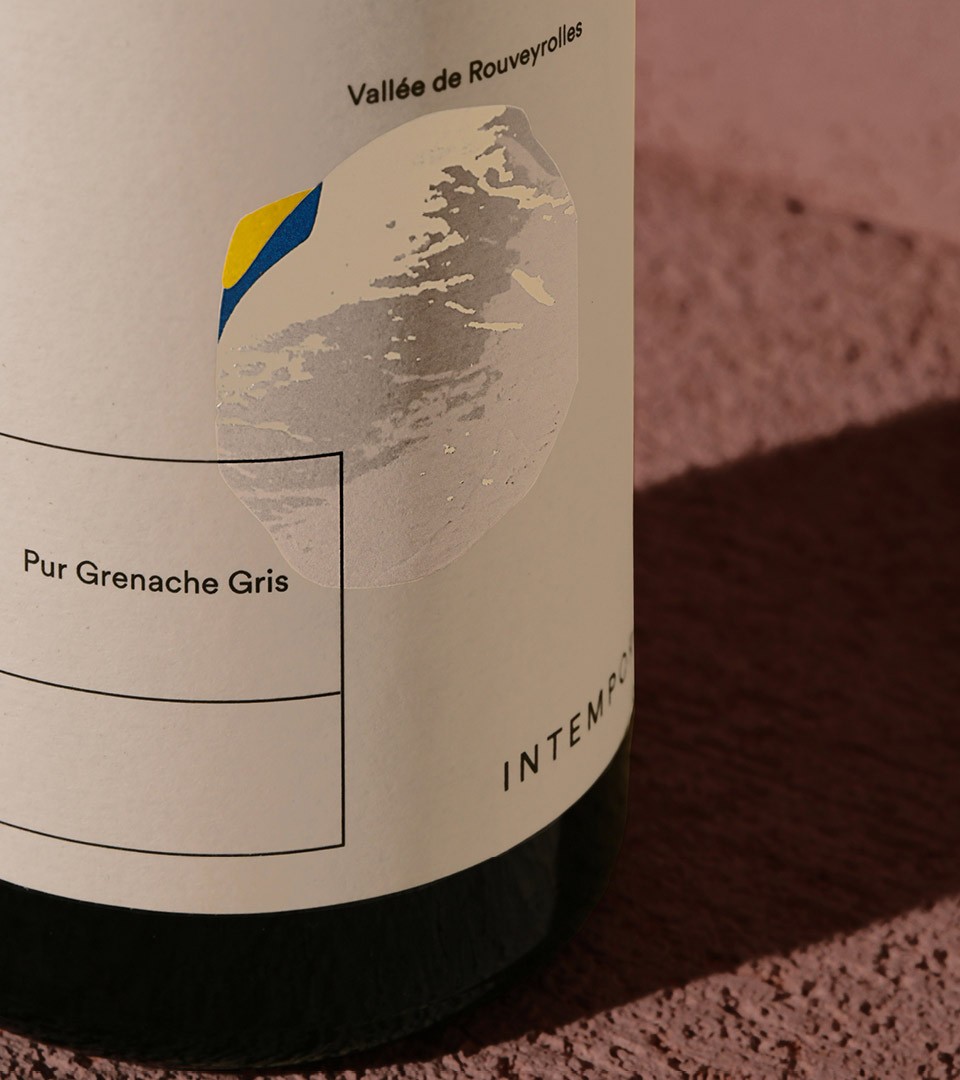
Intemporal, cherished child of its land, is made from the richest & oldest vines selection. The label represents a trace, a memory of the winemaker & the work of the sun on the soil of the valley.
A trace like a kiss
Label design was conceived as a cherished and subtle memory. The trace label we designed is an assembly of the wine soul : like a trace left on the ground, the illustrative signature is a composition of the Dourbie soil, the Dourbie sun and the Dourbie sky. Together they form a rock, like an eternal trace. Using varied print techniques like foil, embossing and selective inks, we worked the label as a soft luxury item.
Mala Coste, the wrong slope, a locality which constitutes the signature of Dourbie.


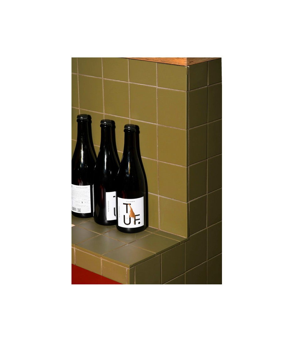
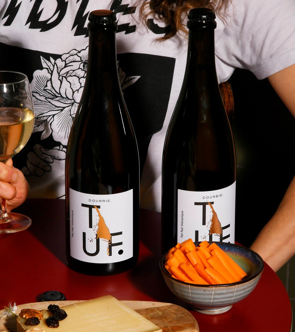
TUF is Dourbie’s version of the perfect organic sparkling wine. Born from an ancestral basalt soil, it’s said that a lava flow would have diverted the Dourbie river from its bed. The design elements represent the flow, transformed into gold.
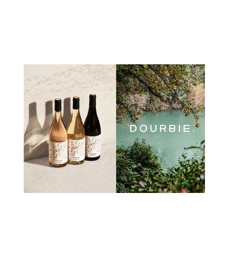
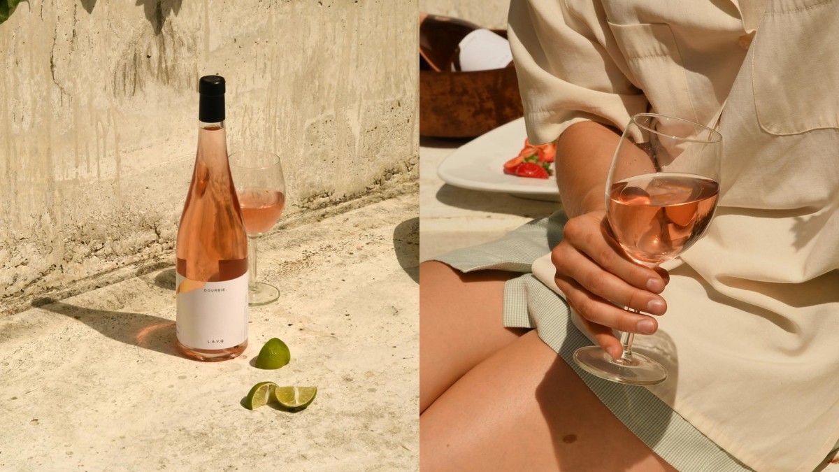
L.A.V.Q (elle à vécu) is Dourbie's version of summer : a fresh and delicate rosé
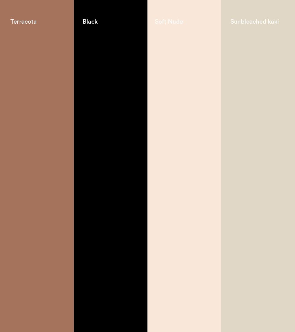
Coast global creative approach makes sense in a global & evolving sector. We chose the classic back to basics approach and rooted ourselves in a tactile and emotional context. The soul of the brand comes from a universe of colors and imagery that all have a human - soft touch approach
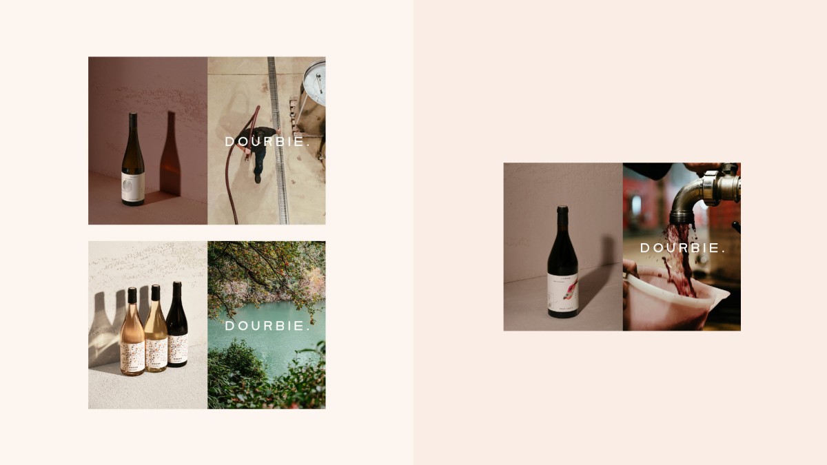
The visual style is about calm, warmth and humanity. The estate photography was shot by Benjamin Leveaux.
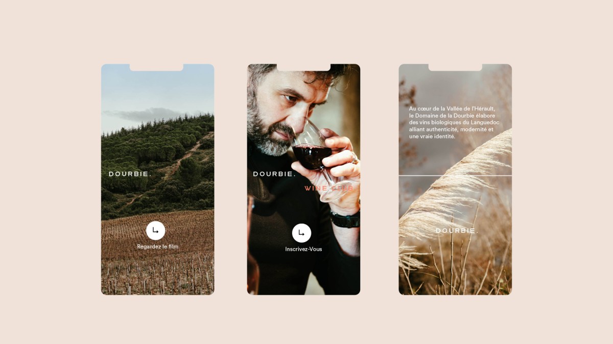
To create Dourbie’s e-commerce site, we distilled the essence of the company down to its core elements. Then we created a digital design system to match the overall brand look and feel. Layout and typography are inspired by the iconic product packaging. An elegant motion design creates calm transitions that mirror a relaxing experience.
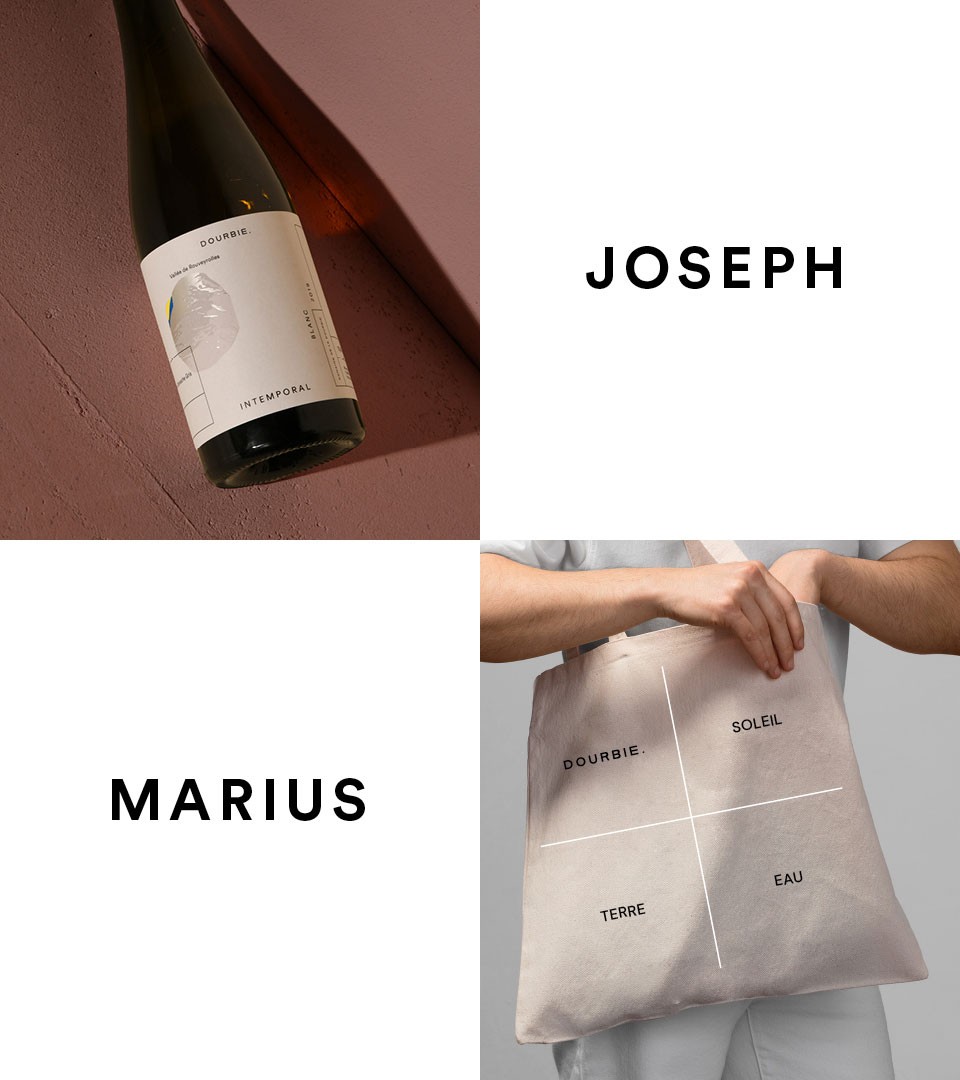
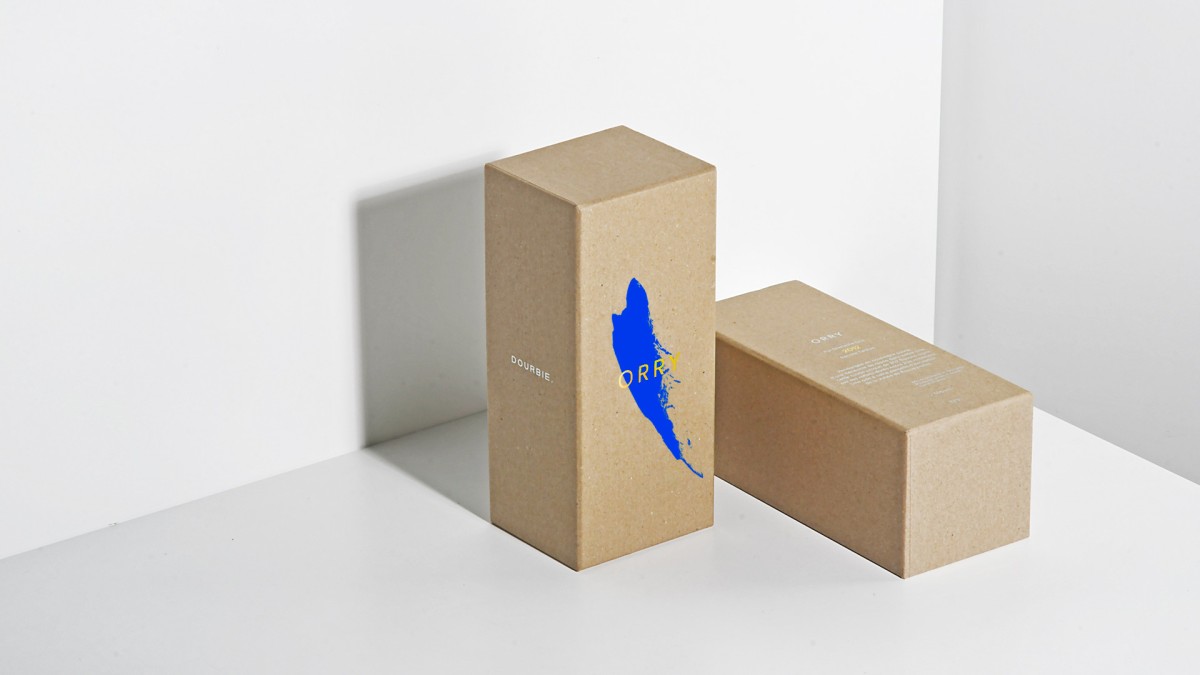
La Dourbie also has a collab program with local producers. Promoting what’s best in Herault with local artisants, The first two products are an exclusive olive oil by David Ferrando and a gin-like “eau-de-vie de vin” by Simon Tardieu. The identity reflects the collabotation.

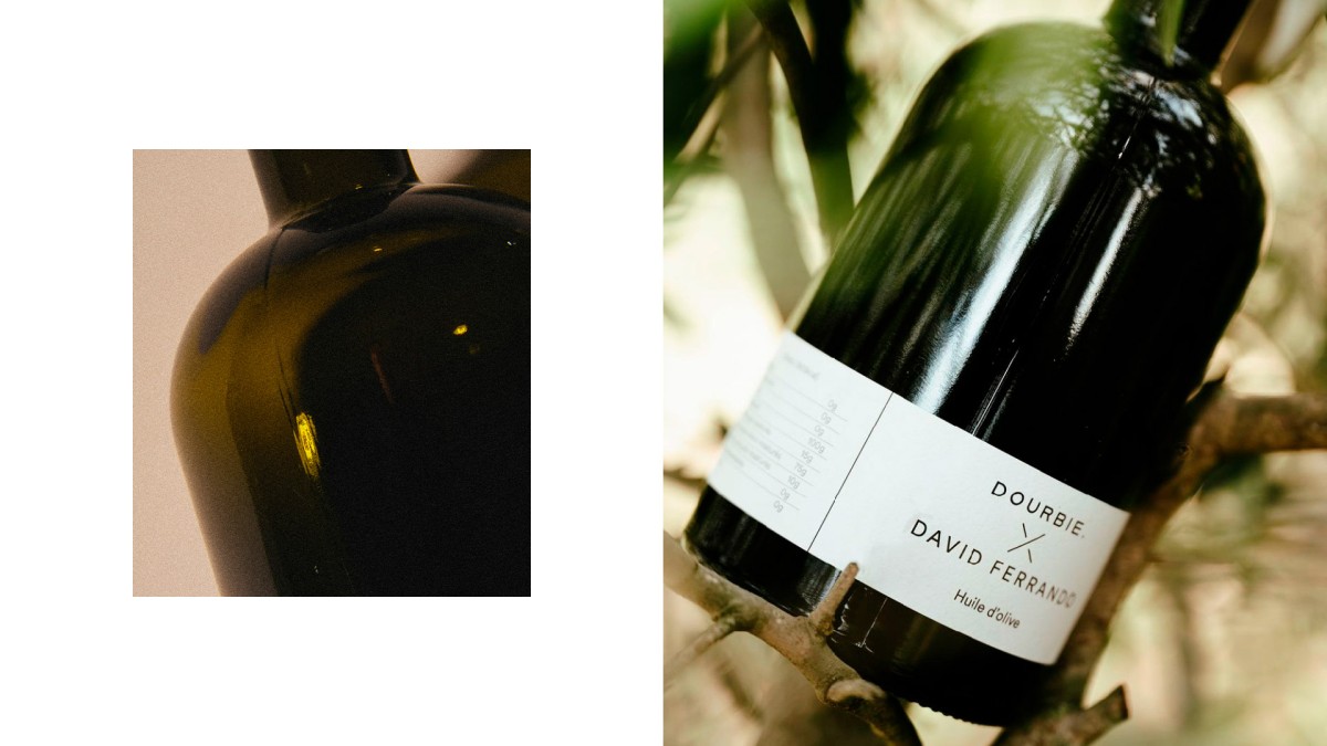
The Dourbie identity takes the lead and the link with producers is made with a stylised cross. The system will be applied on all new collaborations.

