Euro Banknotes for Icon magazine
Rethinking a symbol of diversity & unity
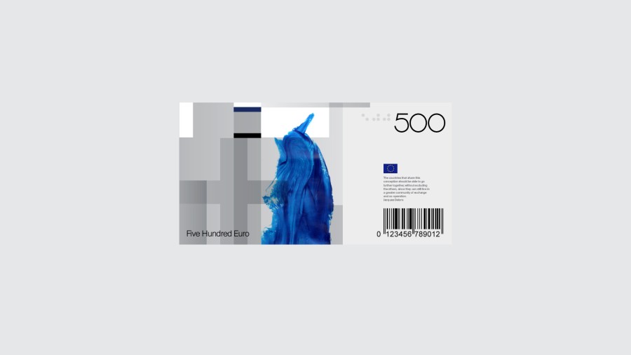
We were asked by Icon magazine to redesign anything we wanted. We opted for the Euro banknotes. It was the opportunity to tell our story about Europe : a vibrant and mixed population, a fusion of identities for equality and freedom.
Radical use of flag features
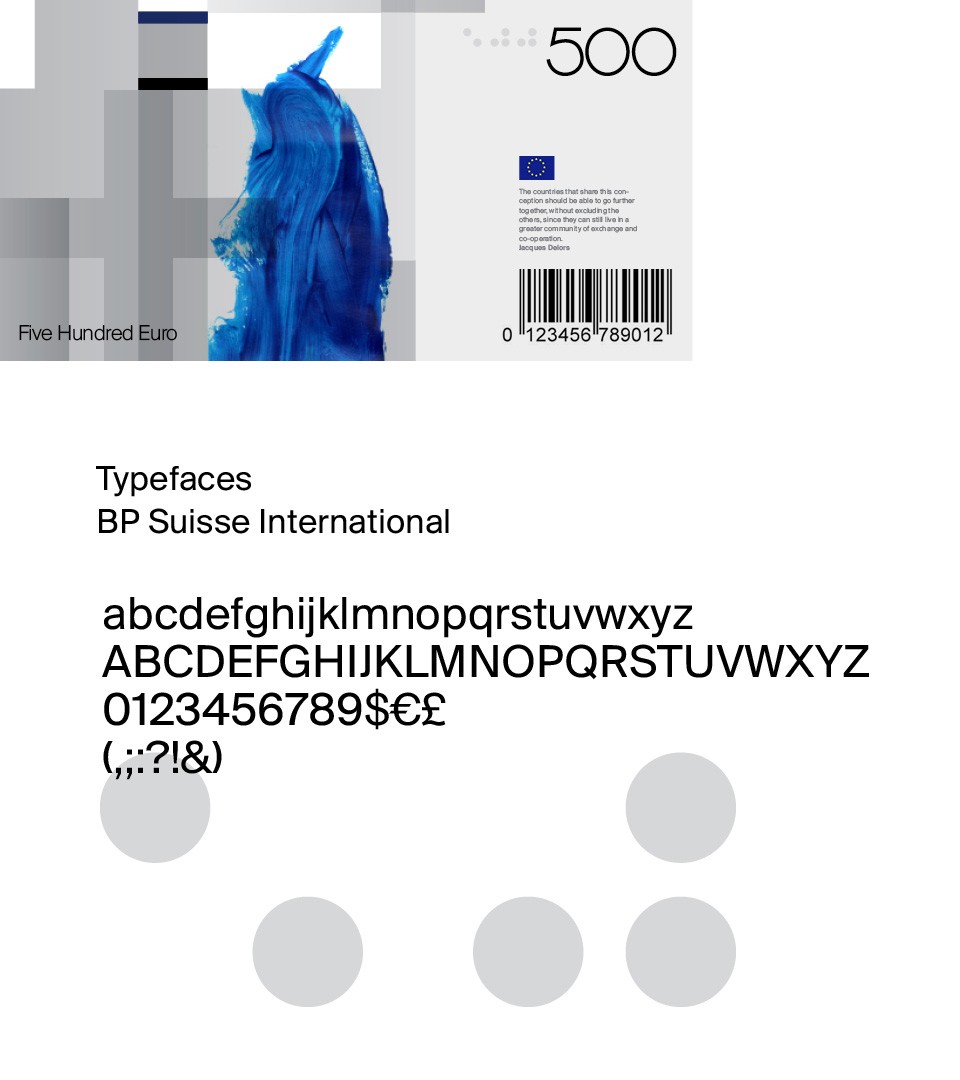
A new banknote needs a new design. By introducing the concept of “merging structure”, we mix countries flags on a free design basis. Each country color code can be used for one or multiple notes. The “grid” can produce numberless solutions.

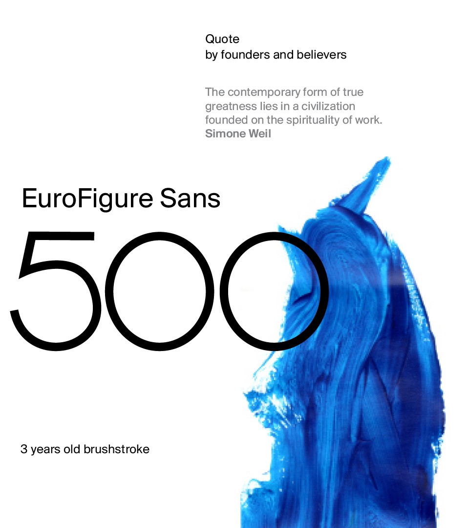
A 3 year’s old brush paint was incorporated in the design of the banknote system, as a reminder that europe must believe in its youth and freedom of expression

Our European dream is a place where all genres and nationality mix to be as one. The choice of a currency item that translate this state was deliberately political to reinforce equality within its territory. Equal trade = equality = freedom.