HUGGYS
— Welcoming everyone with open harms
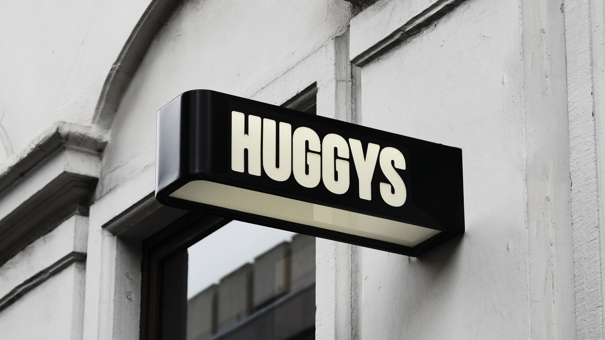
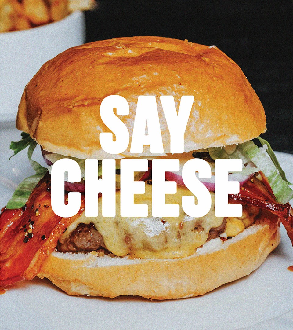
The original "Huggy's Bar" was a local hit from day one, known for its great burgers and relaxed atmosphere. But how do you take something so cherished and evolve it without losing the essence of what made it special? The secret to Huggys’ long-lasting success lies in its values: a brand built for friends, one that doesn’t take itself too seriously, yet is serious about delivering amazing burgers. The goal of Coast's rebrand was clear – To take this beloved spot from a “burger joint” identity to a restaurant-style experience matching the new quality standards.
From Burger bar to Restaurant.
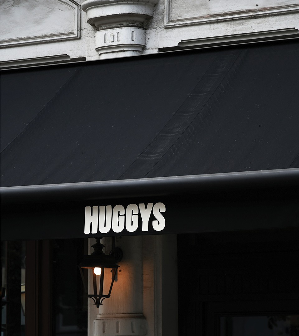
The old “bar” identity was no longer a fit for what Huggys had become. We started by simplifying the name, dropping “Bar” to reflect the new direction. Huggys is today a place where the focus is on high-quality, locally sourced ingredients, and where the Belgian burger experience takes center stage. From the beef to the buns, everything at Huggys is crafted with care and served to all in a relaxed atmosphere.
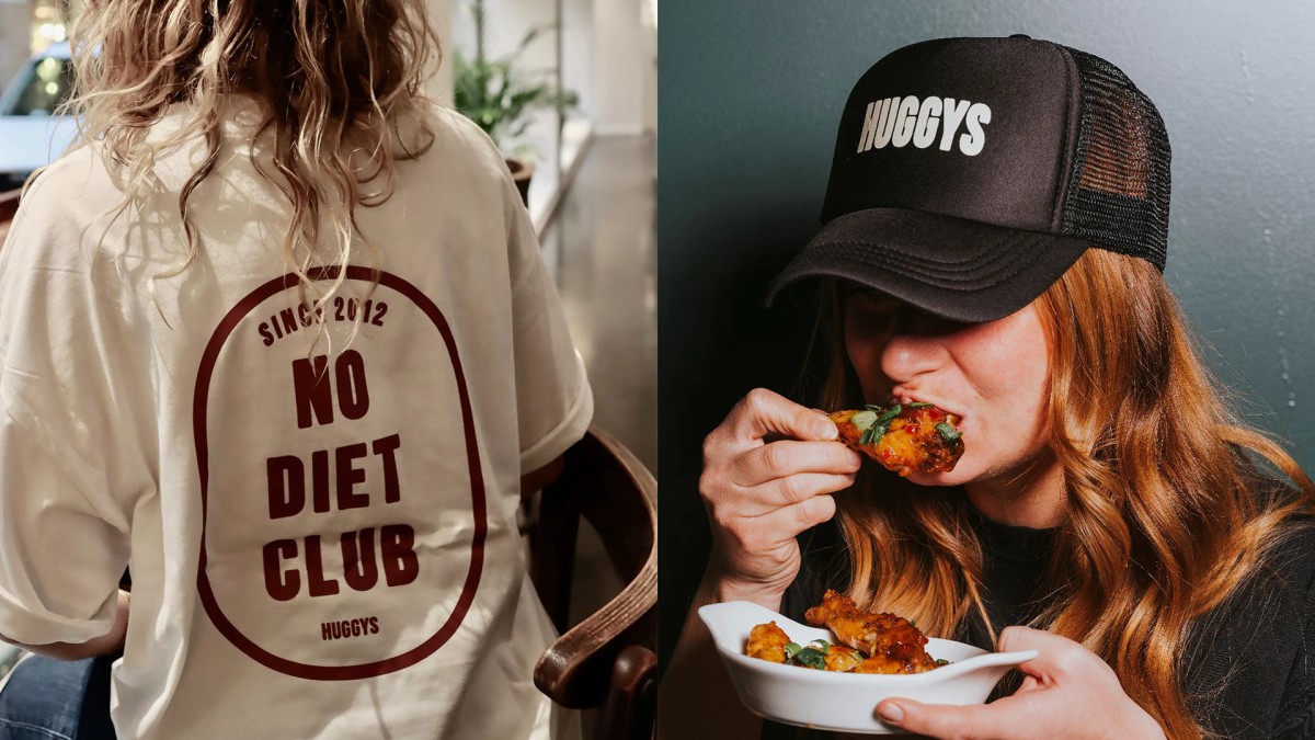
A New Brand Language that say: “Hey, You’re Welcome Here”

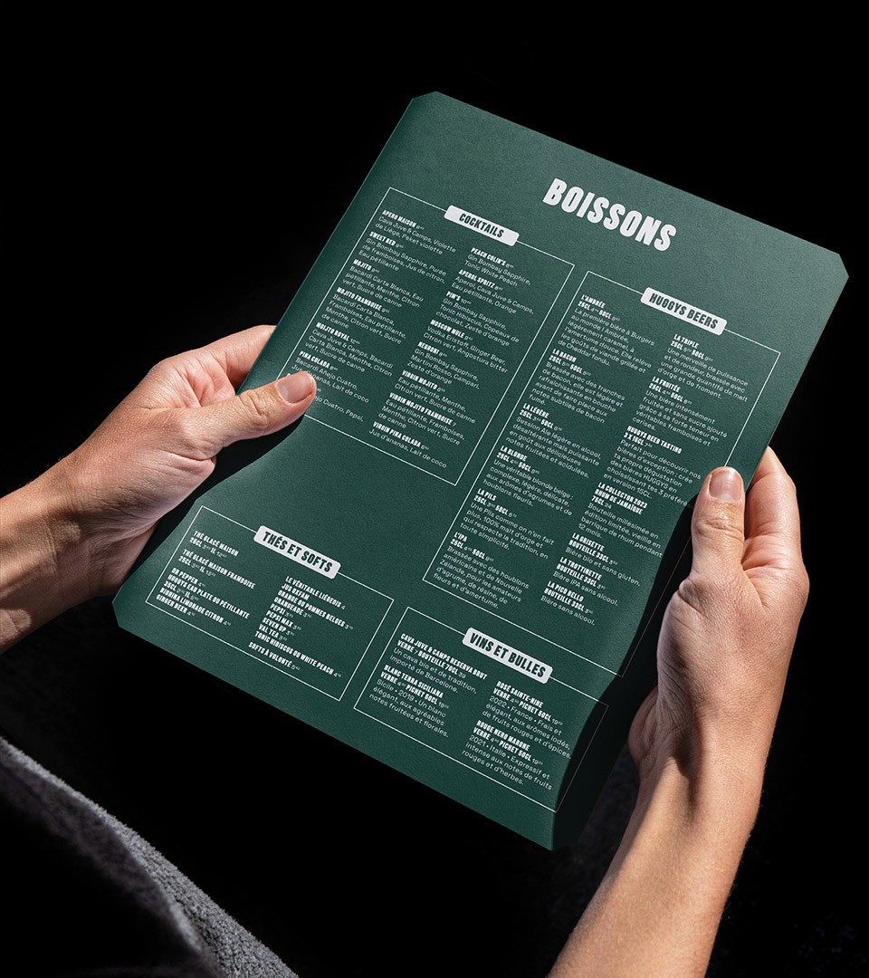
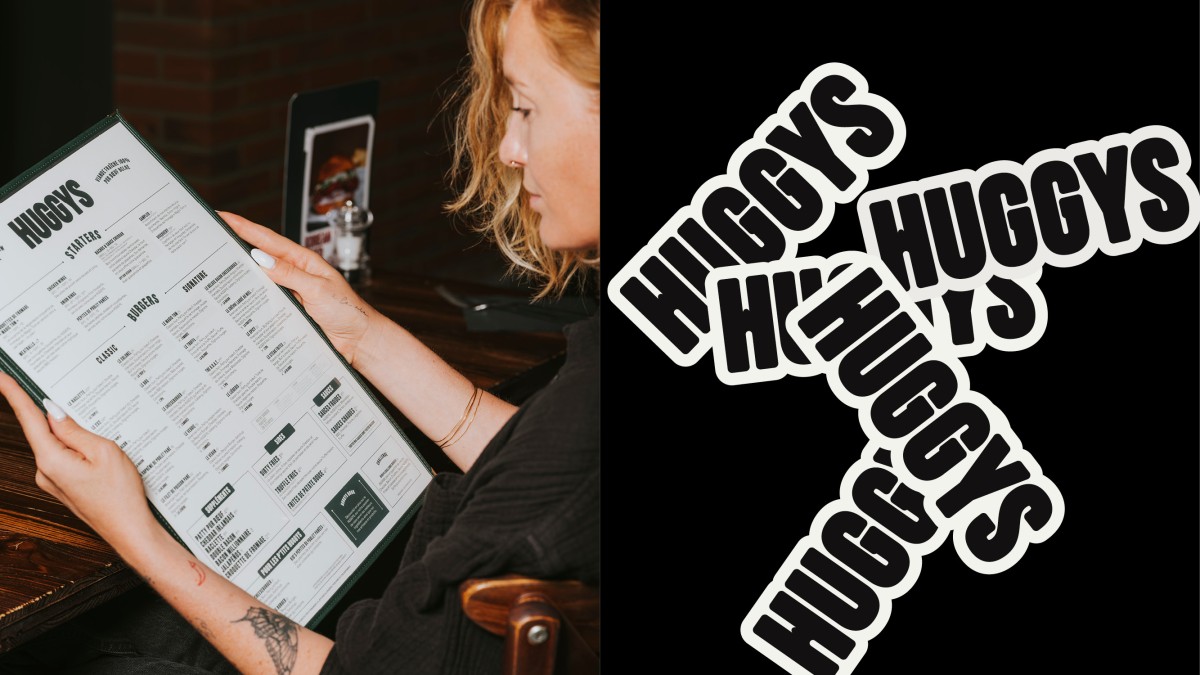
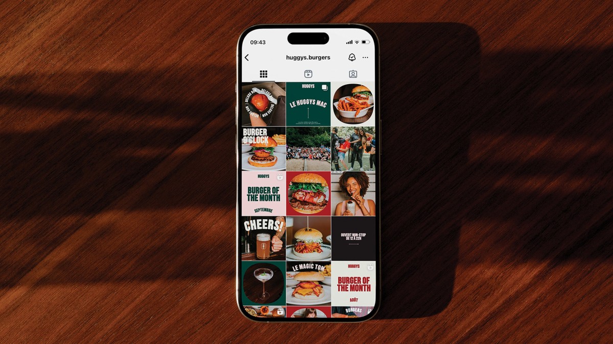
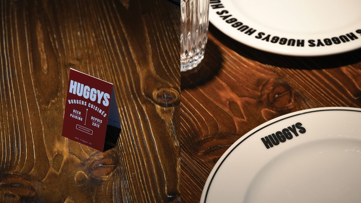
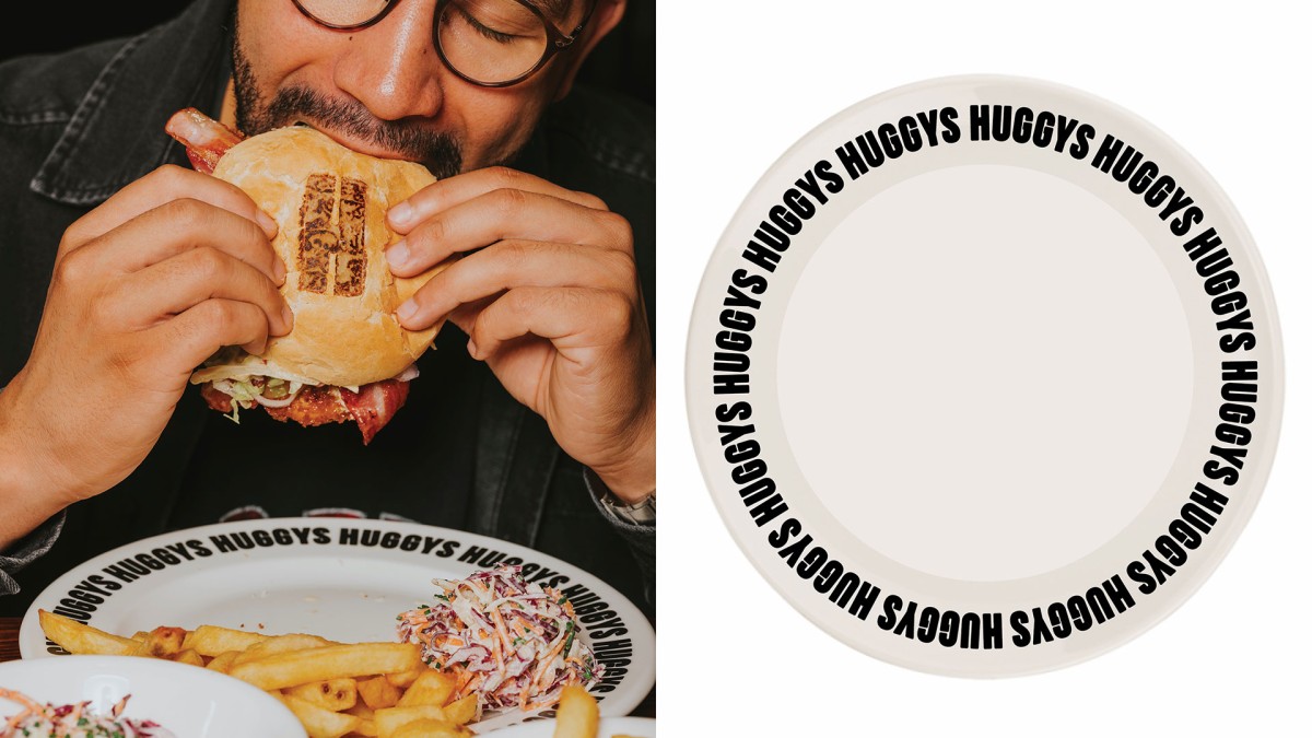
With the new name and attitude came a fresh brand language. We crafted a tone of voice that says, “Hey, you’re welcome here,” making every guest feel like part of the Huggys family. The typography and design choices are playful and approachable, matching the warm, friendly service customers have come to expect.
Emotionally connecting through design
At Huggys, we’ve infused the welcoming branding system with a touch of warmth and personality. By designing emotions into every detail, we’ve crafted a space that feels like home. It’s not just about the food—it’s about creating lovable experiences that connect, delight, and keep you coming back.


The tagline, "Burgers Cuisinés," embraces the brand’s Belgian roots and keeps French as the core language, honoring the local culture. Huggys proudly introduces a “Belgian-style” burger, stepping away from the typical American recipe to create something uniquely local. The owner, a true culinary innovator, is always testing, tweaking, and reinventing flavors to keep things exciting.

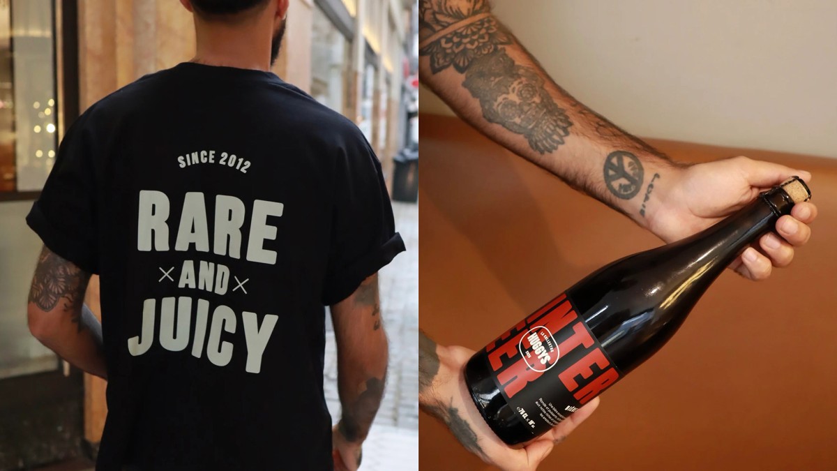
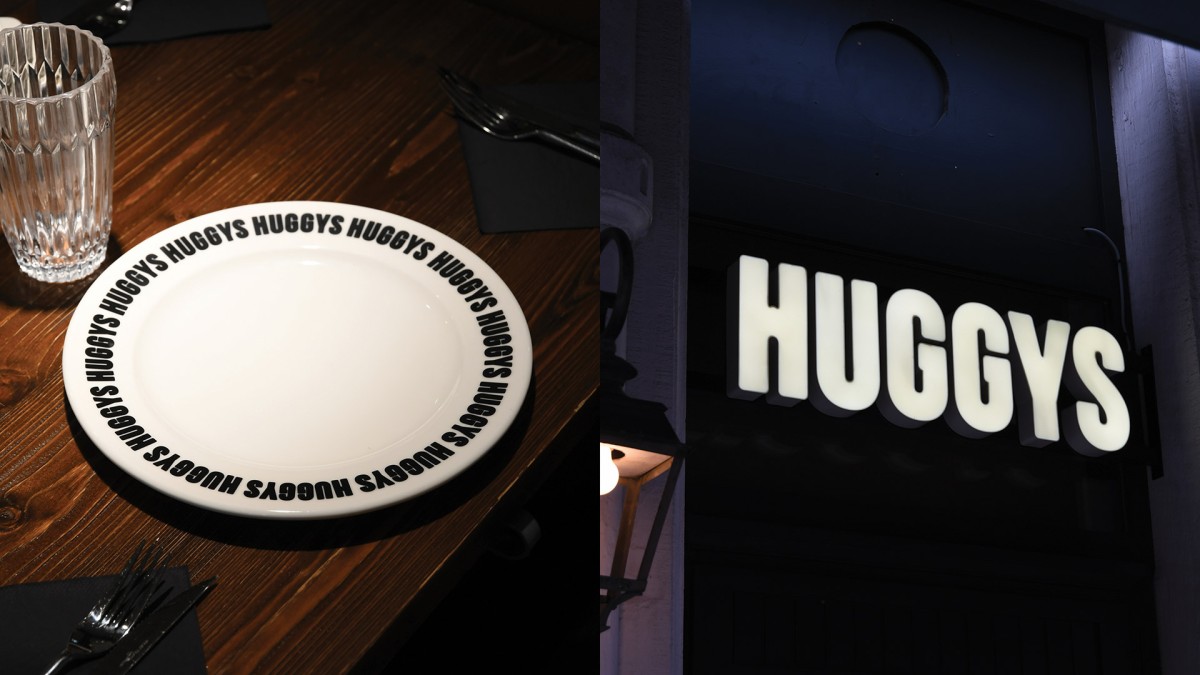
The new branding is all about being inviting, fun, and – of course – delicious. Rounded shapes, welcoming signs, and friendly language are all part of the visual identity, making Huggys a place you want to discover and explore. Every design element is crafted to create a sense of warmth, comfort, and excitement for what’s to come. So, whether you’re a regular or a first-timer, you’re greeted with open arms and the promise of a burger experience like no other.
