Silent Revolt Contributors
Original stickers
We asked designers we love to create their own vision on Silent Revolt. Our briefing to them : what's in your mind right now? What would you communicate in the streets today? Full description available in Silent Revolt : The book.
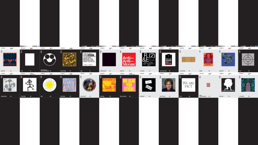
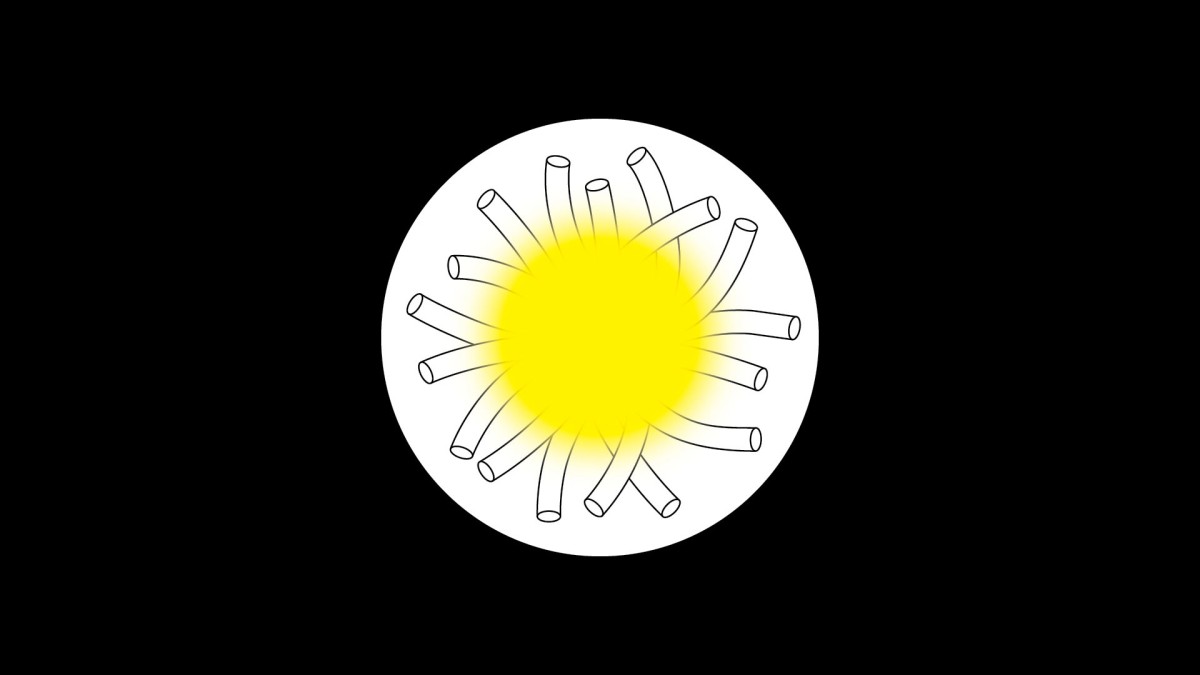
Mark Bohle (001) : BARCELONA : Extract from a series of urban flowers for the streets of Brussels.
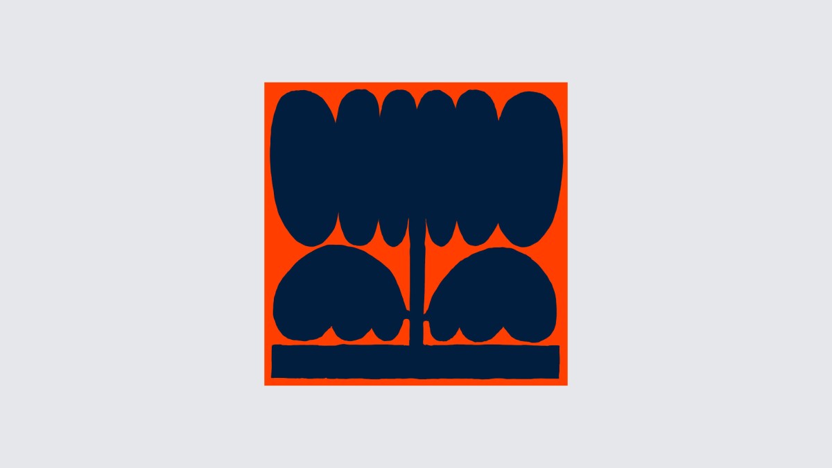
Coast (002) : BRUSSELS : Inspired by the original idea behind SLNT RVLT, this proposition is an invitation to look out for all the tiny details that make the difference.
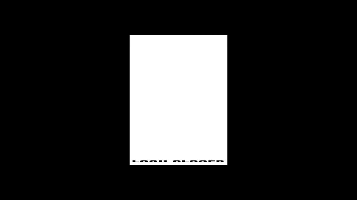
Corbin Mahieu and Lennart Van den Bossche (003) : GHENT : The sticker represents Corbin and Lennarts’ studio mascot: a big smiley created by two abstract people putting their heads against each other.
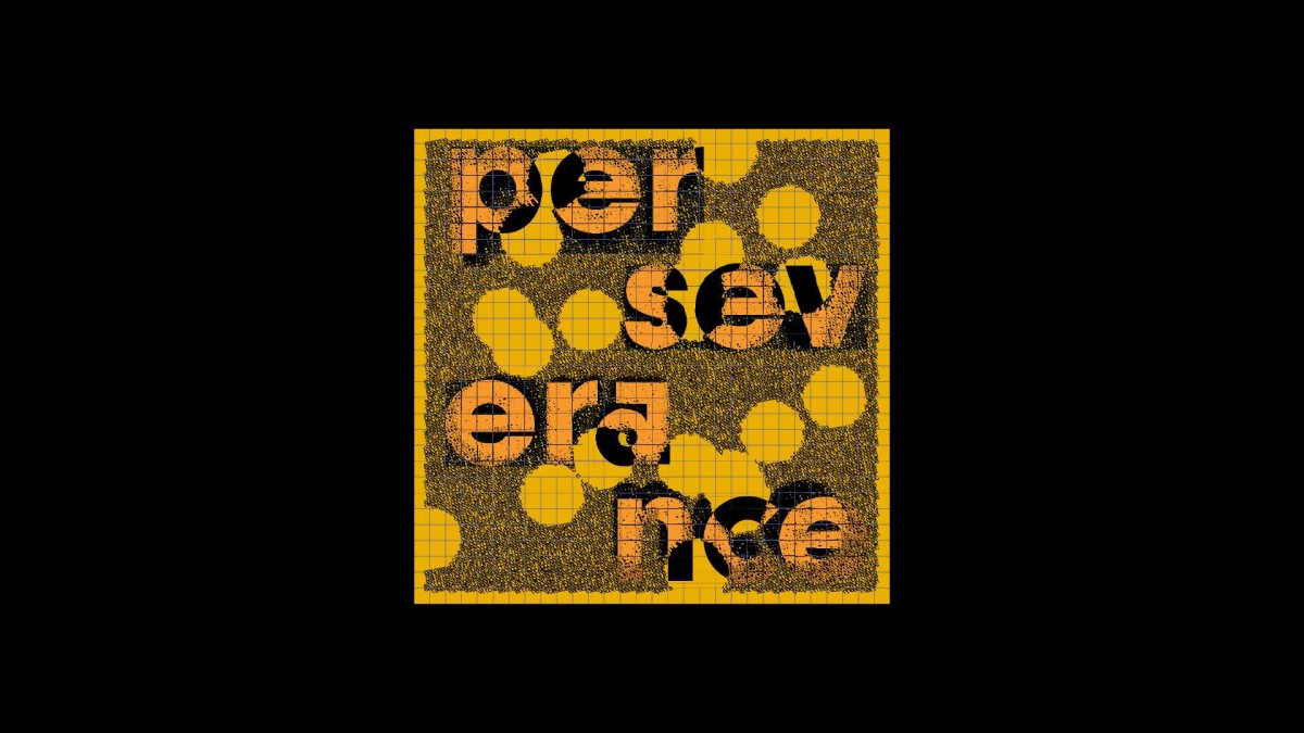
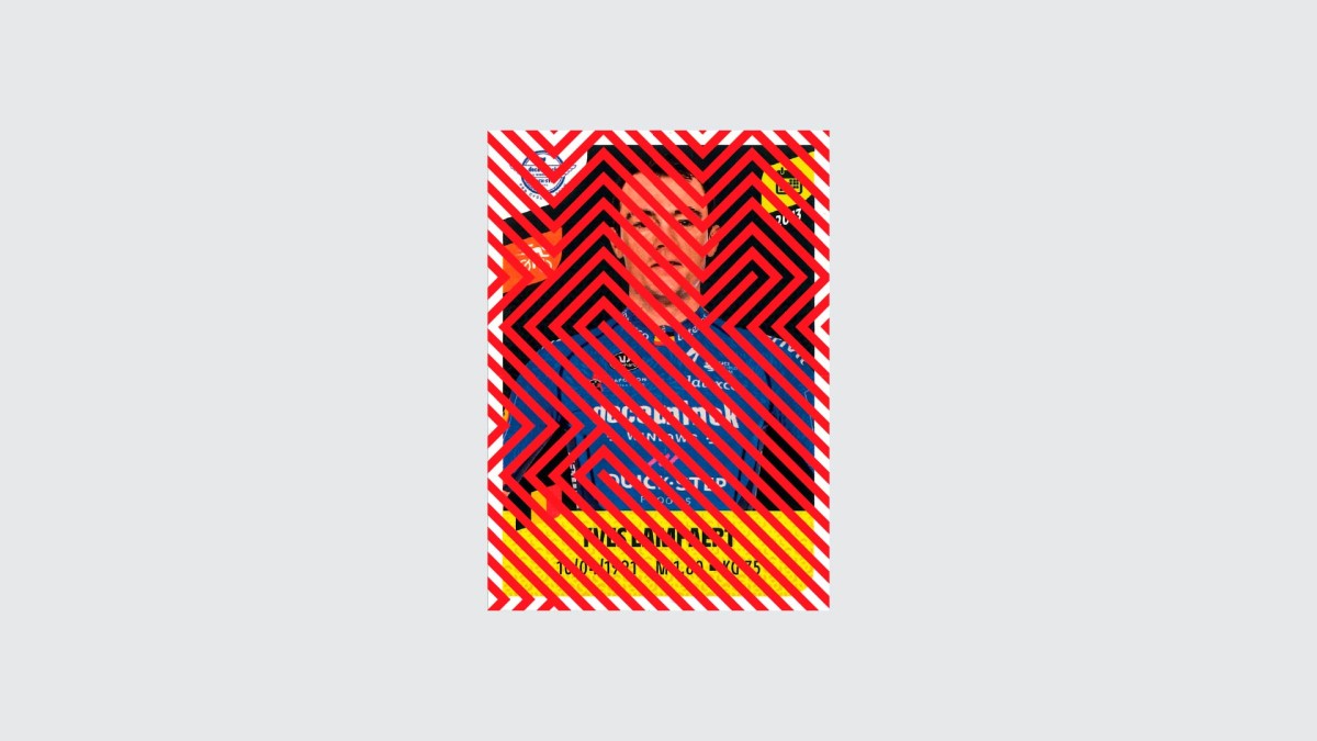
Daniel & Andrew (004) : BUCHAREST : Perseverance in face of hardship. In the unexpected we found our strenght, our humanity. It’s through the struggle that we learned how to come together and find solutions. Find our way to the normal life we knew. Or to a even a better one. It’s all about resilience. It’s all about perseverance. It’s all about us coming together and learning how to make it through.
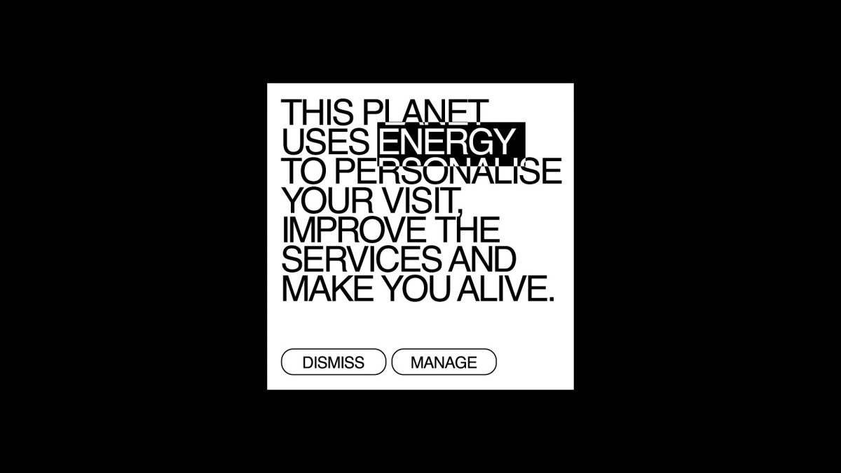
Esiete (005) : BARCELONA : This sticker Esiete have designed for this compilation wants to generate an unexpected message to encourage sustainability. Inspired by the common cookies pop-up we all receive daily while surfing the net, it calls on you to be active in the search for solutions to preserve our planet.
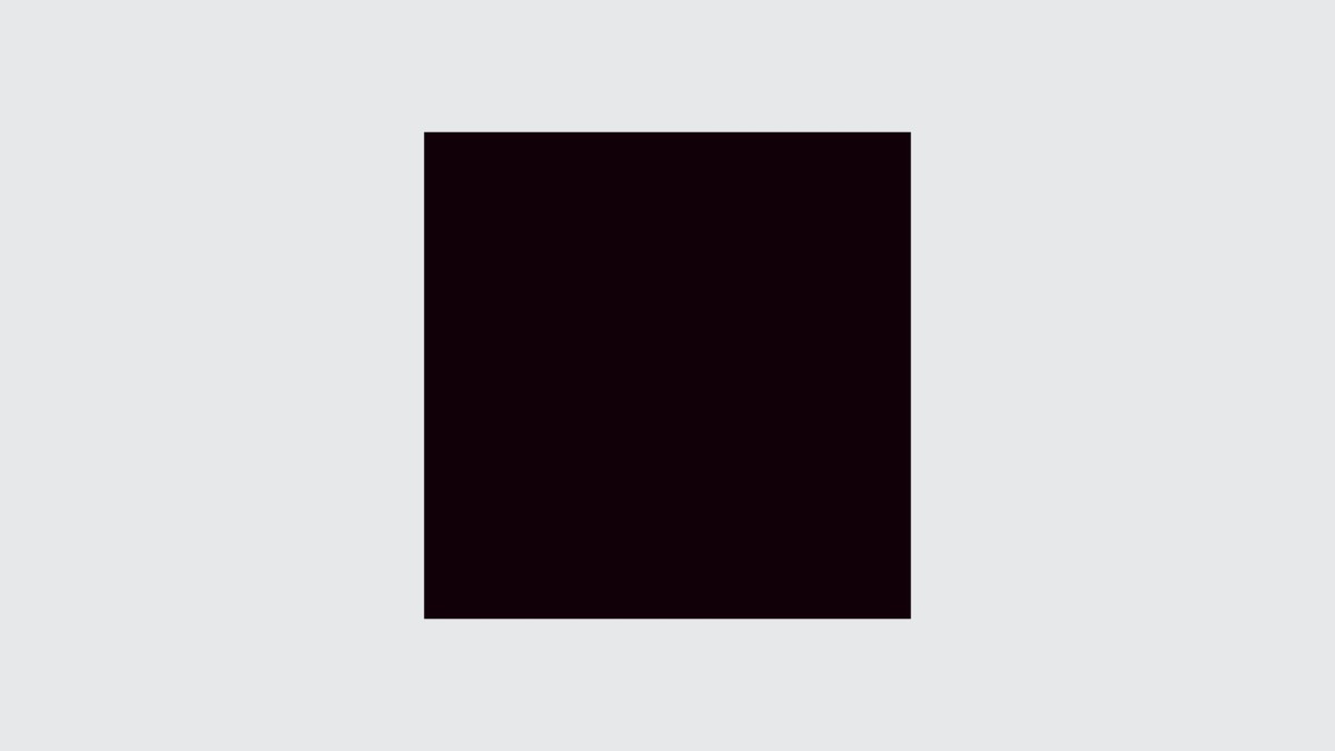
Philippe Galowich (006) : PARIS : Malevich intended his famous “Carré noir” as a zero point, akin to the state of "kháos" in Greek mythology : a void from which all future forms of art could emerge.
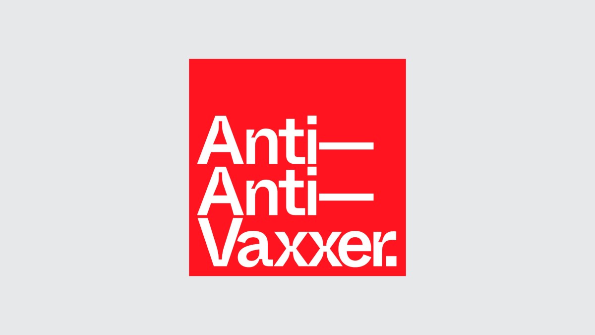
Give Up Art (007) LONDON : Don’t be selfish... : Give Up Art is a fully vaxxed design studio from the UK.
Lucas Hesse (008) HAMBURG : “Rhum und Ego” is a project founded by Lucas Hesse and Sophia Weider. They work with a “Just do it” attitude and like to meet people from different fields. What they have in common is their passion and enthusiasm for their projects, the way they dare to enter new sectors despite their lack of specialized knowledge and make their own paths, perhaps somewhat amateurishly sometimes, but always with a lot of heart and soul.
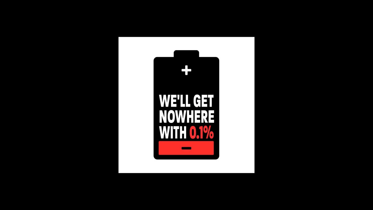
Jack Renwick Studio (009) : LONDON : Only 0.1% of creative agencies are women-owned. As one of these agencies, Jack Renwick’s sticker highlights this lack of diversity in the creative industry. An almost empty battery illustrates that this industry cannot keep progressing when it’s running on 0.1%. We need more diversity to fuel the creative agency industry and power new ways of thinking.
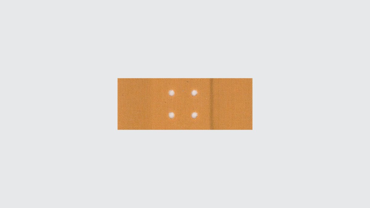
Jan en Randoald (010) : GHENT : This sticker is “een pleister op de wonde”. An attempt to solve all the problems in the world… “Just using it can suffice to alleviate the suffering”…
Mydatah (011) : NAMUR : A digital representation of a one colour silkscreen print on a Panini sticker of cyclist. The lines reproduced are created from a large-format silk-screen pattern which is itself produced from the word JAIL repeated indefinitely. The intention is to “lock up” these characters behind prison bars that represent a “coloured typographic labyrinth”.

Naughty Roll (012) : MACAO : COVID-19 has brought unlimited harm to Earth, and the city of Macao has also experienced economic and psychological damage. Hope it will be over soon.
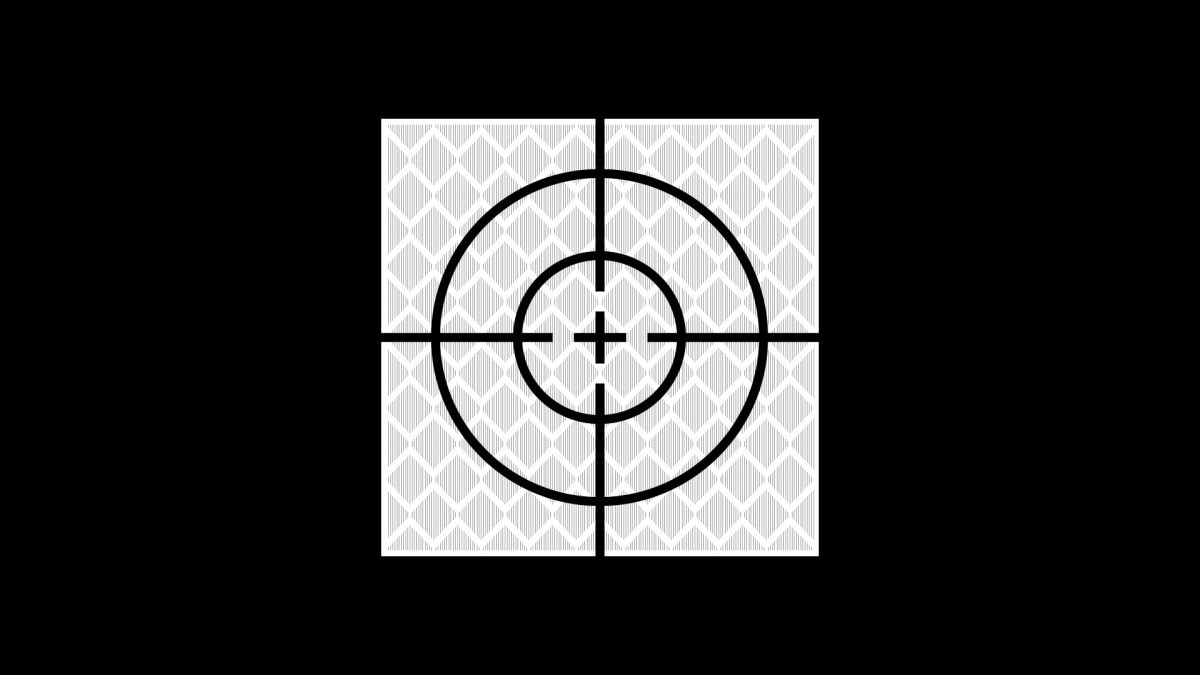
North (013) : LONDON : On returning to their office for the first time in several months after the pandemic, there was a small sticker newly affixed near the door. It was a surveyors ‘retro target’, designed to monitor any issues relating to the building development which had now recommenced across the street. They were struck by how this functional and brutal emblem could feel so optimistic and positive. A sign that London was moving again, changing and evolving as always.
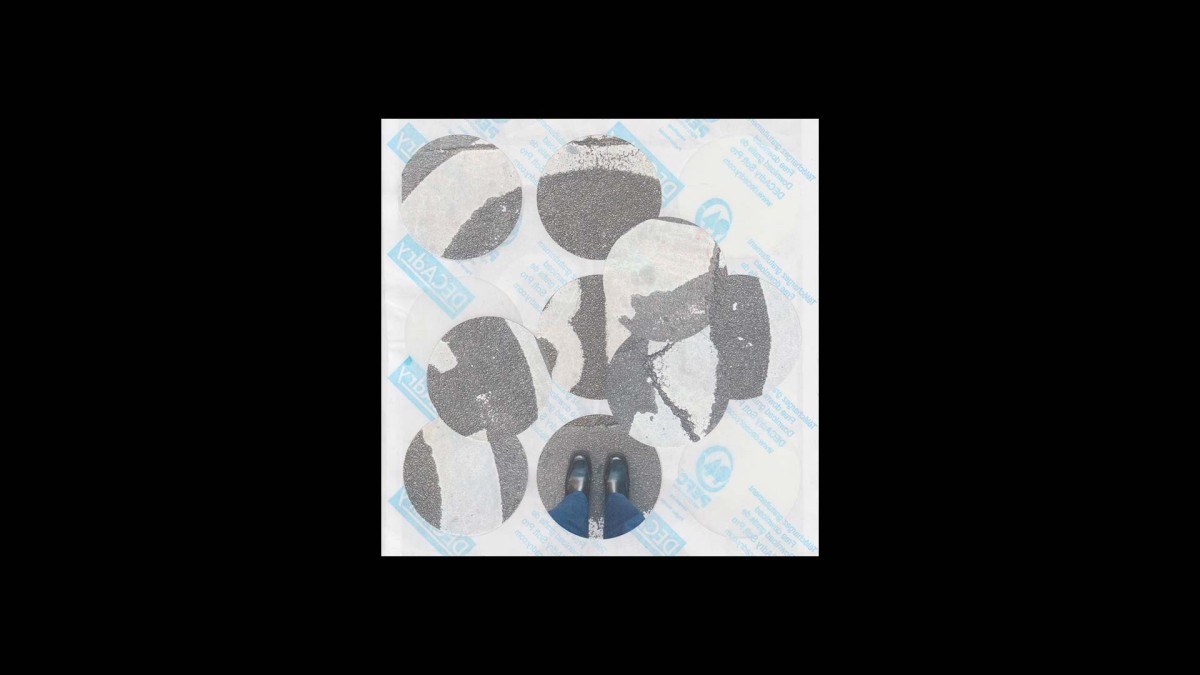
Katrijn Oelbrandt (014) : GHENT : A composition about mixing texture and the presence of physical contact. It shows a deconstruction of the everyday life on the streets and a construction of new lines and textures at the same time.
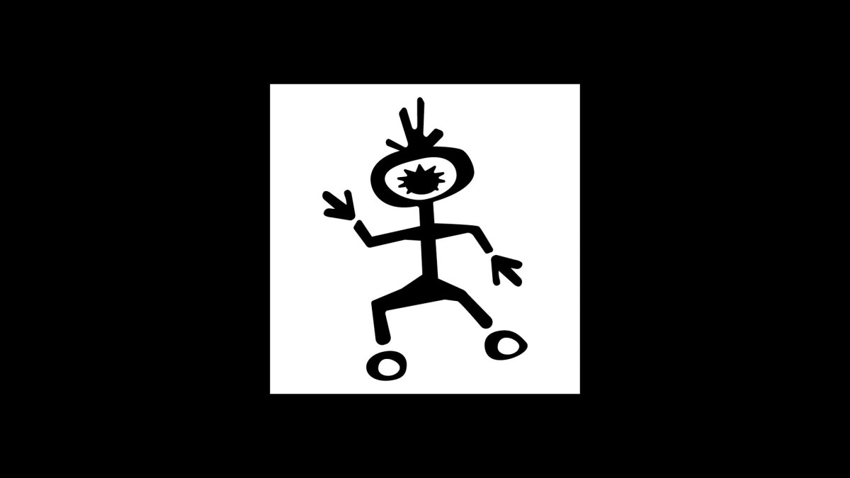
Parabol Studio (015) / OSLO AND AMSTERDAM : This little genderless character depicts the members of Parabol at the studio during the lockdown. Days of rolling out of bed to sit down in front of the computer, work the whole day, and having some happy dances in-between to try to stay sane. It reminds them of their experiences during the pandemic.
SMPL (016) : TORONTO : This is a visual representation of emotions felt during the beginning of the pandemic. Chaotic energy, not knowing what’s going to happen. But also peace in rare moments, staying home and working on ourselves.
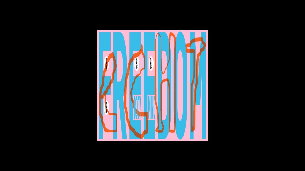
Specht Studio (017) : ANTWERP : Freedom has always been really important to Stephanie Specht : health, thoughts, movement, style, food, medicine and so much more. She became even more aware of the meaning of this word since March of last year, 2020. We take many things for granted. Some freedoms can really be taken away from a human being all at once. To her, real freedom, the kind they can’t take away from you, is the freedom that’s in your spirit.
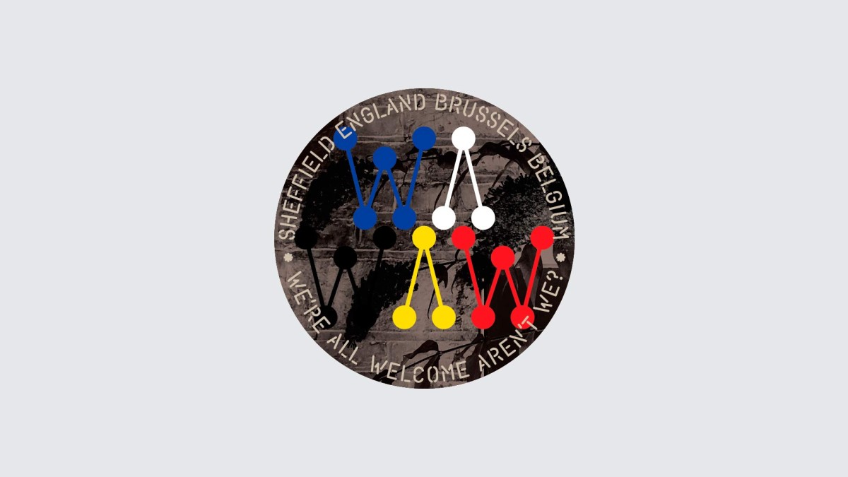
Andrew Stevens (018) : LONDON : We’re All Wednesday Aren’t We? Outwardly an expression of togetherness, WAWAW is in reality a statement of doctrine – a declaration of singularity, and whilst at times Andrew Stevens relishes the rivalries and comradeship shaped by such divisions – Wednesday, Sheffield, Yorkshire, Northern, English, British, and European – he has nuanced this plea, post crappy Brexit, hoping we might somehow remain welcome to enjoy our “common differences”.
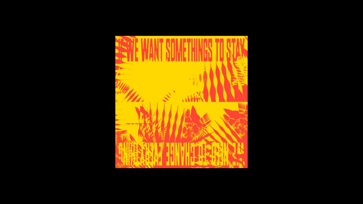
Studio Bens (019) : BERLIN : We all may know the state of danger we’re living in, threatened by the climate crisis, its political implications and the overall state of liberalism, still we don’t act as often as needed if we want to survive. Therefore, we need to be reminded, once or twice a day, in a loud yet positive and empowering way. That’s all Studio Bens wants to achieve.

Studio de Ronners (020) : ROTTERDAM AND ANTWERP : This studio believes in the lasting importance of print, while embracing the digital world. They love to combine print and digital design because they influence, challenge and reinforce one another. They illustrated this symbiosis by redirecting our sticker to an animated Instagram filter. The animation reveals more statements while playing with the analogue aesthetics of stickers. Curious? Discover how to scan the sticker on their Instagram page.
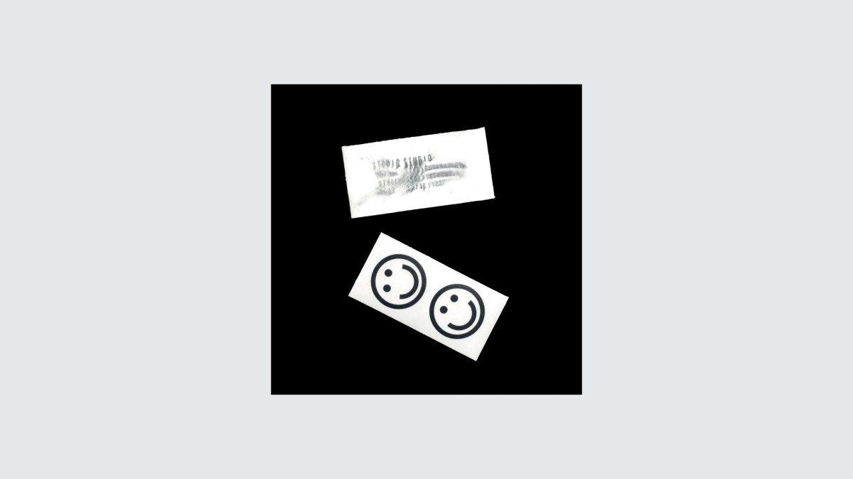
Studio Studio (021) : GHENT : The sticker is simple. The smileys are double. They represent Studio Studio, are recognizable and suitable everywhere.

Studio Thomson (022) : LONDON : Portrait of Juan R. Cruz, Ph.D., Aerospace Engineer at NASA / Langley Research Center, Hampton, Virginia, USA. Found on the Public Domain Archive www.archive.org Publication date 11/29/2007.
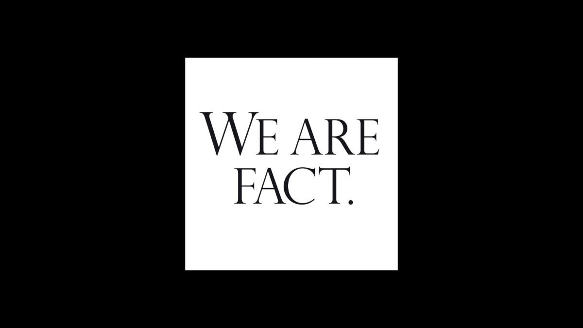
Unfun (023) NUREMBERG : Facts exist. We are 4.54 billion years old, but should not give up yet. Those years are gone already. We need to think about the ones ahead; as we all wish to exist in a post-fucked world.
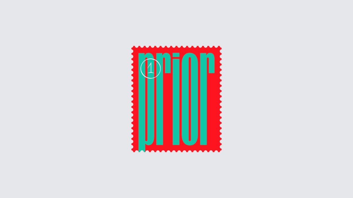
Ruben Vandennieuwenborg (024) : GHENT : PRIOR is a reaction to the sticker community. Tags and stickers are often used, among other things, to convey the message “I was here”, and to claim an area. Stamps on the other hand, send a message when someone can’t be present. Its content, however, stays enclosed between the sender and the recipient. By detaching the stamp from the envelope, and using it amongst other stickers, an interesting juxtaposition takes place.
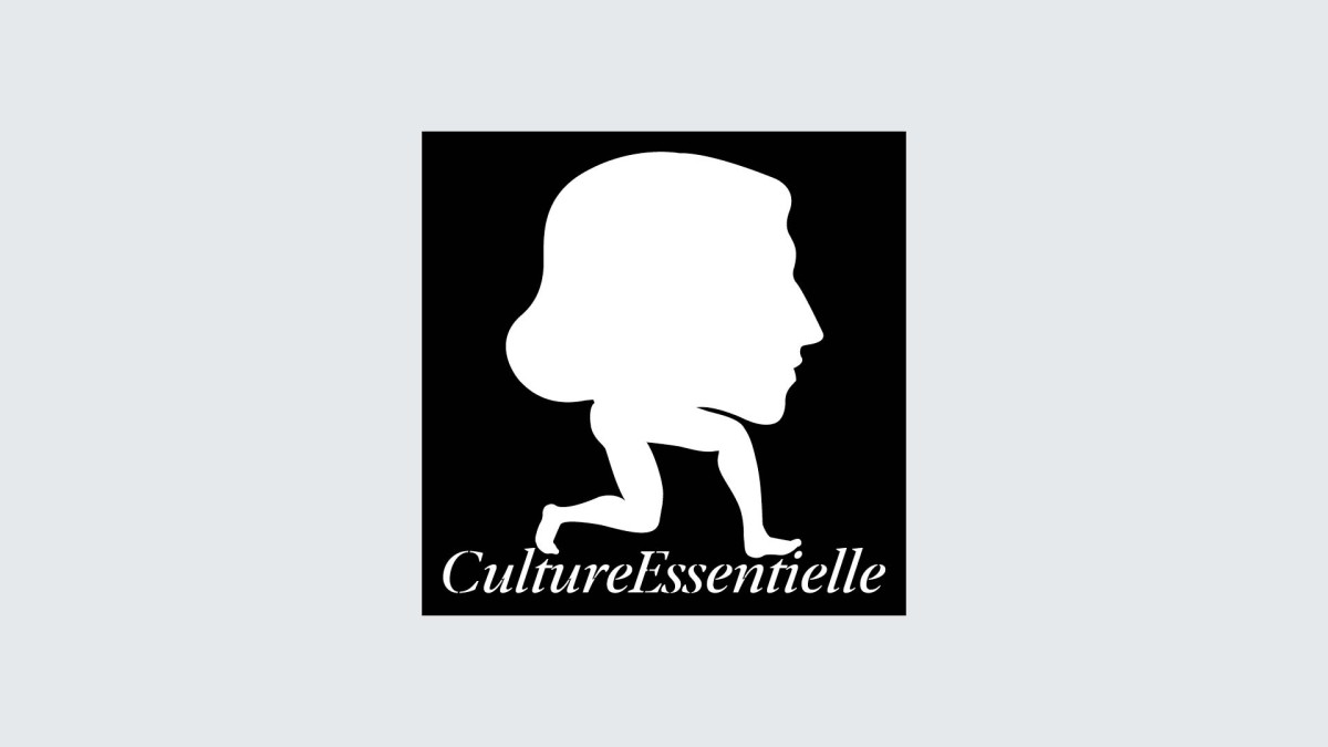
Pierre Vanni (025) : PARIS : Originally used as a series of posters for the national French theatre TheatredelaCité, the sticker “CultureEssentielle” (Essential Culture) shows a cultural place, amputated from its public and forced to keep going on in these uncertain times.
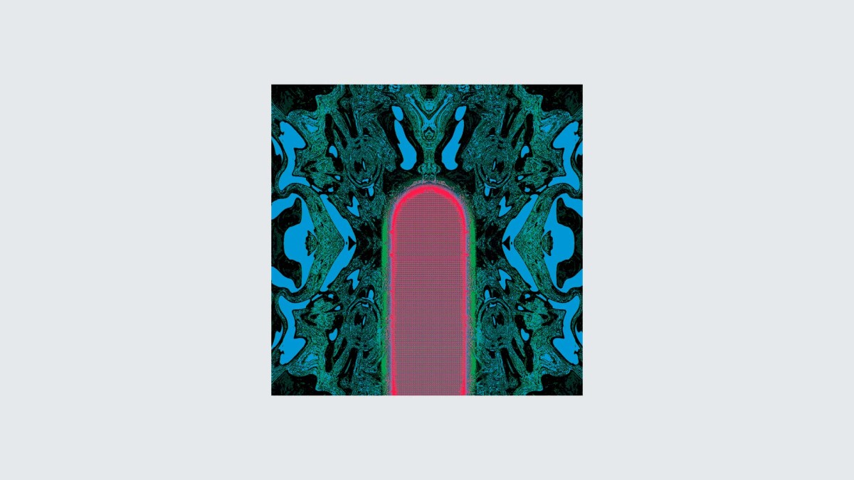
Victor Verhelst (026) : GHENT : For SLNT RVLT, Victor wanted to make a sticker that could refer to a portal to another universe. As if you could be sucked into that small portal. It lets you dream away to what world is behind that portal.