ANTWERP SYMPHONY ORCHESTRA
— The sound of Antwerp
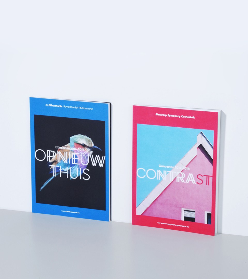
Koninklijke Filharmonie van Vlaanderen, or deFilharmonie, was their original name. To regain attention, attract an international audience and to mark their comeback at de Koningin Elisabethzaal, we renamed them to Antwerp Symphony Orchestra and build a new identity system inspired by Antwerp, its location.
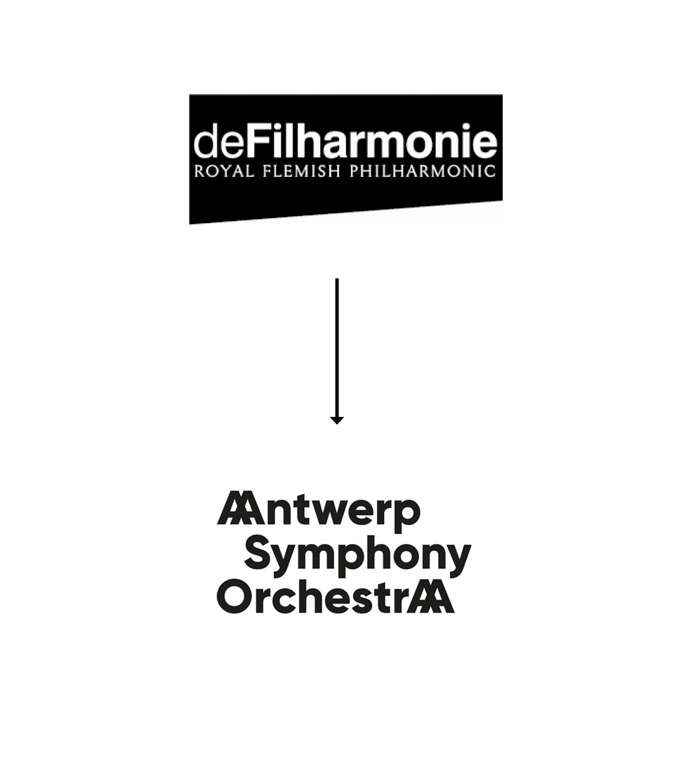
From deFilharmonie to Antwerp Symphony Orchestra. A new name and a rebrand.
Multiple names were used between 1955 and 2017 to define the Symphony Orchestra of Flanders but time came to clearly define what the orchestra stands for. Conducting research and interviews within the institution we resolved multiple problems by using location, description and English as language.
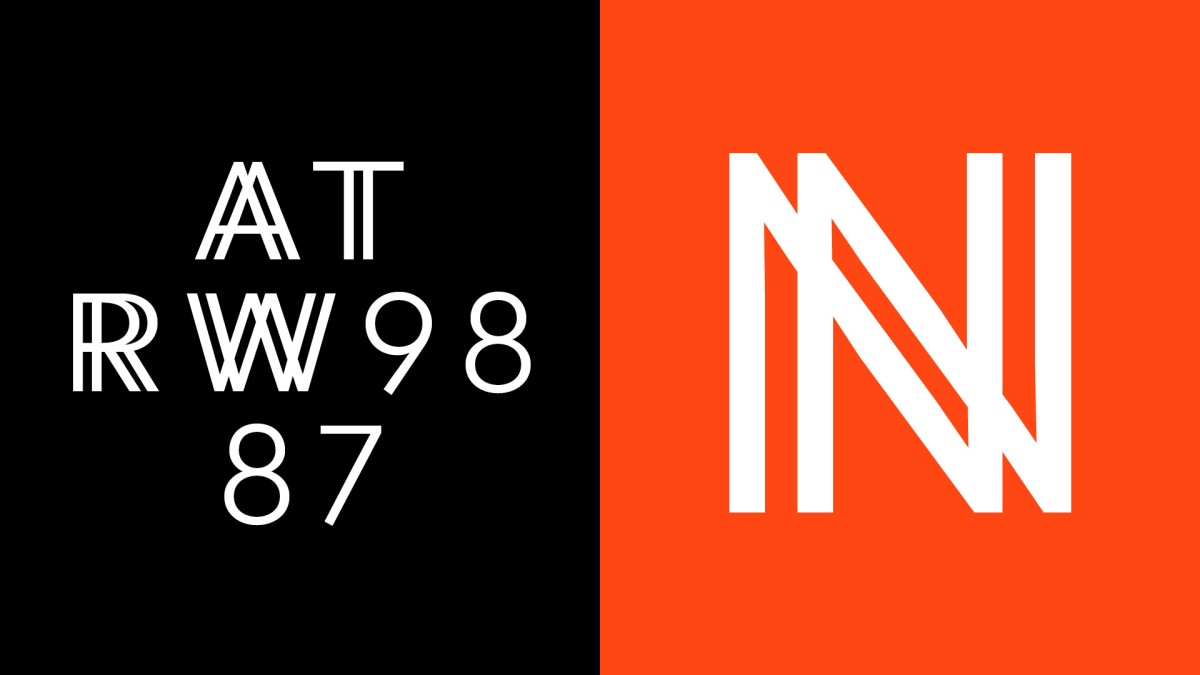
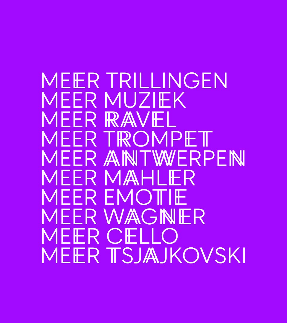
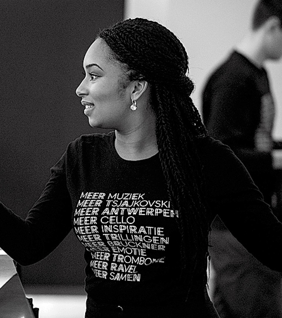
Antwerp Rythm as global identity concept was created : a customised typeface showcasing rythmics on letters "A", "N", "T", "W", "E", "R", "P" only and a custom photographic rythm treatment on images.
An ode to music & creativity
We wanted to promote classical music as an eternal contemporary medium. Always creating and there for centuries, classical music in all its forms is a rare music style that lived the ages without losing its edge. We wanted, via that system, to remain modern for a younger audience and also an audience who do not see classical music as vibrant as it is.
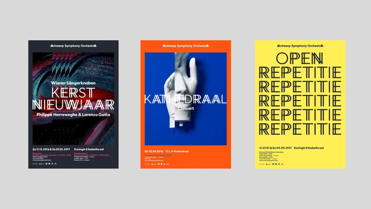
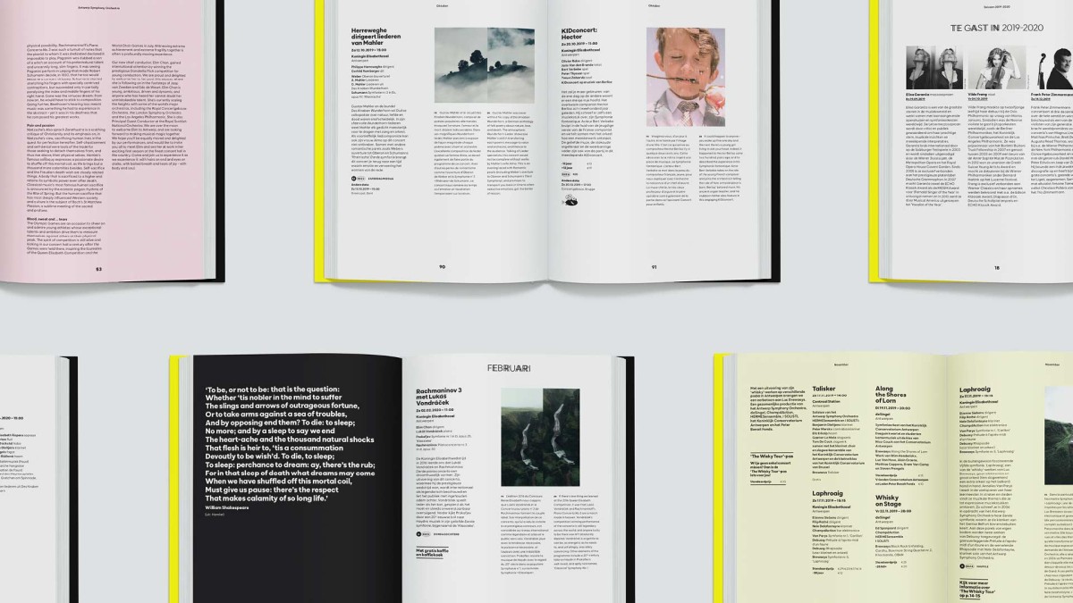
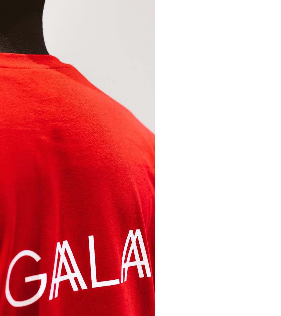
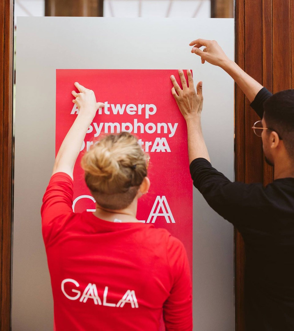
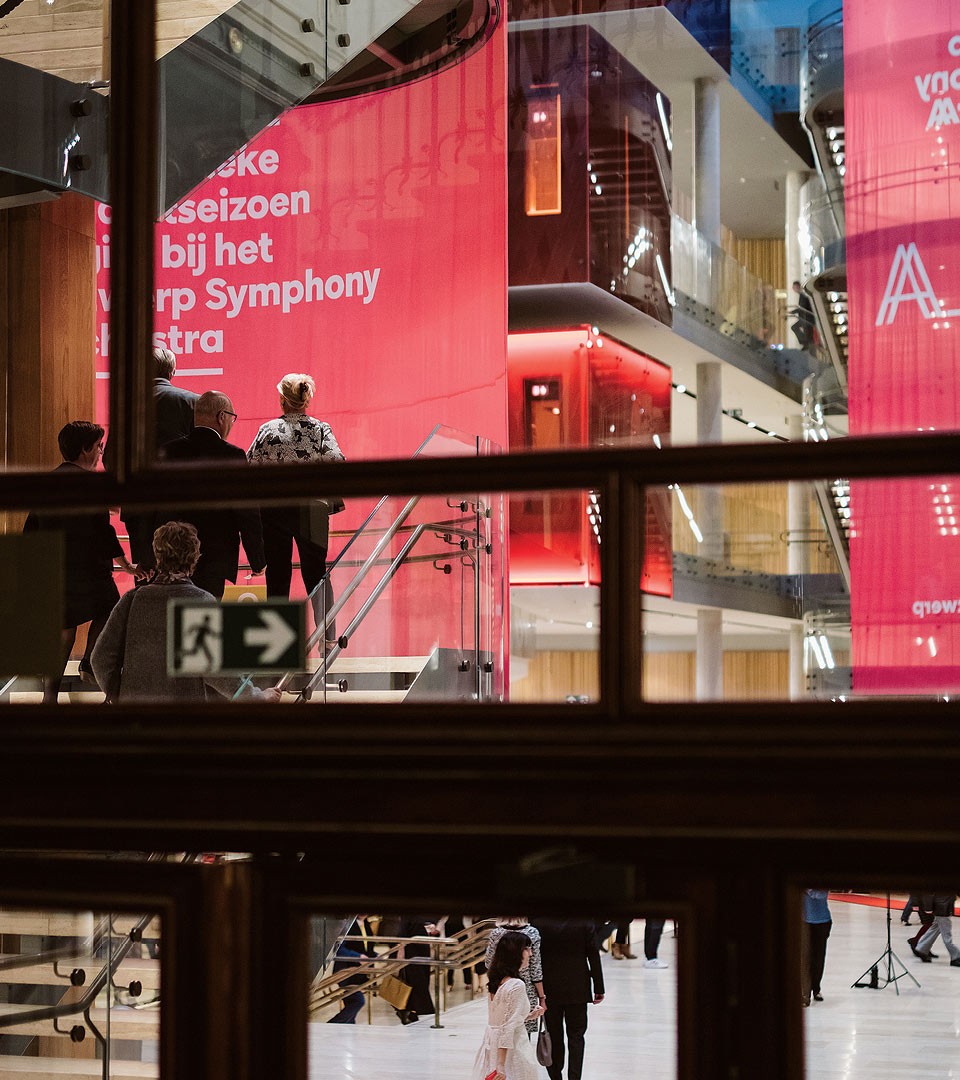
Posters, magazines, communication
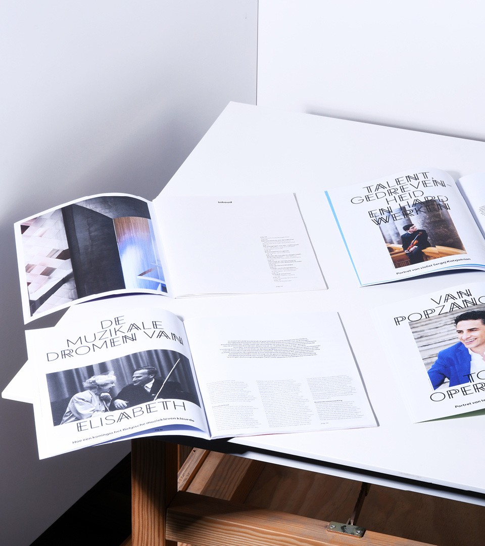
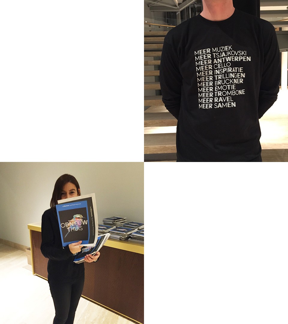
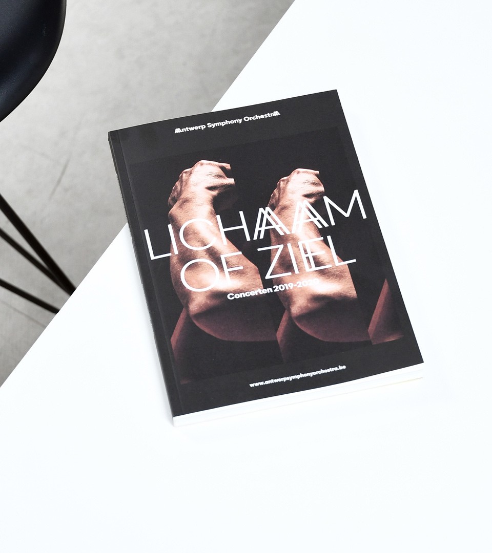
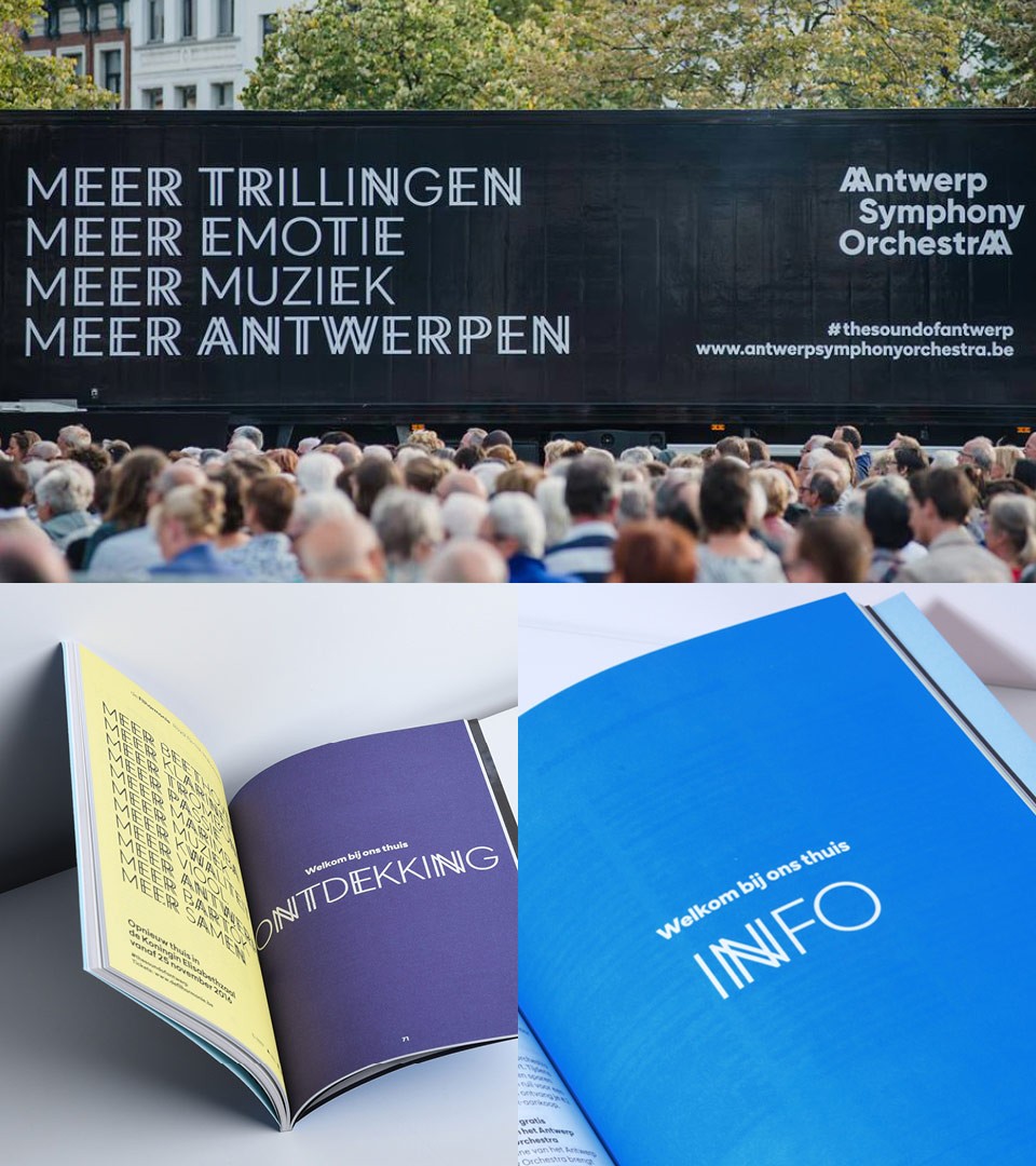
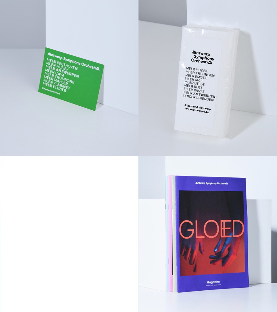
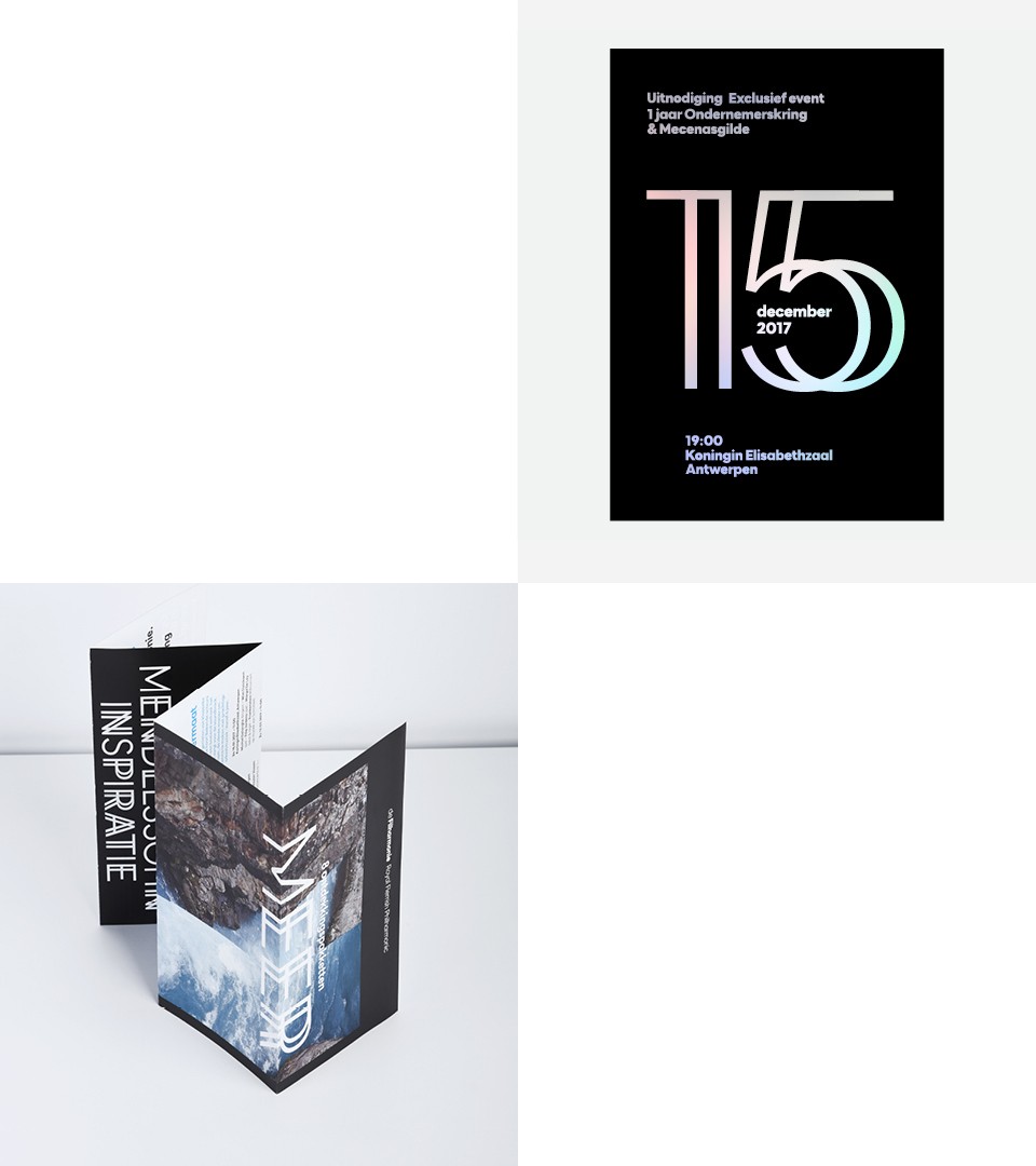
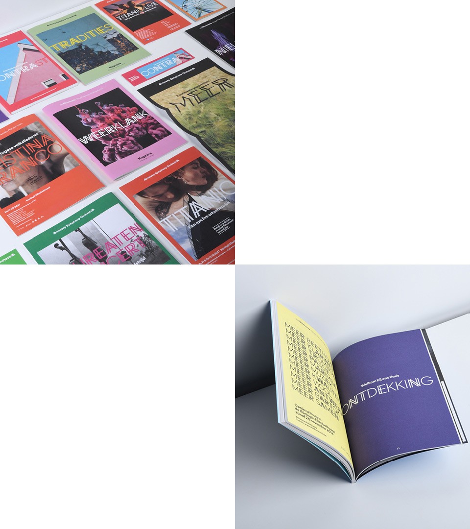
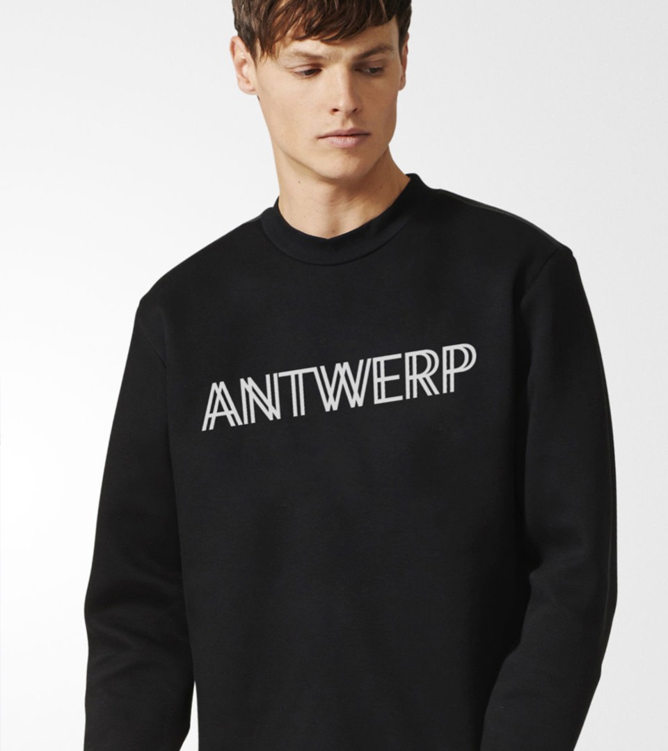
A full range of communication products were created. From posters to postcards, a lot of different formats and media were used. The magazine was also devised as a corner stone to the identity.
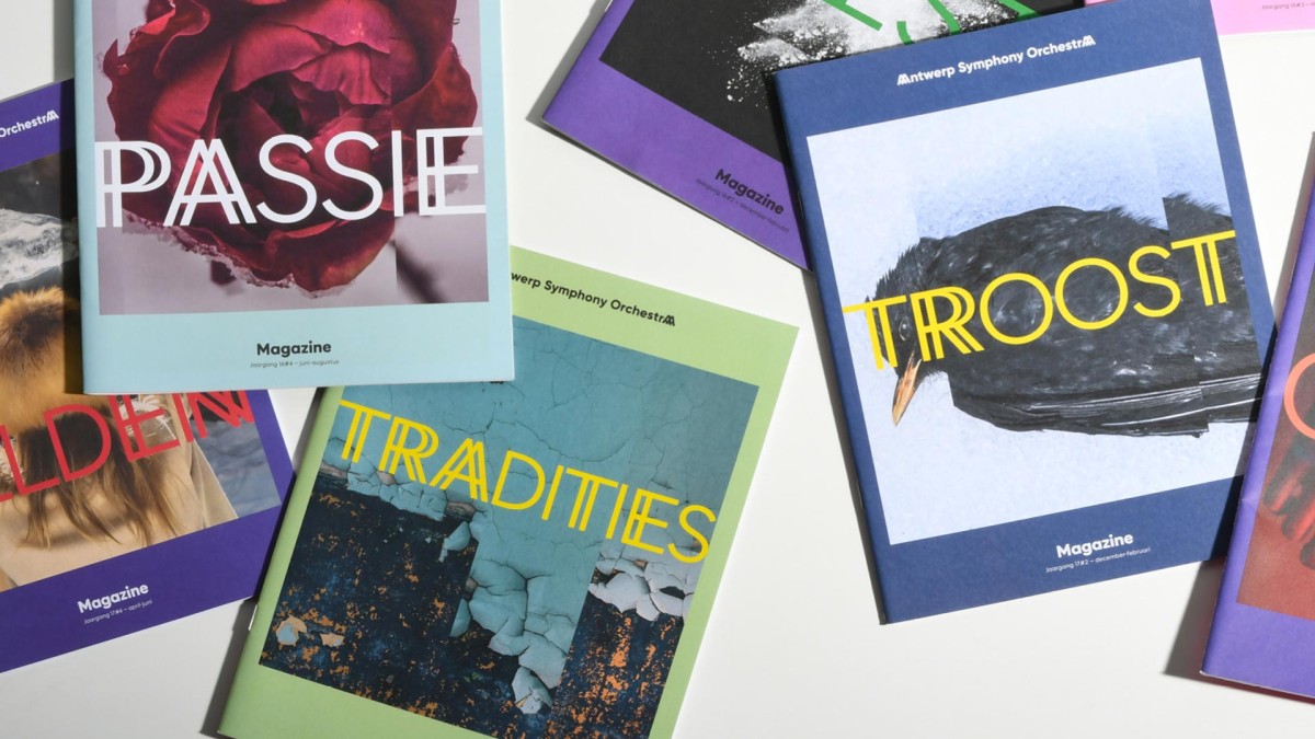
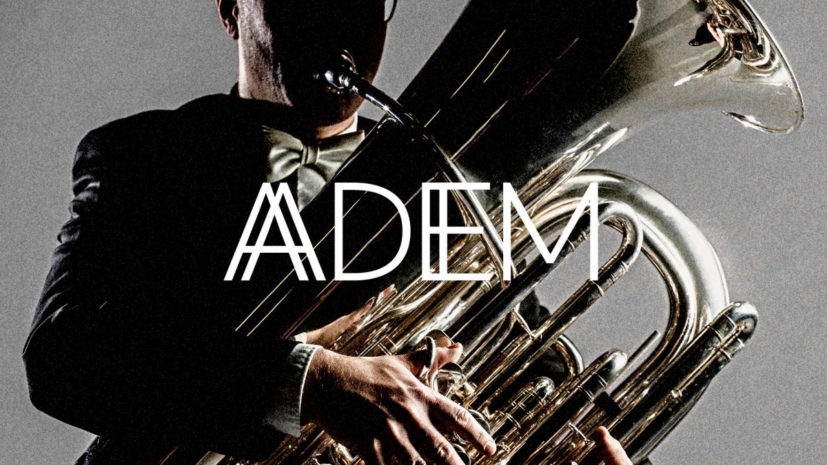
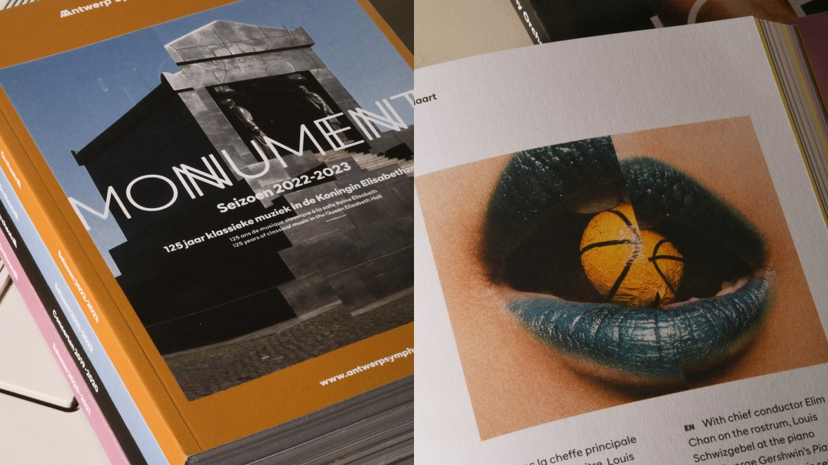
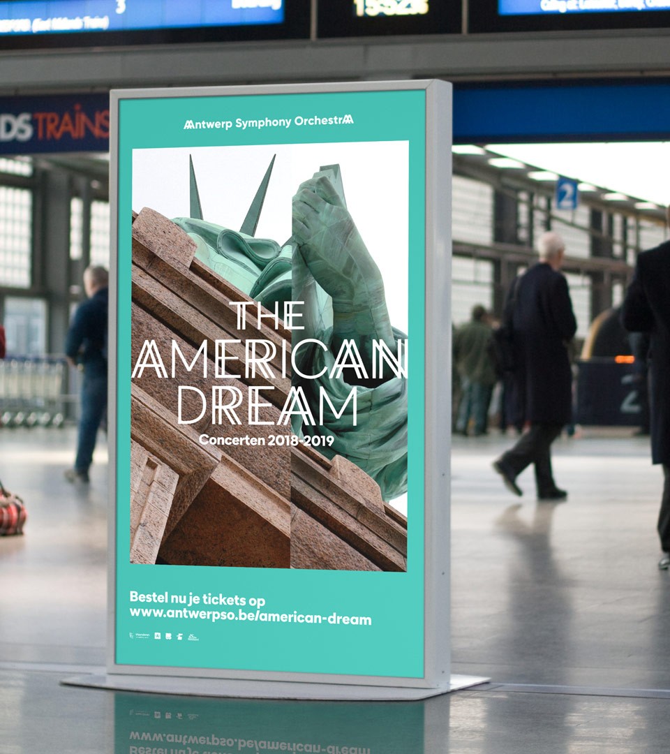
Each new year, a new theme
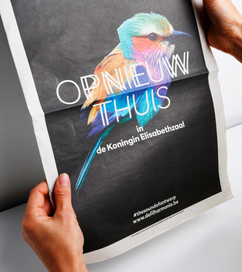
The Antwerp Symphony Orchestra works every year with a new theme. The first year of the rebrand, the concept of the campaign was “Opnieuw Thuis”, “At home Again”. The meaning of the campaign was to communicate the return of the Symphonic Orchestra at its home : the Royal Elisabeth hall. Located next to the famous Antwerp Zoo entrance, we worked on a visual as a wink to the location’s geographical situation.
Each year, an original theme brings the audience to a new story. These themes find their inspiration in the program proposed by the orchestra and the emmergence of social events. The 2021-2022 season was the year of breathing (Adem), like a return to life after more than a year of culture sidelined following the pandemic. Breathe on all levels: to feel free again, to go out again, to share and laugh.
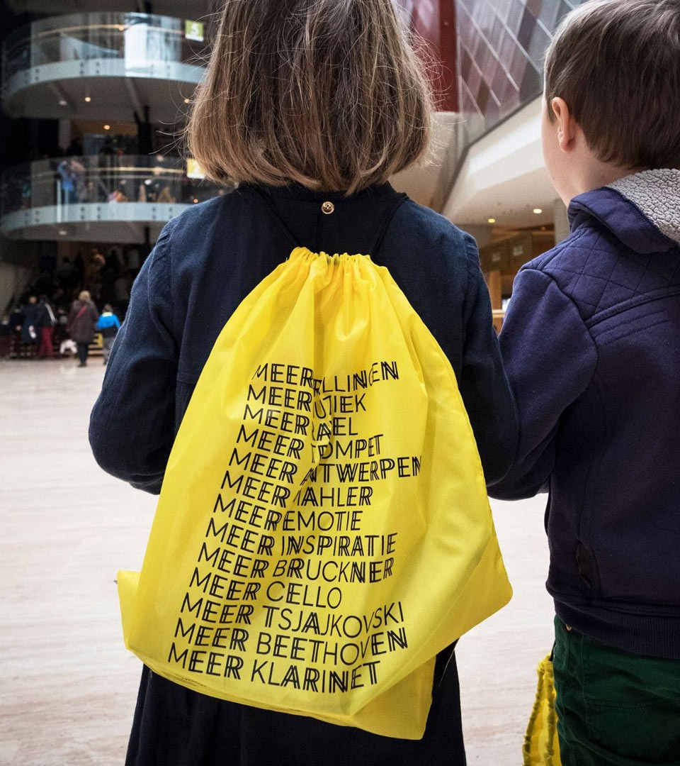
Communication for all
For all audiences and all ages, the Antwerp Symphony Orchestra aims at bringing classical music to all. There are programs for kids, programs for the elderly, programs for families. The music is vibrant so the Orchestra plays all sorts of genres and styles : from the most classics to avant garde.
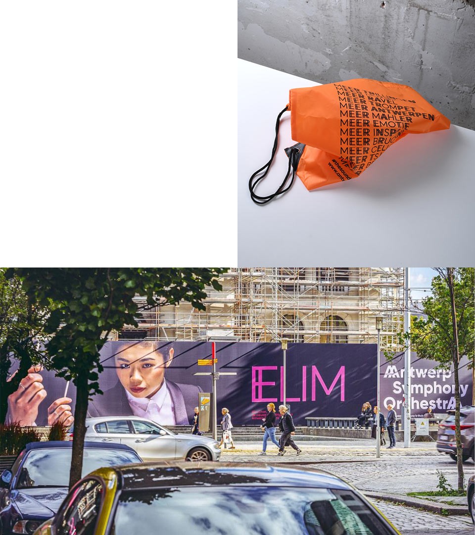
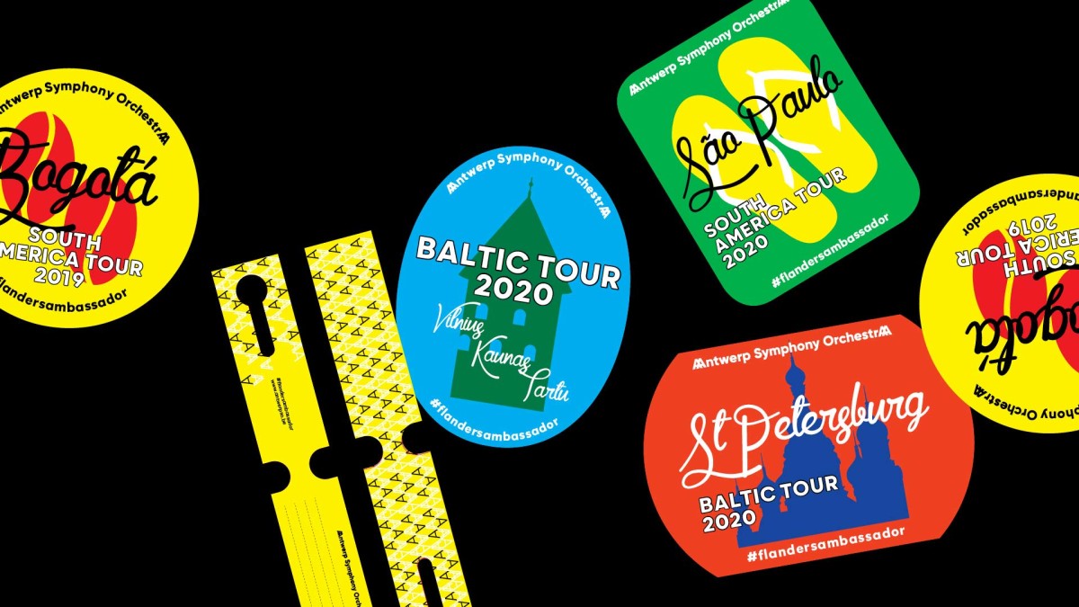
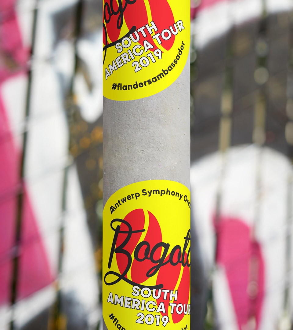
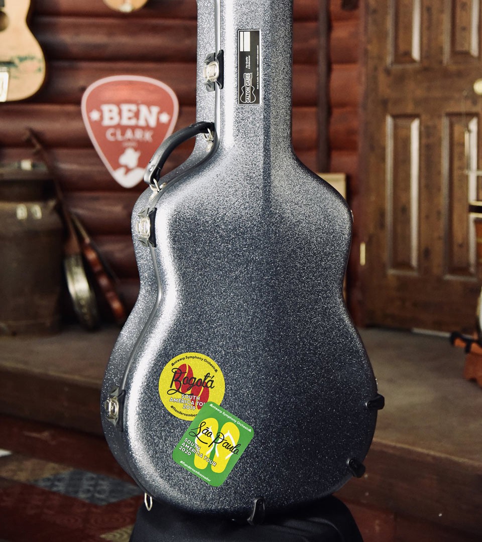
When the orchestra leaves Antwerp and plays abroad, we designed their travel tags and a line of stickers commemorating locations they visit. A vintage take on voyage before booking.com
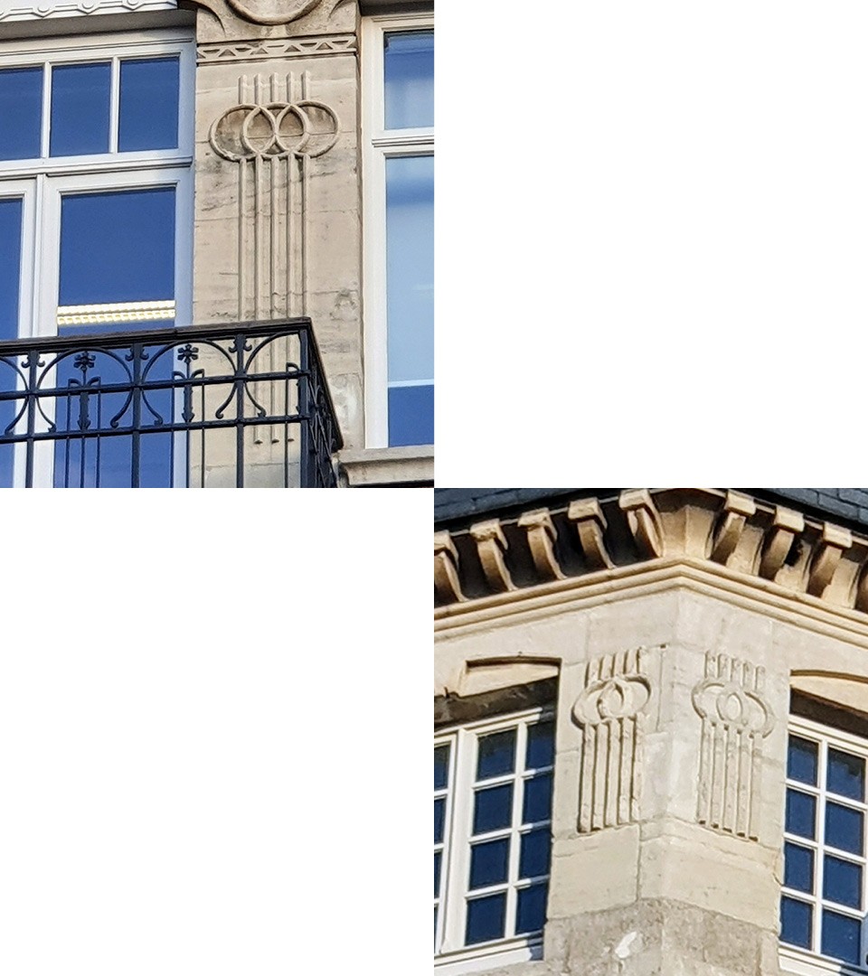
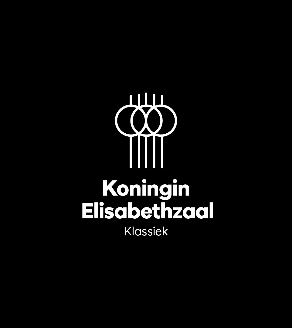
The orchestra plays at the Koningin Elisabethzaal. Inspired by the ornaments on the 1897 building façade and using the same typeface as the Antwerp Symphony Orchestra logotype, we designed the logotype for the location as part of the Antwerp Symphony Orchestra identity system.
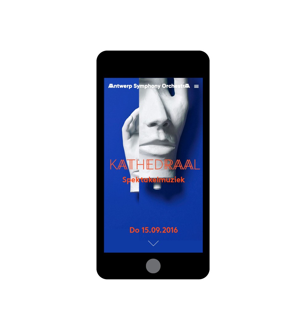
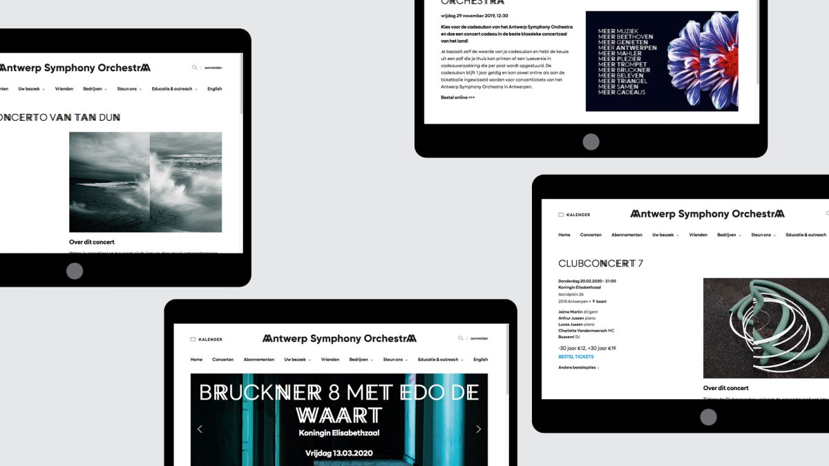
The digital experience
Clear and fresh, the website design is all about bringing the experience to the audience. With our rebrand, using typeface and images, we wanted to bring rhythm to the digital experience.