ORDRE DES ARCHITECTES
— Branding for architectural order
The order of architects in Belgium defines and organizes the missions of the architect and for this it has administrative, normative, jurisdictional and training responsibilities of its members. In 2019 the order decided to rebrand itself and modernise its approach towards its audience.
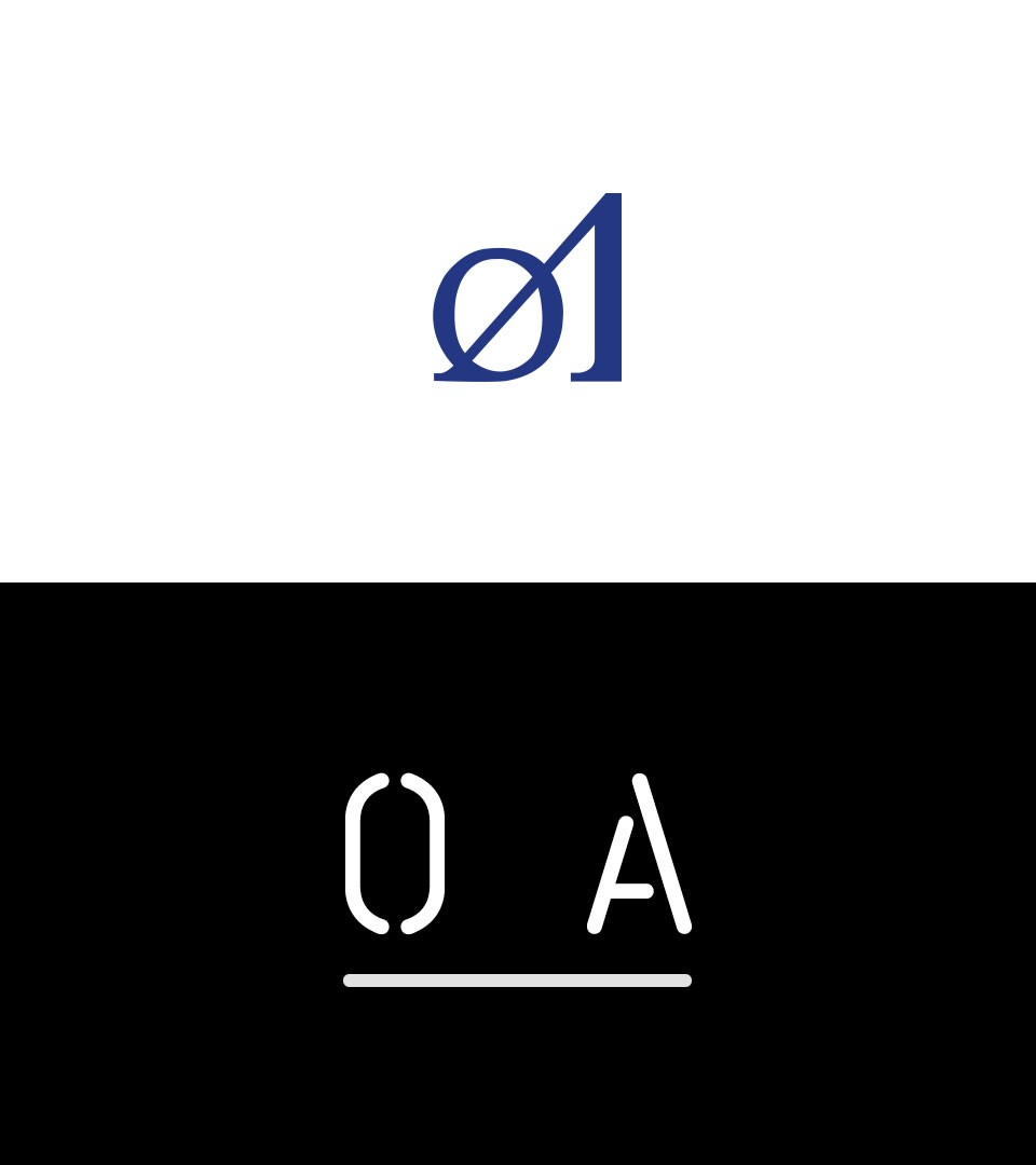
A rebrand to reconnect with the order audiences
The order of architects defines and organizes the architect’s mission in its relations with the public interest and private interests. The previous identity was a translation of a mission only through its juridic expression. We changed this by adding the architects values in the brand and a relationship between the order and its multiple audiences.
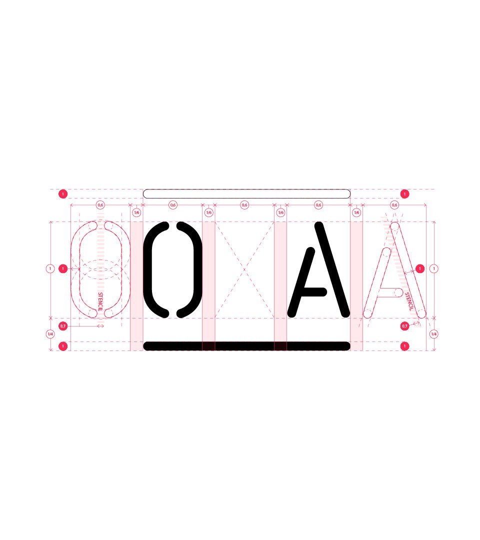
The logotype structure
The first change was to integrate the values of architecture in the brand : for this we opted for a custom typeface inspired by the origins of architectural typography, and in addition to this, a line of communication that we use on identity elements such as stationary and signage.
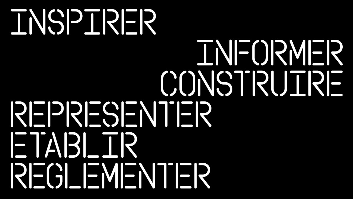
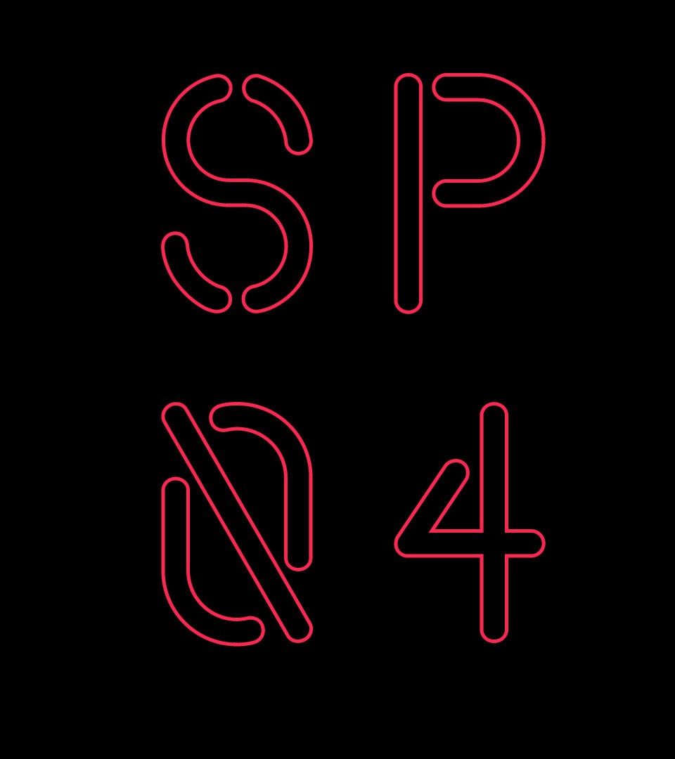
The new identity system flexible by the creation of a new typography
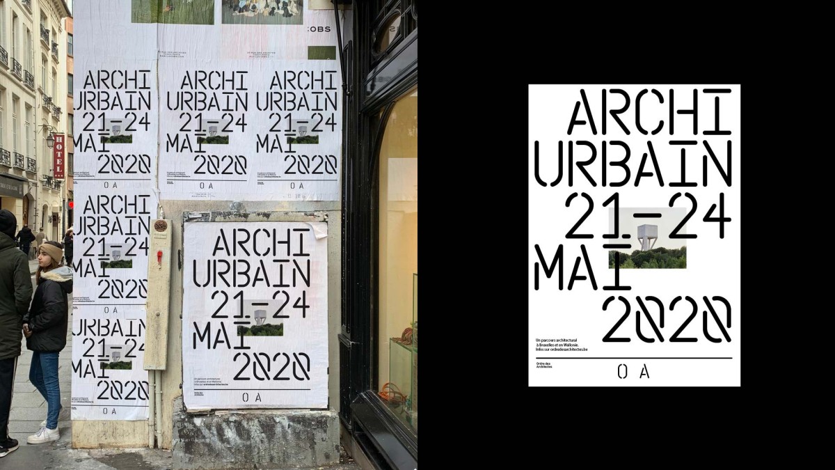
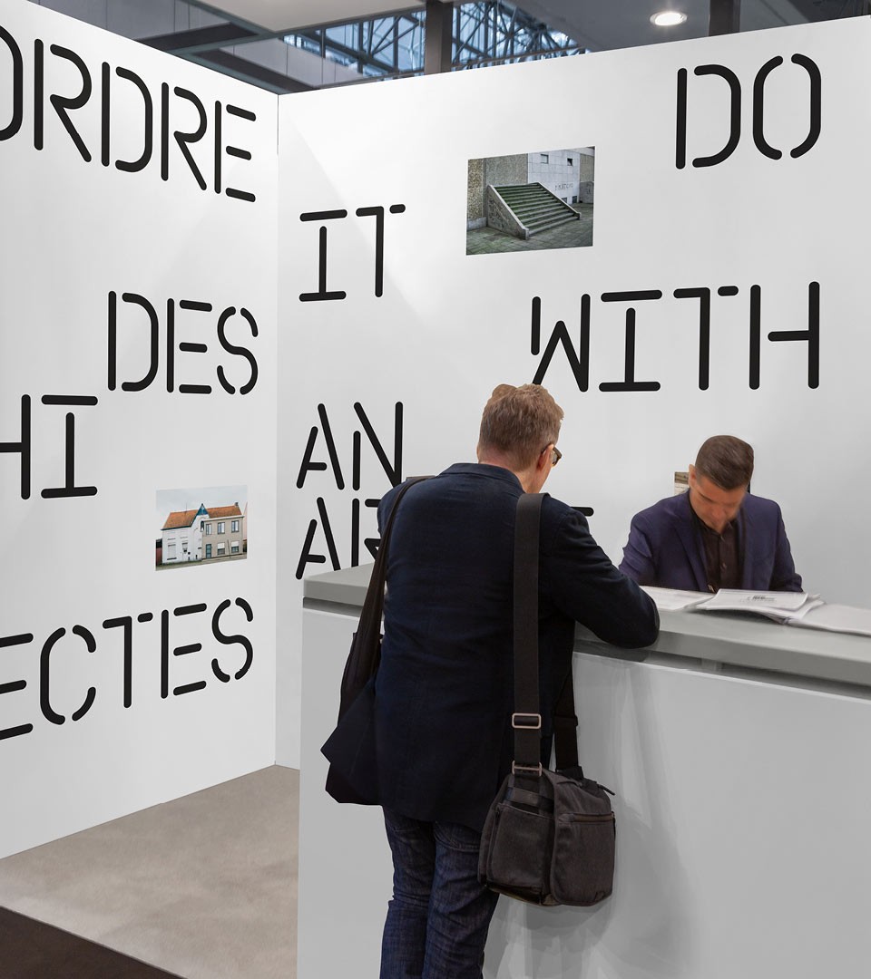
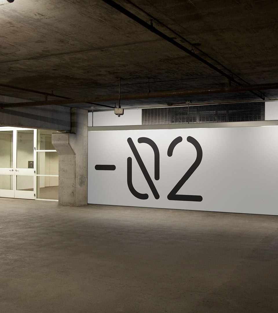
The OA typeface design is a signature font applied to the identity elements of the Order of Architects. It explores the world of technical drawings and architectural plans driven by norms and standards. It has simplified mono-linear strokes with round terminals, informed by the main objective of stencil lettering — easy reproducibility, to which letter-shapes need to adapt by reducing complex forms to basic elementary shapes.
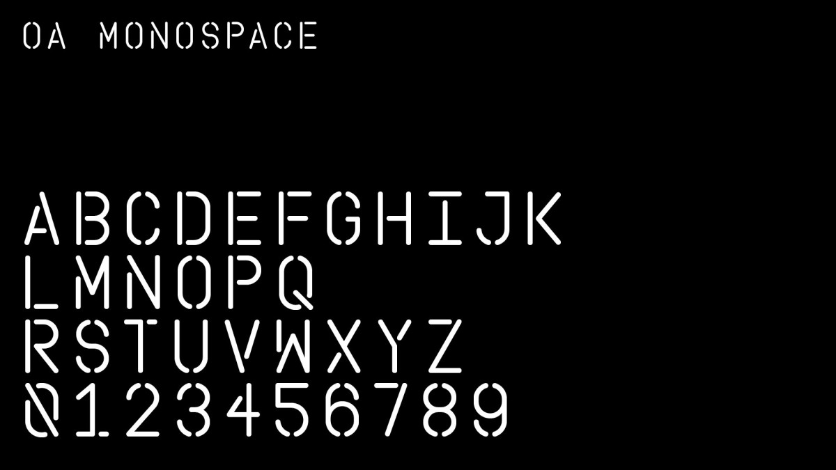
The OA monospace is a typeface with layout rules that limits its usage to match the architectural practice : devised as a monospace grid typeface, layout is manageable on a strict vertical grid like a regulation within the identity. Still very flexible, this aspect of the brand is underlining the identity of the institution.
A custom typeface rule as structural communication grid.
The font design was conducted by our team to highlight the institution's purpose : architecture as a discipline which is creative and structural. The layout is fixed on a monospace approach : all text and spacing are all the same on all title elements.
A narrative system between structure and creativity.
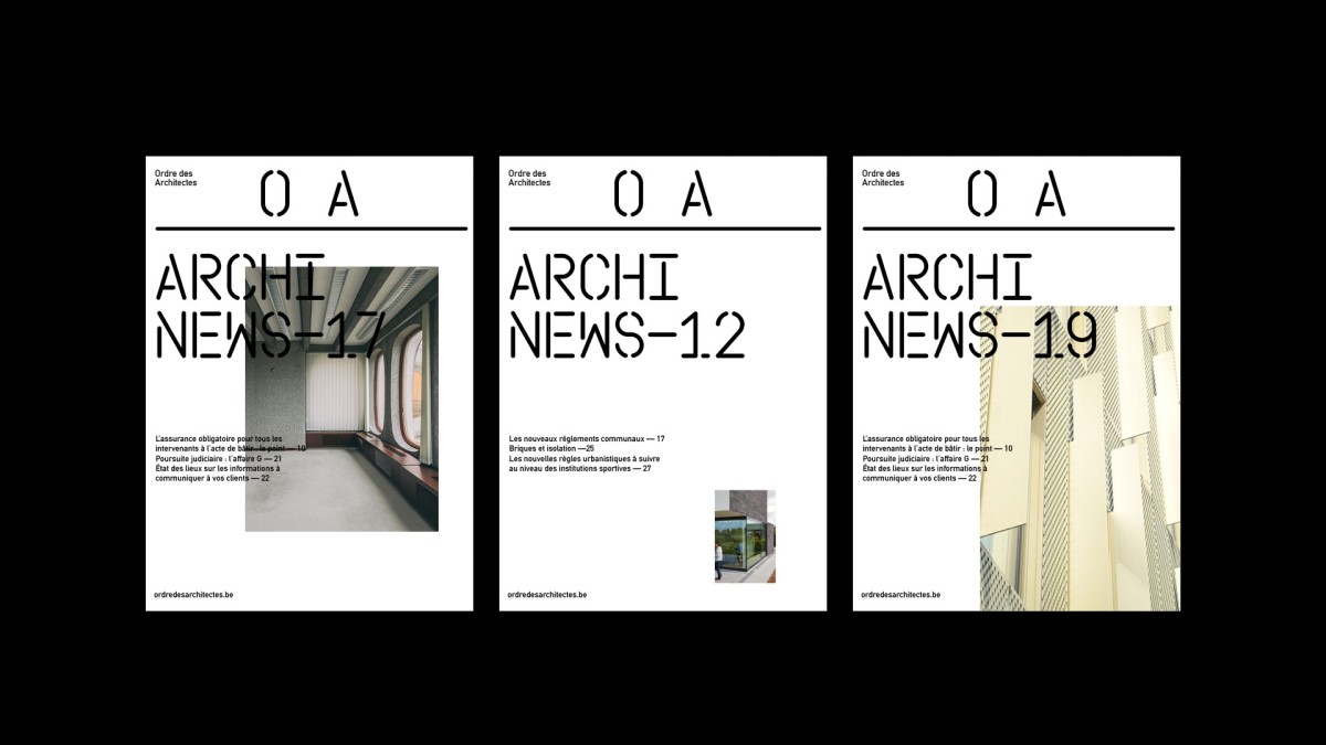
The system was developed accordingly to the venue multiple use : from postcards to posters, from print to screen, from exhibit to performances. All together, the system works organically with a simplicity in mind.
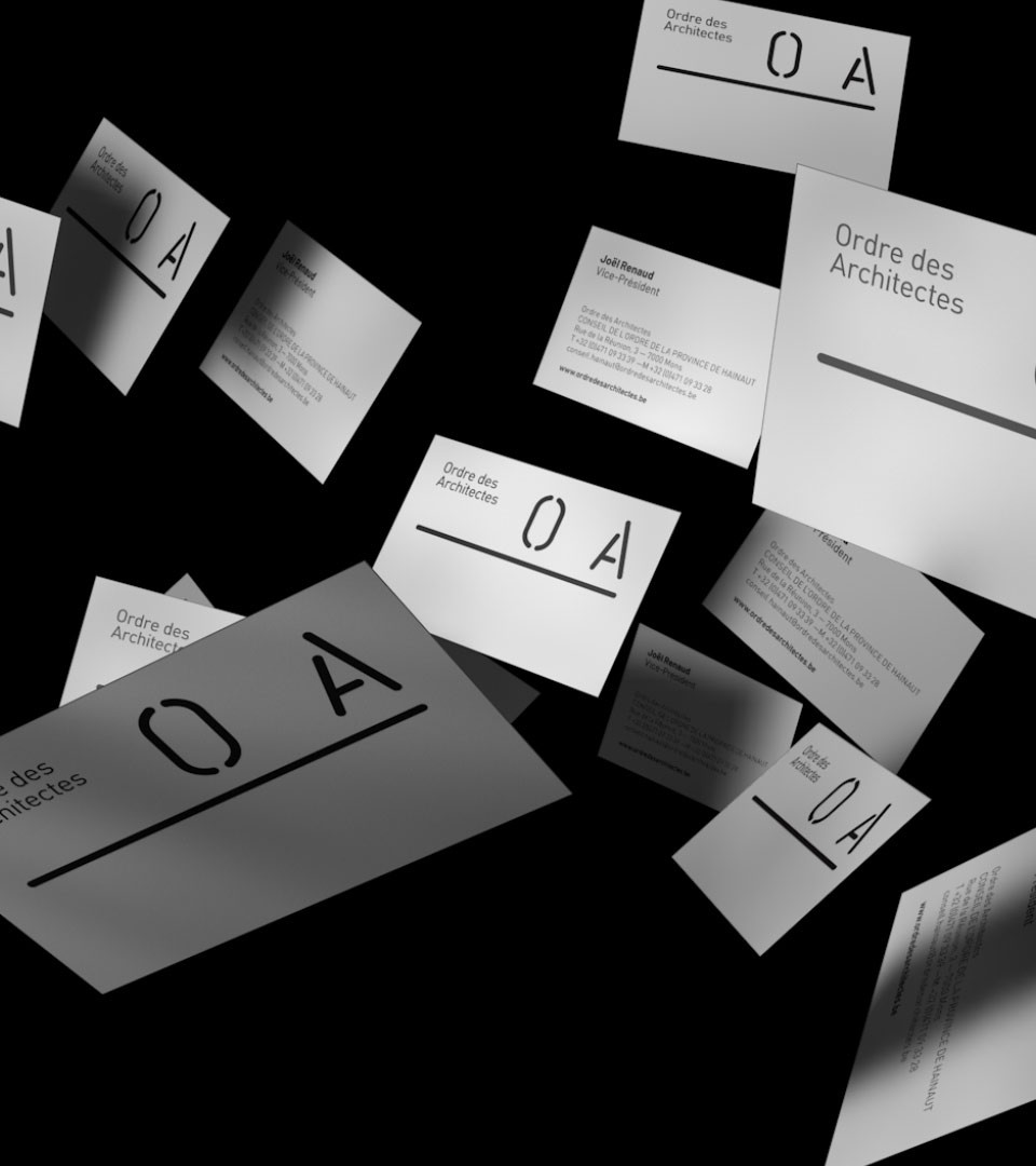
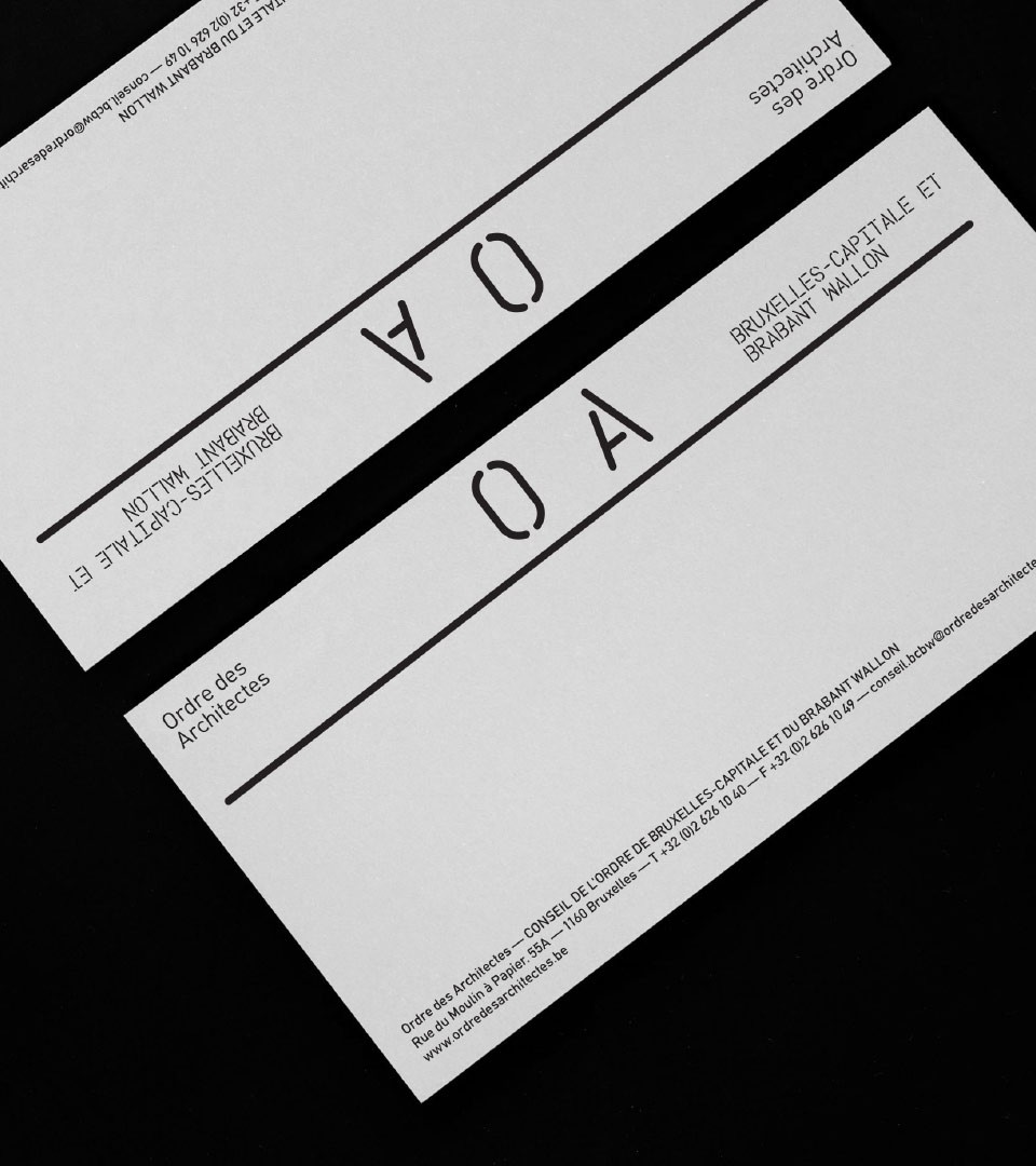
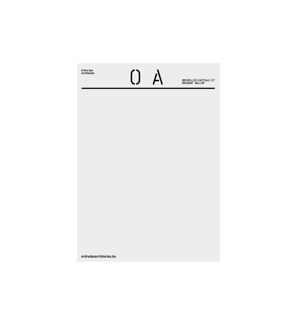
Stationary & information
Our Typeface system works seamlessly in all of the organisation main features.
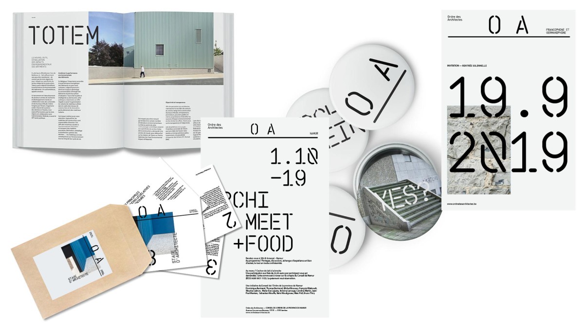
Visual communication
The system is made to be fresh and flexible, allowing a full range of layout possibilities while remaining fully identified to the Order branding.
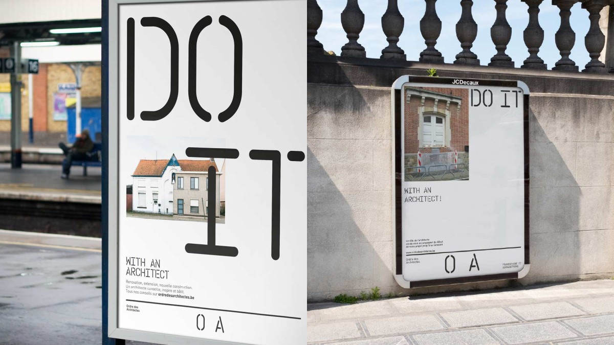
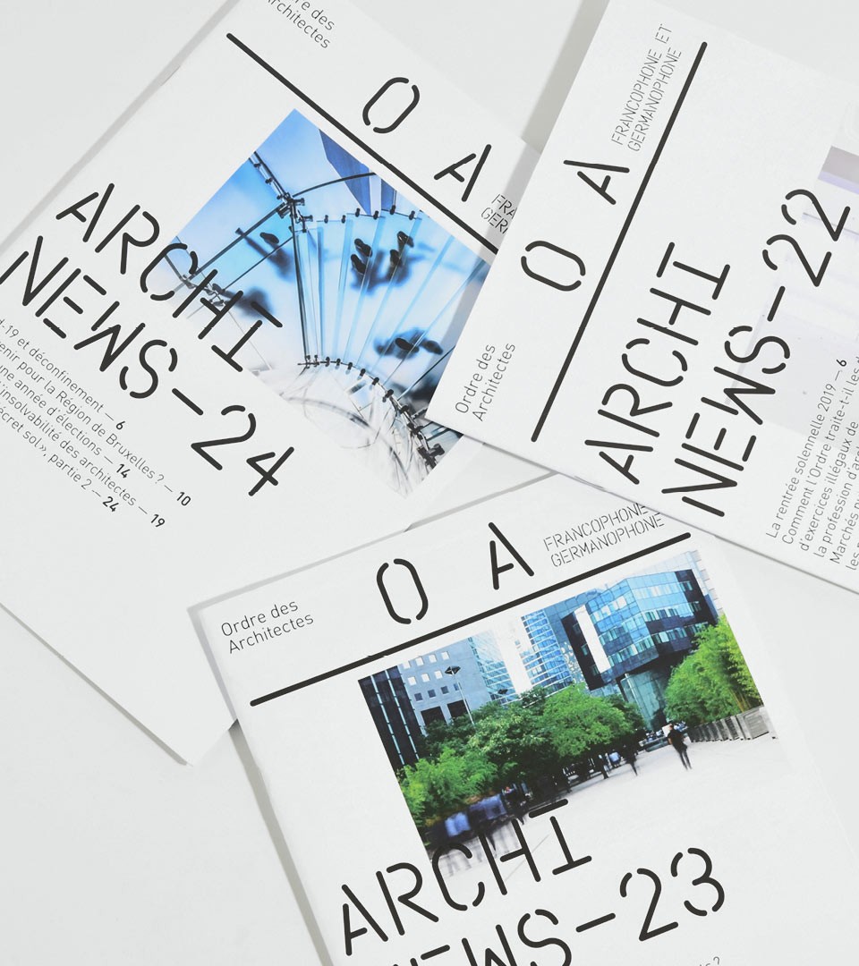
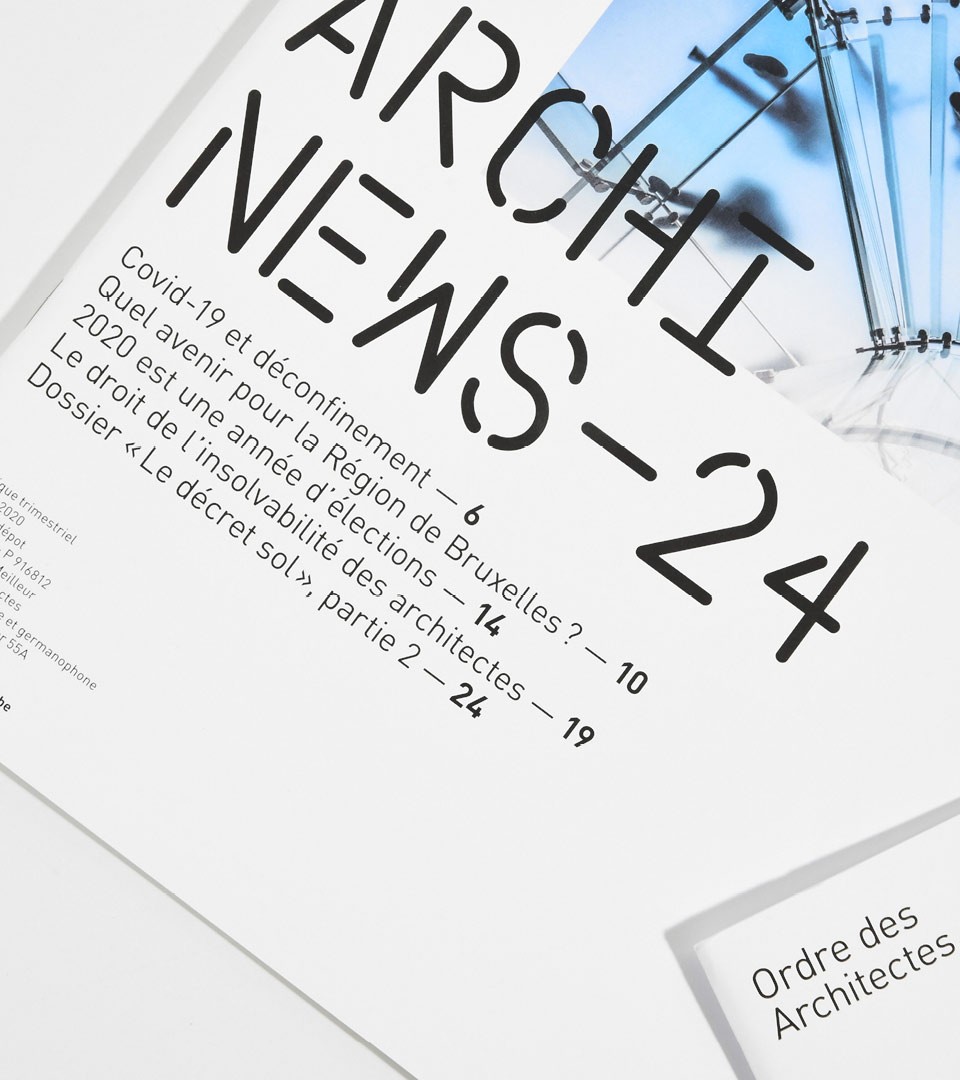
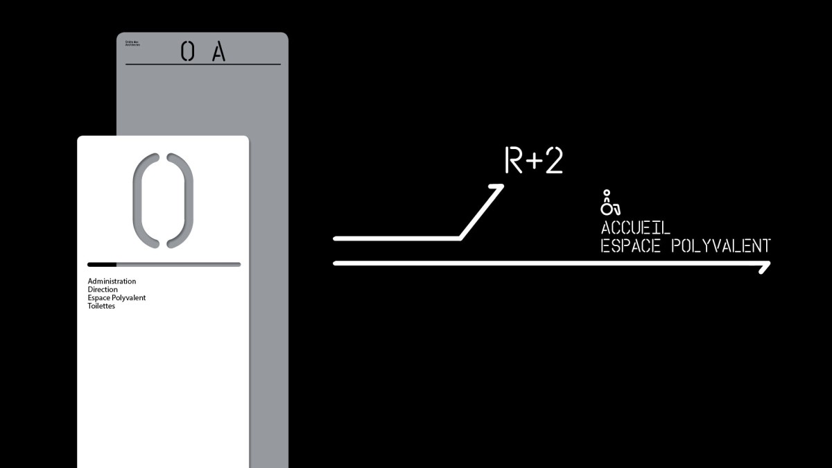
The OA identity is developed with a set of rules allowing the architecture line to be used as directional item. Along with the typeface and grid, the line is playful and can be used on a variety of elements such as direction and information.
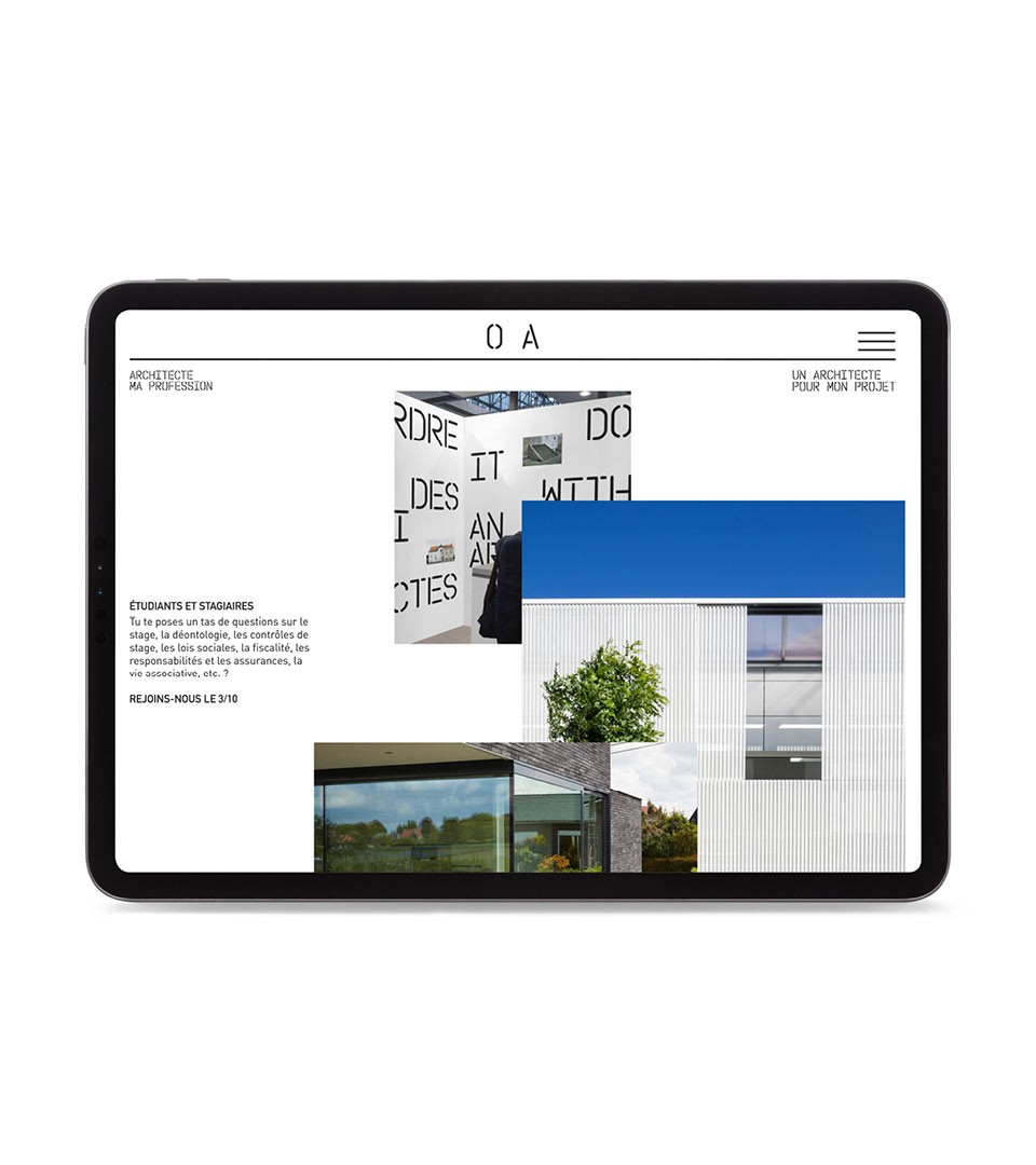
Website
Our website concept is dedicated to visual narration. Following the fluid grid visual approach like on brochures and magazines, the flow represents the diversity of the architectural practice.