AILOS
— Robotics gearbox future
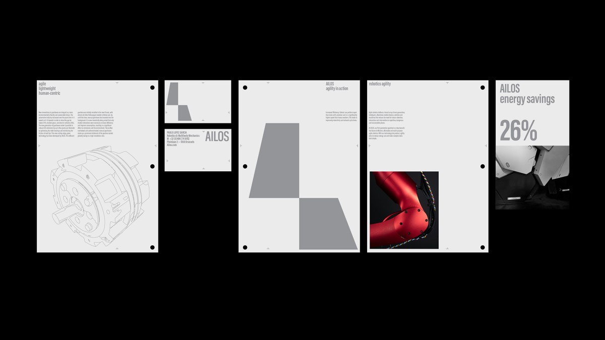
AILOS is a start-up tech company who developped a revolutionary gearbox with a high ratio of efficiency and agility. Reducing energy use by 30% more than of any other gearbox, AILOS puts on the market a greener solution for a better future.
Efficiency and agility at the core of branding
To translate the company values, we embarked the team on a branding journey. Starting with the definition of their brand name, our design work was inspired by fluidity, lightweight elements and flexibility.
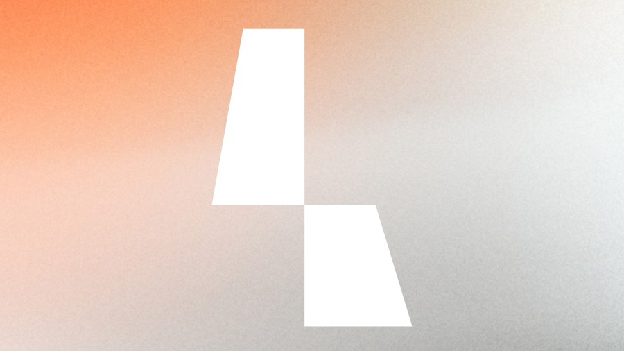
A responsive logotype : By encapsulating the ethos of a brand that pioneers performant gearboxes, a meticulously crafted logotype transcends mere aesthetic appeal, becoming a conduit for communicating the brand's intrinsic values. A responsive logotype serves as the quintessential ambassador for a brand, particularly within the realm of robotics where precision and innovation reign supreme. Through a responsive logotype, the brand elevates itself from a mere provider of products to a beacon of trust and reliability. In essence, the logotype becomes a symbolic representation of the brand's legacy, promising performance.
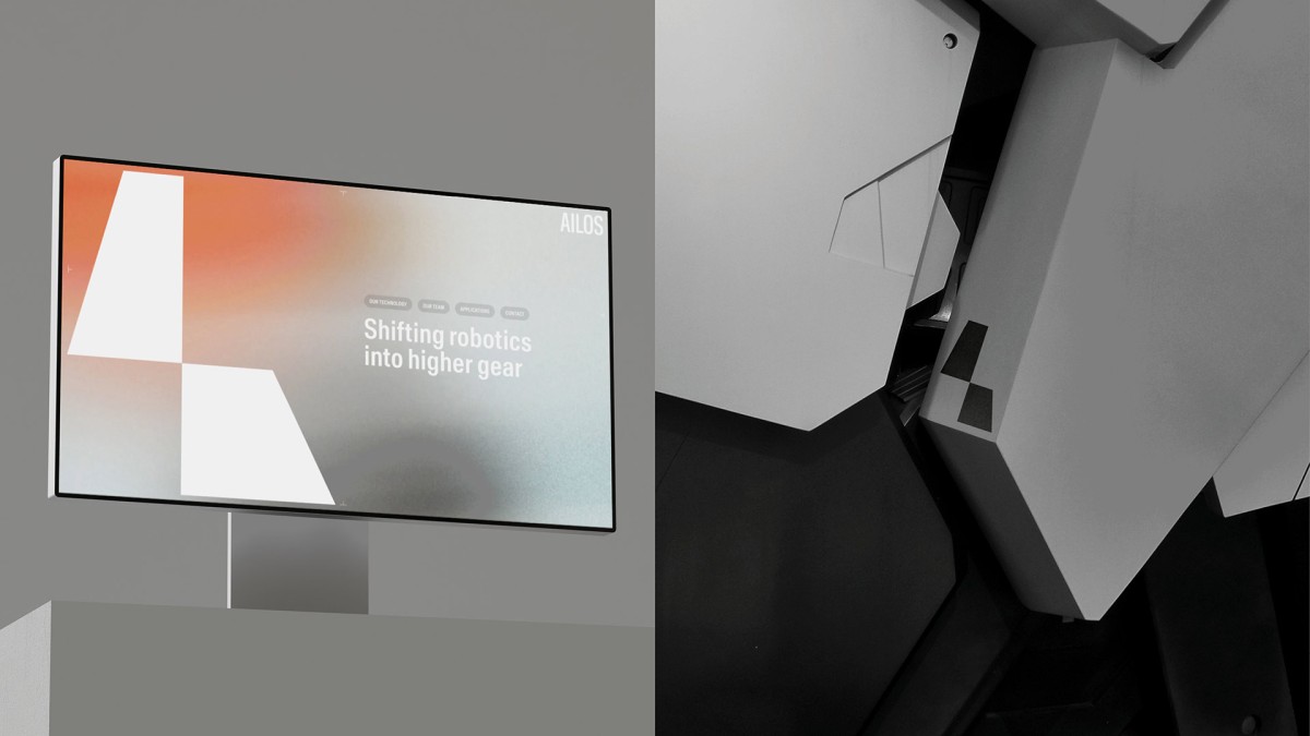
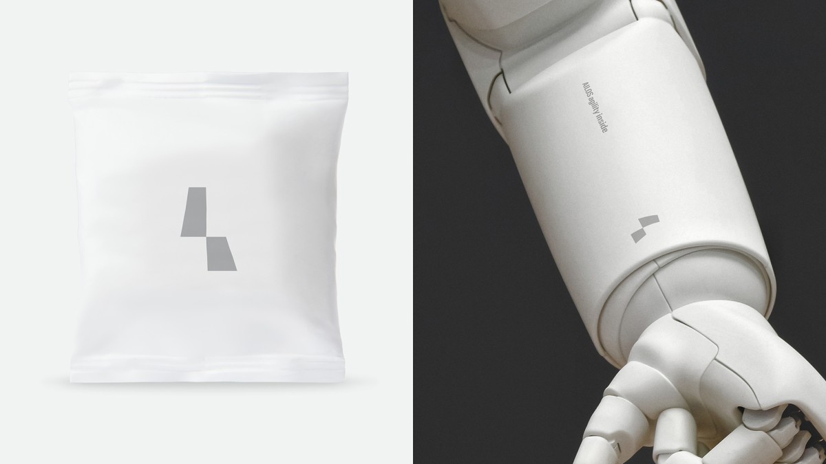
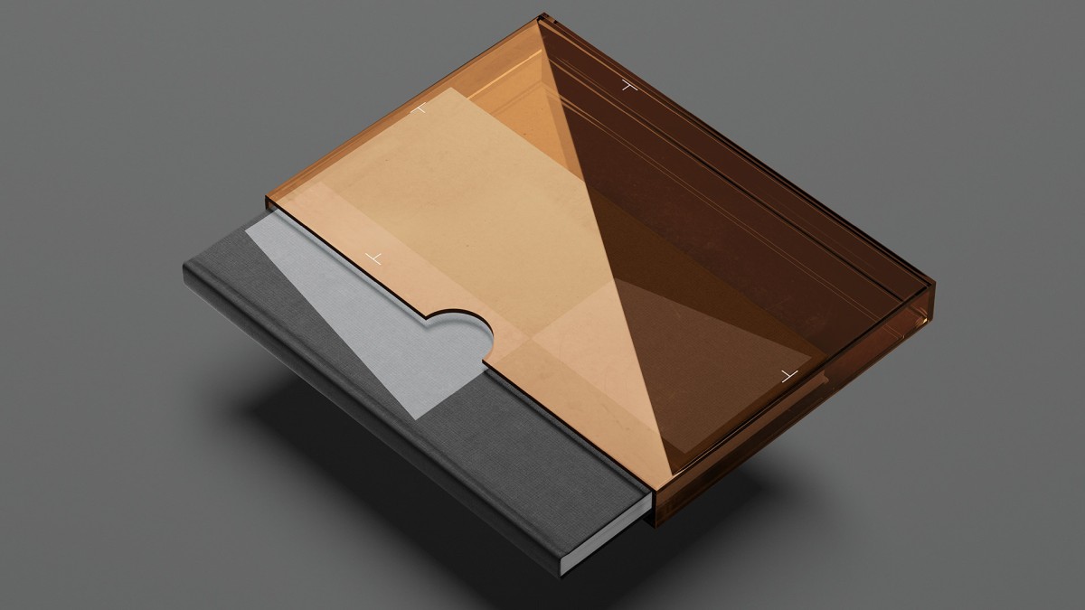
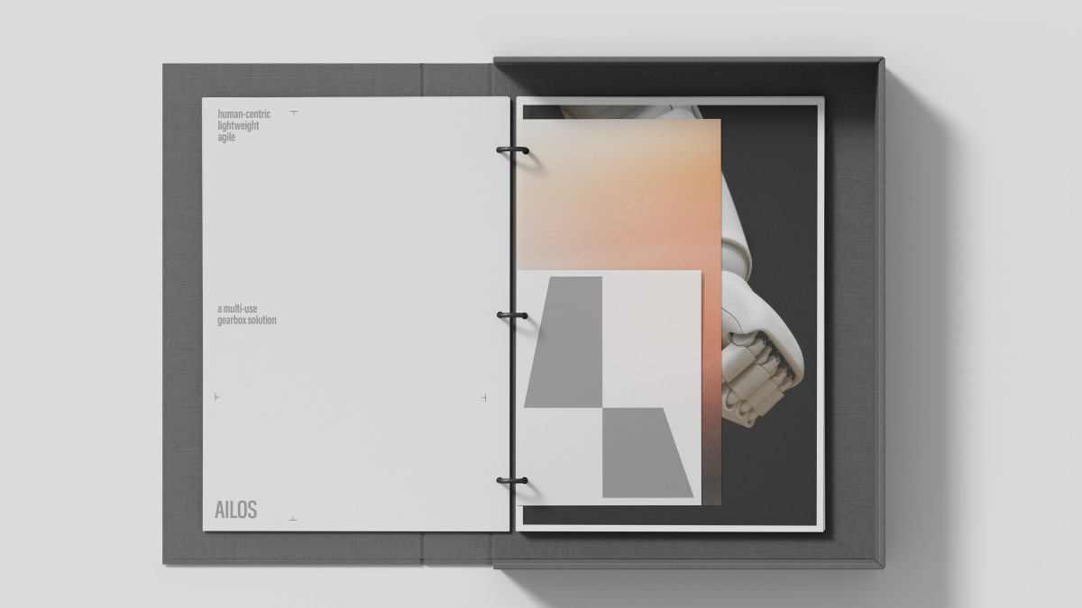
To reinforce the brand's visual DNA, we devised a fully responsive identity system extending beyond the confines of a static logotype, embracing a dynamic approach that mirrors the agility and adaptability inherent in Ailos. It comprises a symphony of visual elements meticulously orchestrated to convey the brand's essence across diverse mediums and contexts.
From digital interfaces to physical spaces, each manifestation of the brand identity seamlessly adapts, ensuring a cohesive and immersive experience for stakeholders.
Crafting a name for a startup that seamlessly integrates the values of innovation and timelessness necessitates a multifaceted approach rooted in holistic thinking. Doing so, we have created the brand name AILOS. The word “Aiolos” (or “Aeolus”) has its roots in Greek mythology and translates to “quick-moving” or “nimble” in Greek. It is most notably associated with the Greek god of the winds, who had the power to control and direct the winds according to his will. This name reflects attributes of swiftness and agility, which are fitting given Aeolus’ dominion over the ever-changing and dynamic nature of winds.
Through a harmonious fusion of typography, color palette, imagery, and motion design, the brand narrative unfolds with clarity and resonance, leaving an indelible imprint on the collective consciousness.
Whether navigating a website, engaging with promotional materials, or experiencing a physical product, stakeholders are enveloped in a holistic brand ecosystem that transcends traditional boundaries.
Moreover, a fully responsive identity system fosters brand recognition and loyalty by imbuing every interaction with a sense of familiarity and coherence.