CORE EQUITY HOLDINGS
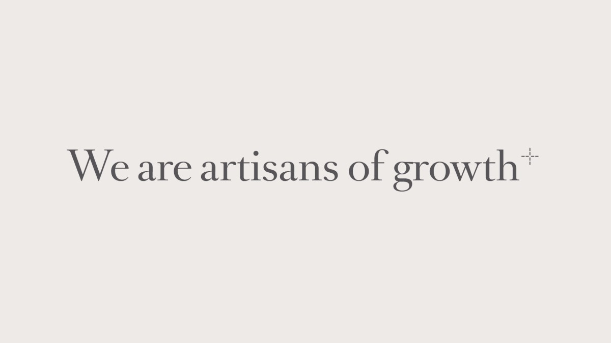
— Artisans of growth
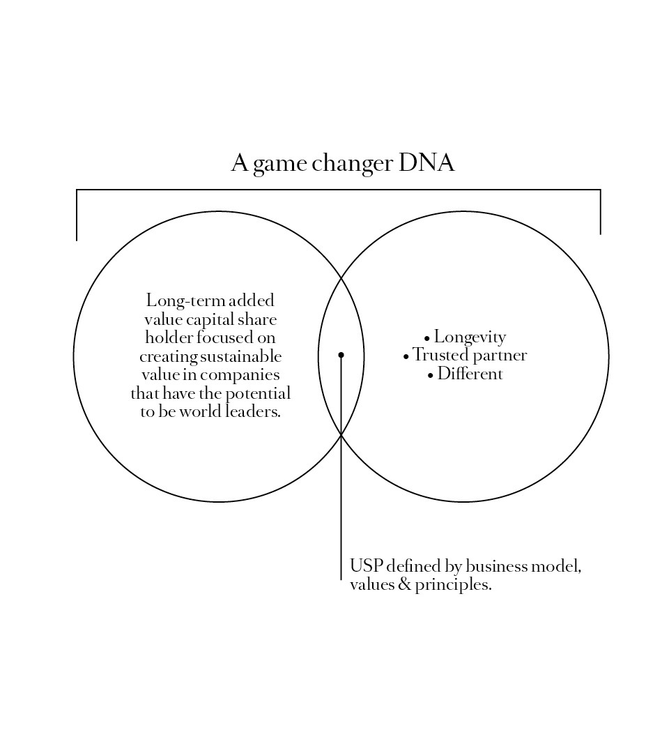
Core equity holdings is a private equity fund with a long-term investment policy providing a stable shareholding environment and patient capital. With a team of hands-on partners, Coast developed for them a branding platform under the tagline “artisans of growth”. At the core of their ambition, the brand platform supports their values and position the fund as a game changer in the industry.
Defining the DNA of a new European player in private equity
Working in close collaboration with the company 6 founding partners, we set out to create a unique process which resulted in the creation of their brand : a new kind of private equity fund. Only investing in a handful of companies, through partnerships with managers and owners they have the ambition to drive their businesses to full potential and build lasting value with an optimized and flexible investment structure.
The creation of the DNA of Core equity Holdings resulted in the design of a crafted logotype, and their baseline as “artisans of Growth”. They translate the attitude of the fund: Human, hands-on and with a longer lifespan as traditional funds.
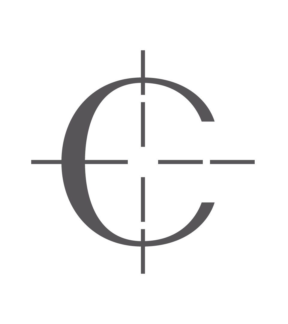
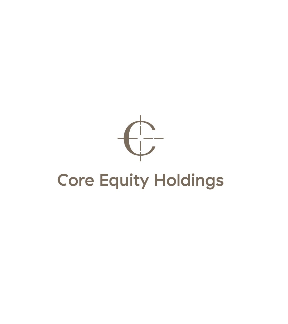
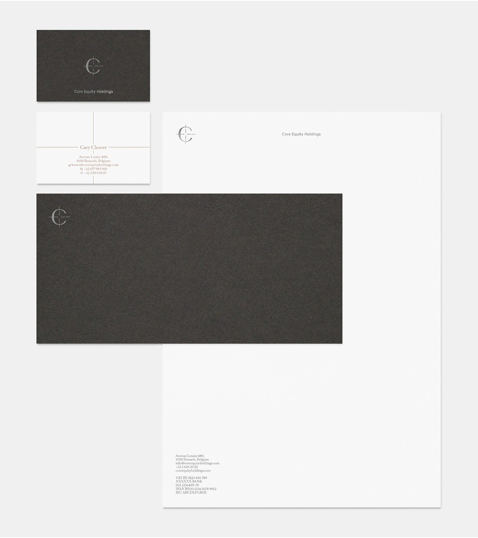
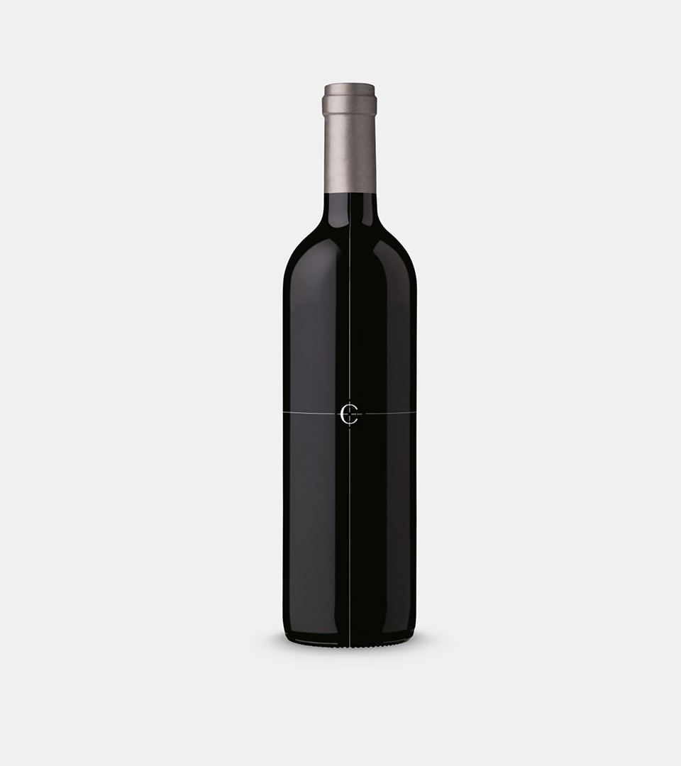
A crafted logotype
The icon symbolises two elements : the translation of their Core promise and the fund precision in delivery results and sustainability at the highest details. The “C” target is an open sign of trust and reliability and at the same time a crafted sign.
The iconic logotype and its target symbol play a role at different levels : from structure in communication to design grid, the cross has the ability to communicate the fund story and visual DNA at the same time.
Partners at the Core of their business
With a strong experience in private Equity worldwide, the partners share a commitment in creating, preserving, growing businesses in which they believe in on different levels. From growth perspectives to sustainable business future, they only invest in a small number of platform companies in their respective markets. They are located in Brussels and Hong Kong.
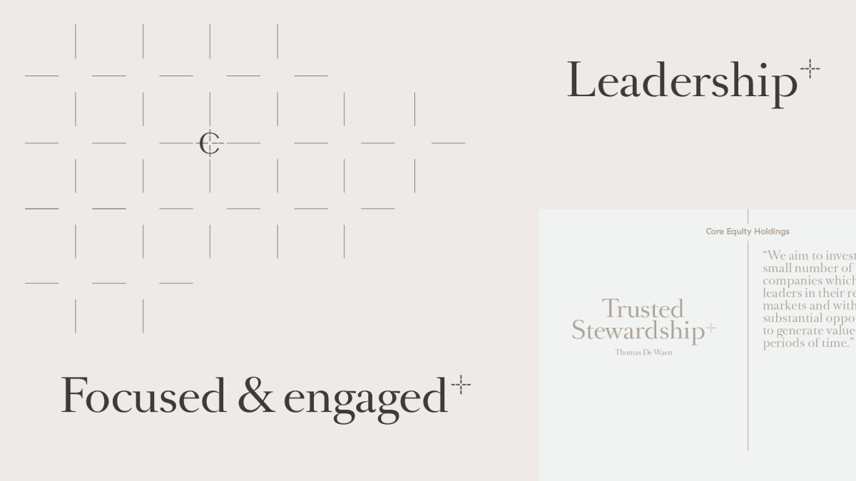
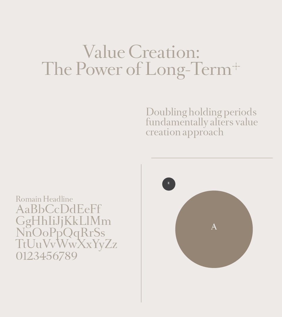
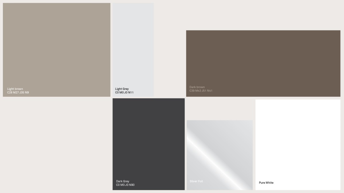
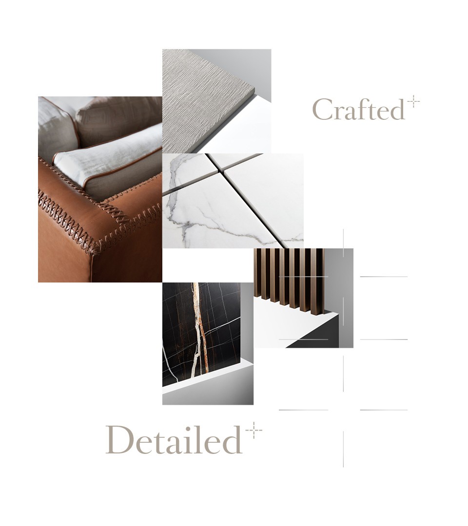
The identity system reflects the ambition behind the partners vision. A structured fund with a human heart. Soft colors, balanced and elegant typography and use of crafted materials are the key elements of the Core Equity Holdings identity.
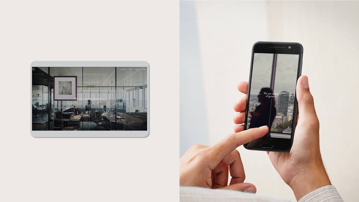
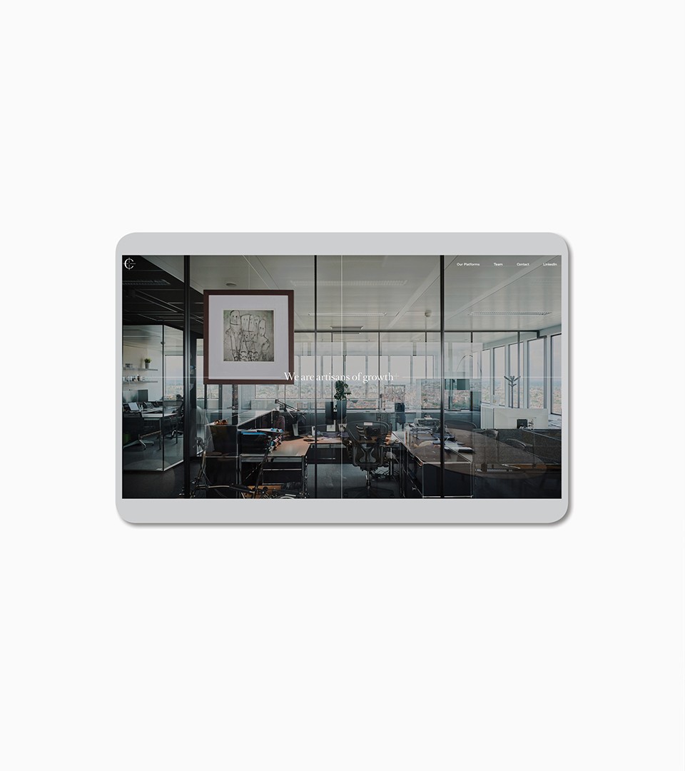
To highlight the fund human scale and hands-on partners, we organised a photographic session at the Core Equity headquarters. This illustrative journey expresses the fund on a variety of supports : on their website and on communication elements.
Artisans of Growth
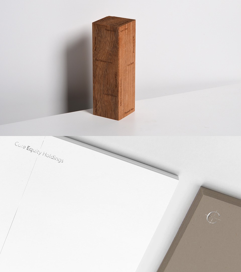
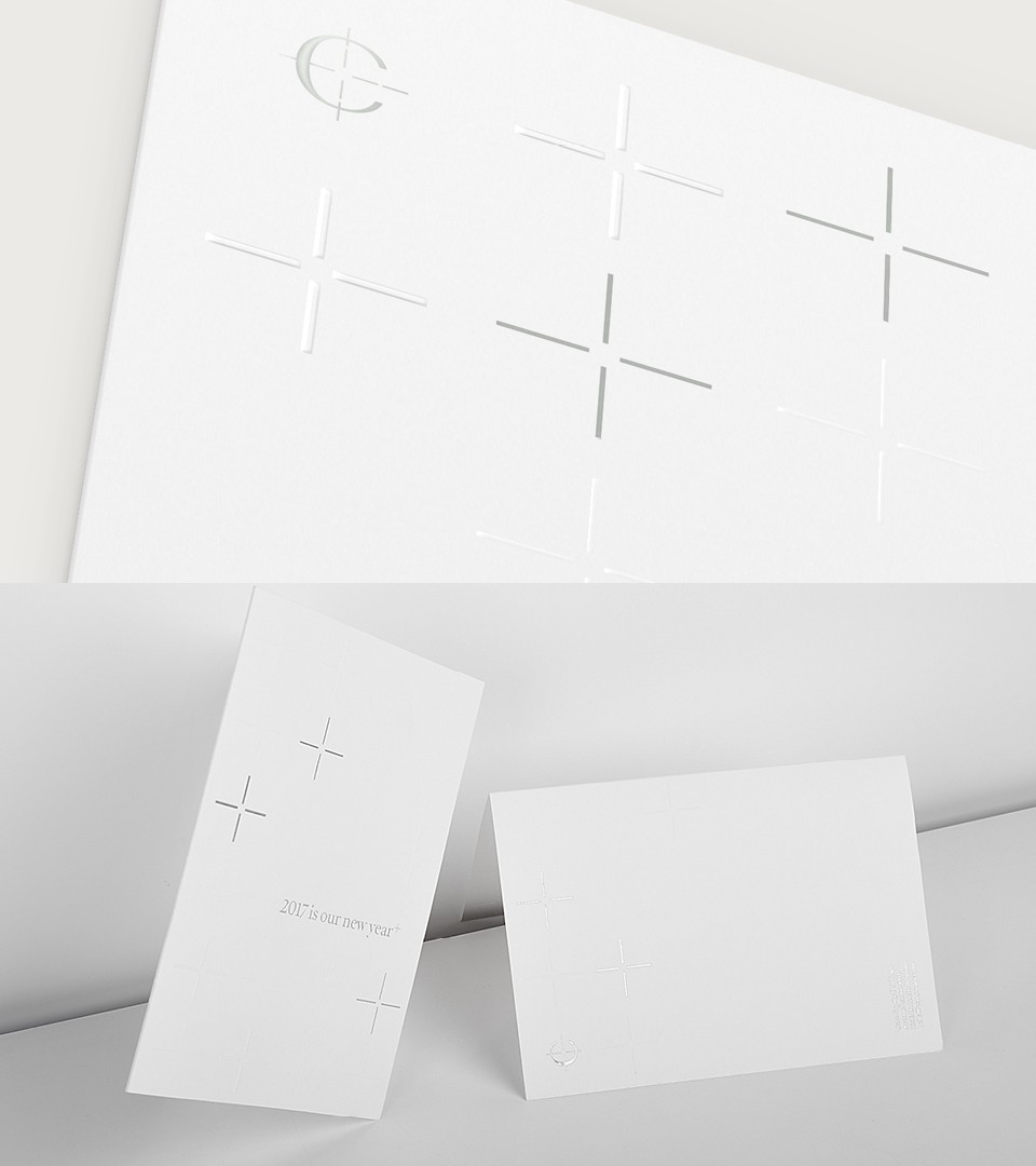
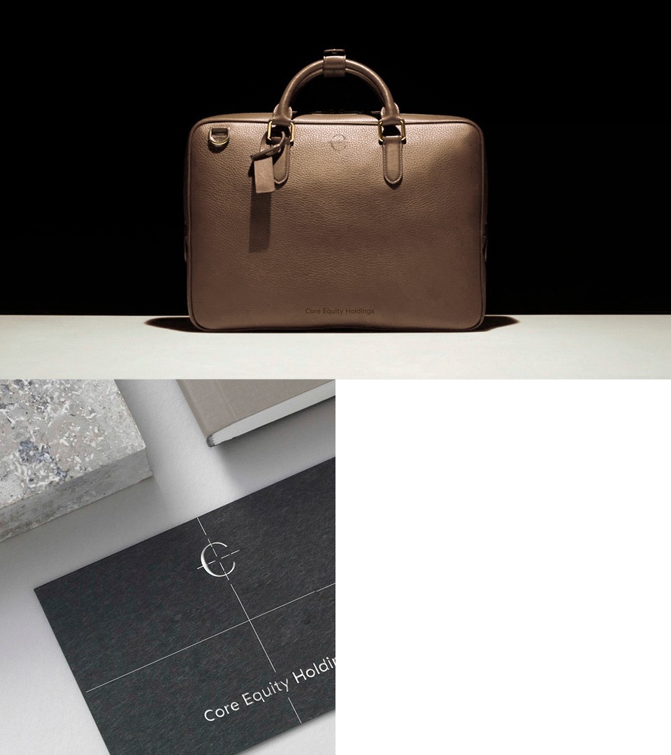
Our creative strategy was informed deeply by the insights we uncovered in the immersion. In particular, we devised a corporate identity that would use craft production methods as part of the implementation. Business cards print using heavy stock and chrome foil, embossed greeting cards, and a custom made leather travel bag with the logo iconic signature are all part of the corporate identity system.
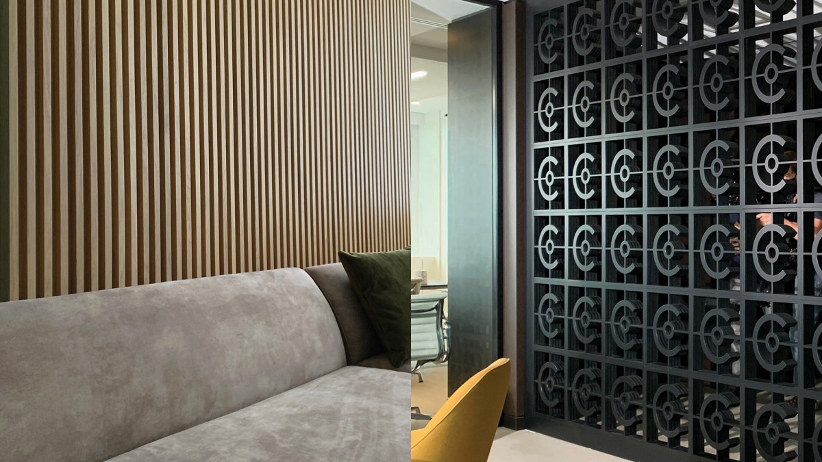
DNA for interior design
In addition, we provided Core Equity Holdings with an interior design & material styleguide to be used for the design of their new offices. Applying the same DNA as for the brand and its identity, we devised a document referring to materials and techniques to inspire architecture development.
The website is the window of Core Equity Holdings to the world. Carefully designed and developed at Coast, the website is a first step into Core Equity Holdings featuring the workforce and management behind the private equity fund.