EURELECTRIC
— Objective 2050
Eurelectric is a sector association that represents the common interests of the electricity industry at the European level. It covers all major issues affecting the sector, from generation and markets to distribution networks and customer issues. Its identity needed a refresh, we helped them to transform.


A rebrand
Eurelectric new management wanted to get rid of the previous logotype and global look and feel : regarded as old fashioned & not adapted for the new digital ecosystem, the logotype was also not representative of the changes the industry is facing at the moment. Our work was to deliberately enhance the readability & accessibility of the brand, transforming itself as a dynamic actor of the socio-ecological changes occurring today.
The new brand needed to express the values of electricity within the new energy challenges of the twenty first century : a higher demand & a greener energy available for all. The logotype expresses the dynamics behind electricity : we provide electricity for all and for a greener future.

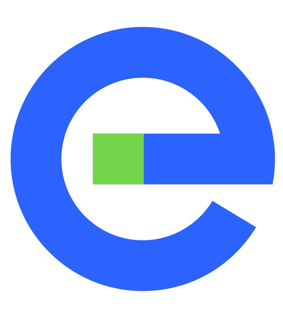
The signature “e”
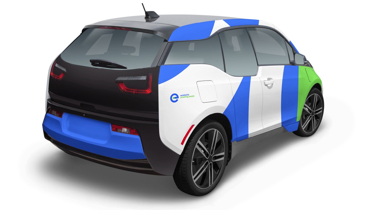
Symbolising the direction towards a greener energy, the signature “e” was devised as a tool to be applied across many different channels and is adaptable to many formats from extra large to extra small.
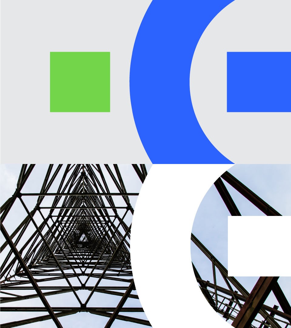


The logotype as structure for layout
Using the shape of our signature “e”, we have formed a structure that can be applied to a variety of communication elements. This results in a combination of images and text for the content, and lines and curves for the visual form.

The new graphic chart is straightforward : with a color combination signature of the electric blue & electric green, the system use a single typeface and informatics with clear purpose and layout. To be bold and dynamic.
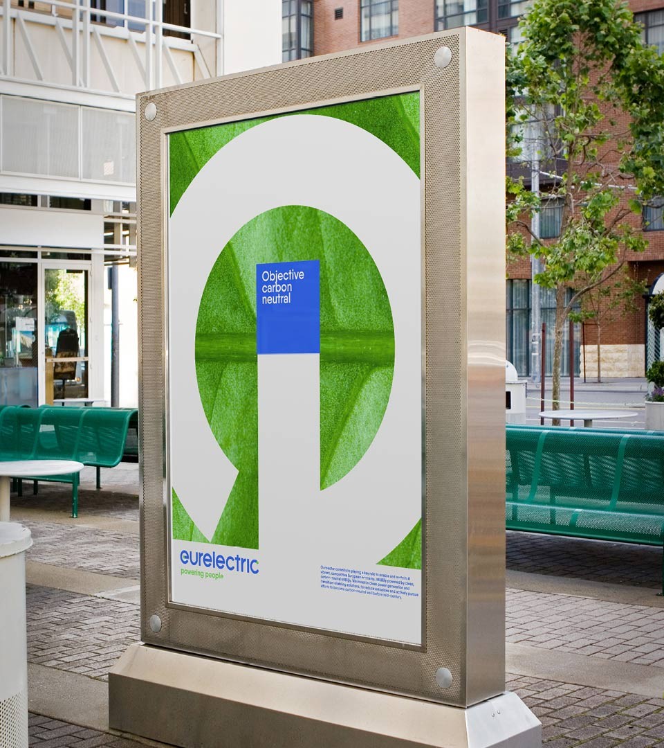
A powerhouse of graphic use
Using the shape of our signature “e”, we have formed a structure that can be applied to a variety of communication elements. This results in a combination of images and text for the content, and lines that compliment the curvature of the identity.


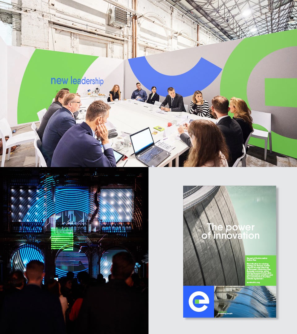

Events
Organising major events such as the Power Summit which is the leading forum where the European power sector ecosystem connects, Eurelectric dynamic organisation provides tools, opinions and directions for the current status and future development of the electricity sector. Here show Power Summit 2018 in Ljubljana, Slovenia.