Healant
Branding for Self-healing innovative technology
We collaborated with Valence Technologies to develop the brand identity for their groundbreaking innovation, Healant — a self-healing material.

Endurance, spreed, first to lead
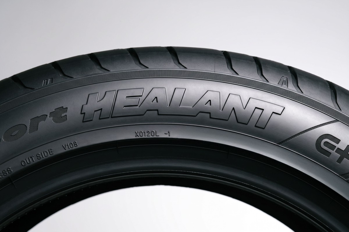
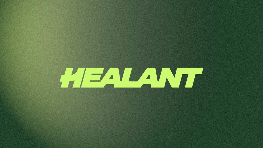
In designing the Healant brand logotype, our ambition was to create more than a mark — we set out to create a symbol of excellence, ambition, and relentless forward momentum. Inspired by the road, the thrill of speed, and the strength of endurance, the identity captures the spirit of a true champion: driven to go further, faster, and always one step ahead. At the heart of the design, the italicised “H” conveys movement, dynamism, and acceleration, while its integration with the number “1” reinforces Healant’s pioneering spirit — a brand built to lead, to innovate, and to be first. Together, these elements form a distinctive symbol of progress, performance, and leadership — embodying the belief that excellence isn’t simply about reaching the finish line, but having the courage and determination to lead the way.
Designed with durability in mind, the identity was crafted as a timeless presence—adaptable across all surfaces, platforms, and environments. Whether applied digitally, physically, or in motion, the identity maintains its distinctiveness.
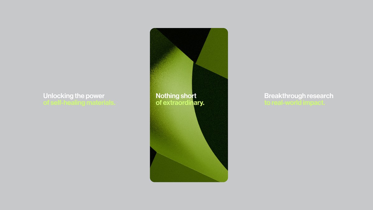
Healant is a unique solution for a global challenge : help the transportation industry with a new technology adapted to all major players.