POPPY
— Car sharing, ready when you are
The planet is changing, and using shared car services can help. By choosing shared cars, we reduce emissions, save money, and avoid the hassles of car ownership. This eco-friendly choice supports a healthier environment and simplifies transportation, making life easier and more sustainable for everyone. Poppy is the car sharing service company by D'ieteren Group launched in 2018.

Our task
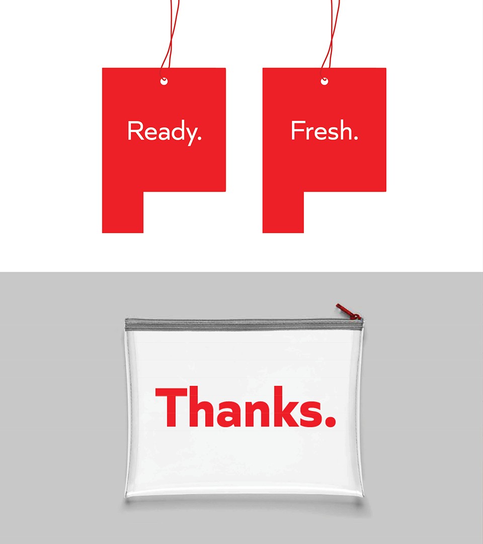
We conducted a comprehensive review of the brand’s equity, recognizing the need for a refresh due to an aging fleet and ambitious new plans. Our focus was on rethinking the core language, baseline, and value proposition. We streamlined the copywriting and visual codes, highlighting a powerful color scheme and their original strong logotype. With over 5,000 vehicles, including cars and vans, our goal was to revitalize the brand and position it as a key player in city transportation. This refresh aims to modernize the brand assets and reinforce its commitment to customer satisfaction and excellence in urban mobility.
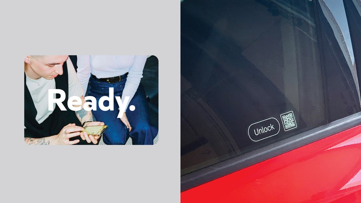
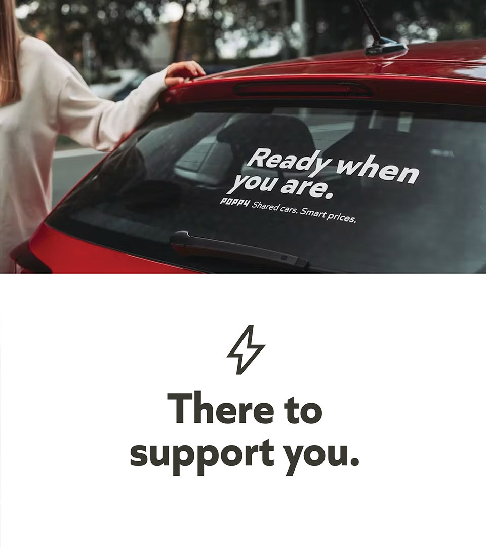
A new catchphrase : “Ready when you are” captures the essence of car sharing. This hassle-free service ensures a car is always available, no matter life’s challenges. Enjoy the convenience, save money, and reduce your carbon footprint with a car that’s ready whenever you need it, making life simpler and more sustainable.
From “Smart city” to “Smart prices” strategy : A smart city integrates technology and eco-friendly practices to enhance urban living, improving transportation, sustainability, and quality of life. By transforming the smart city principle into a pricing strategy means offering customers innovative, value-driven, and environmentally conscious products. This strengthens brand loyalty and emphasizes core values of innovation and sustainability. Coast’s copy work on the strategic tagline aligns with sustainability goals and differentiates the brand as a leader in smart, forward-thinking solutions, maximizing customer satisfaction and brand equity.
The brand’s core promise is to offer customers the freedom to travel effortlessly and stress-free. By highlighting diverse destinations as achievable and appealing goals, Poppy position itself as accessible and straightforward. This approach reinforces the brand’s identity as easy-to-use, inclusive, and customer-focused.
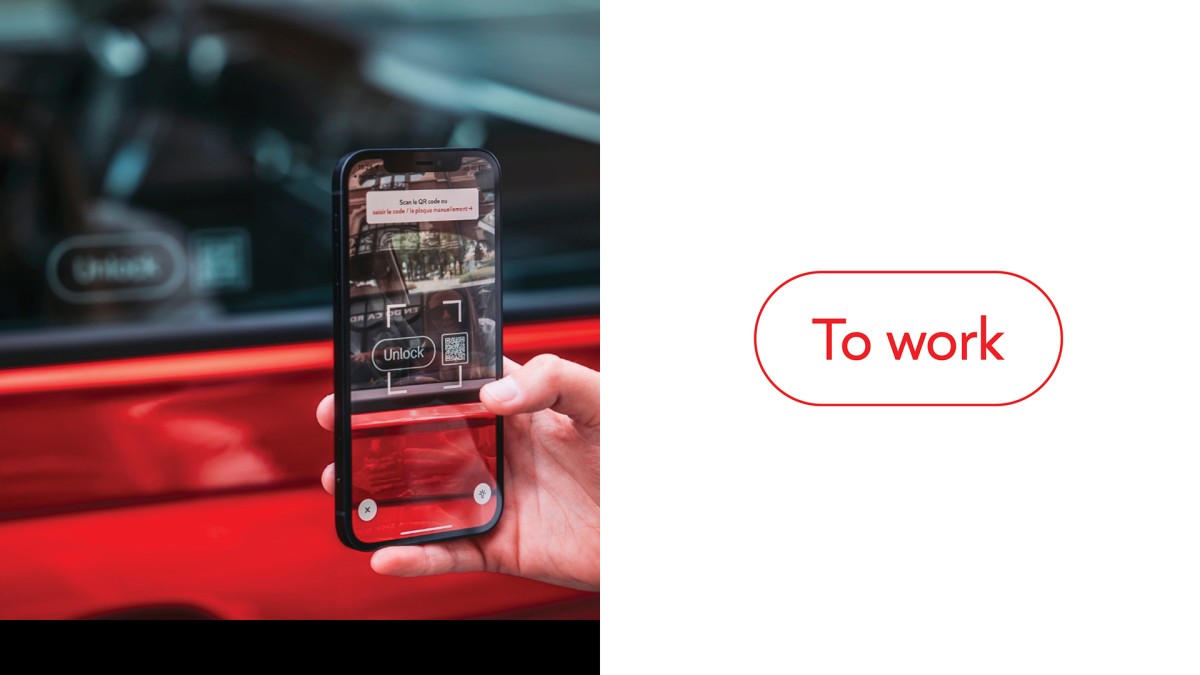
Our mission was also to redefine the brand’s digital assets through a streamlined system, incorporating a new typeface, updated color codes, and a simplified approach. This transformation extended to newsletters and website design, ensuring a cohesive and modern digital presence.
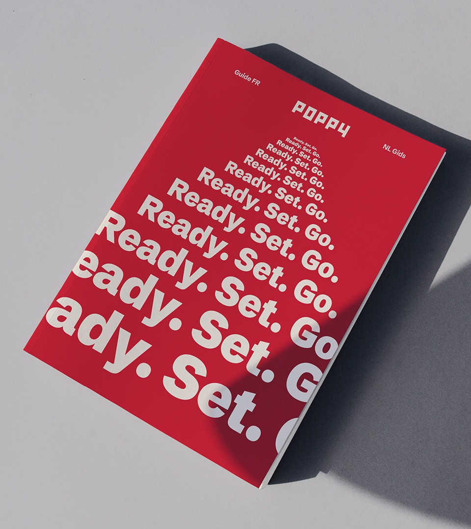
Redefinition of assets
We were tasked with redefining the brand’s assets, initially crafted by Minale Design Strategy. While preserving the original color code and logotype, we focused on refreshing the brand messages and enhancing customer interactions. Our work included a comprehensive review of the fleet and digital assets to ensure a cohesive and modern brand experience. This revitalization aims to create a more engaging and positive connection with valued customers, driving forward our commitment to excellence and service.
