SUSTAINABLE PUBLIC AFFAIRS
— Public affairs agency with a sustainable purpose
Willem Vriesendorp has a goal: to drive the world’s most sustainable Public Affairs consultancy. Having worked in renowned public affairs offices across Europe, he saw a gap in the market : contributing to a more sustainable world, helping brands achieving their ambitions with a partner who lives, works, and communicate in full sustainability.
Today, sustainability issues are on everyone’s agenda.
We know it all, we see the facts. Our modern life changes our planet. From mass consumption to the use of carbon fuels, the ways of being sustainable play today a huge role in all modern government or trade organisations. Public affairs agencies are big actors in the change and their actions can have an impact on the way the world will be tomorrow.
Sustainable Public Affairs, targeting decision makers who want to make a change
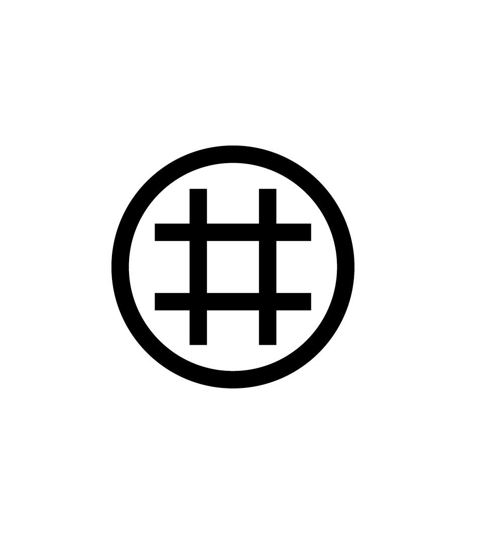
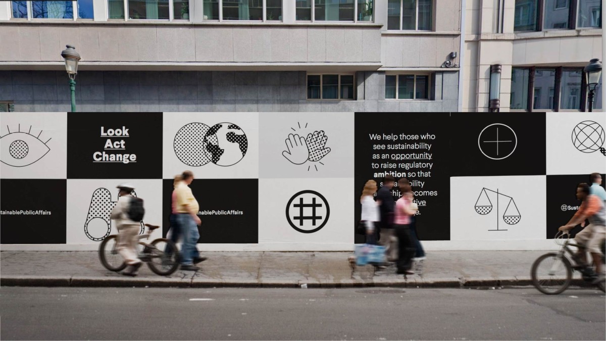
At Sustainable Public Affairs, there is no room for compromise. The consultancy partners exclusively with companies committed to driving meaningful change toward sustainability. To capture this spirit, Coast developed a bold identity that positions the firm as a rebellion: its logotype fuses the symbol of the Earth with a hashtag.
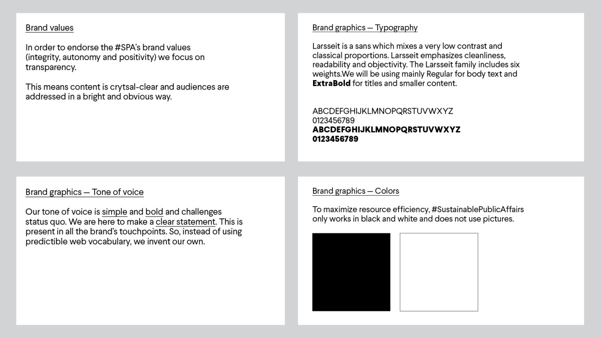
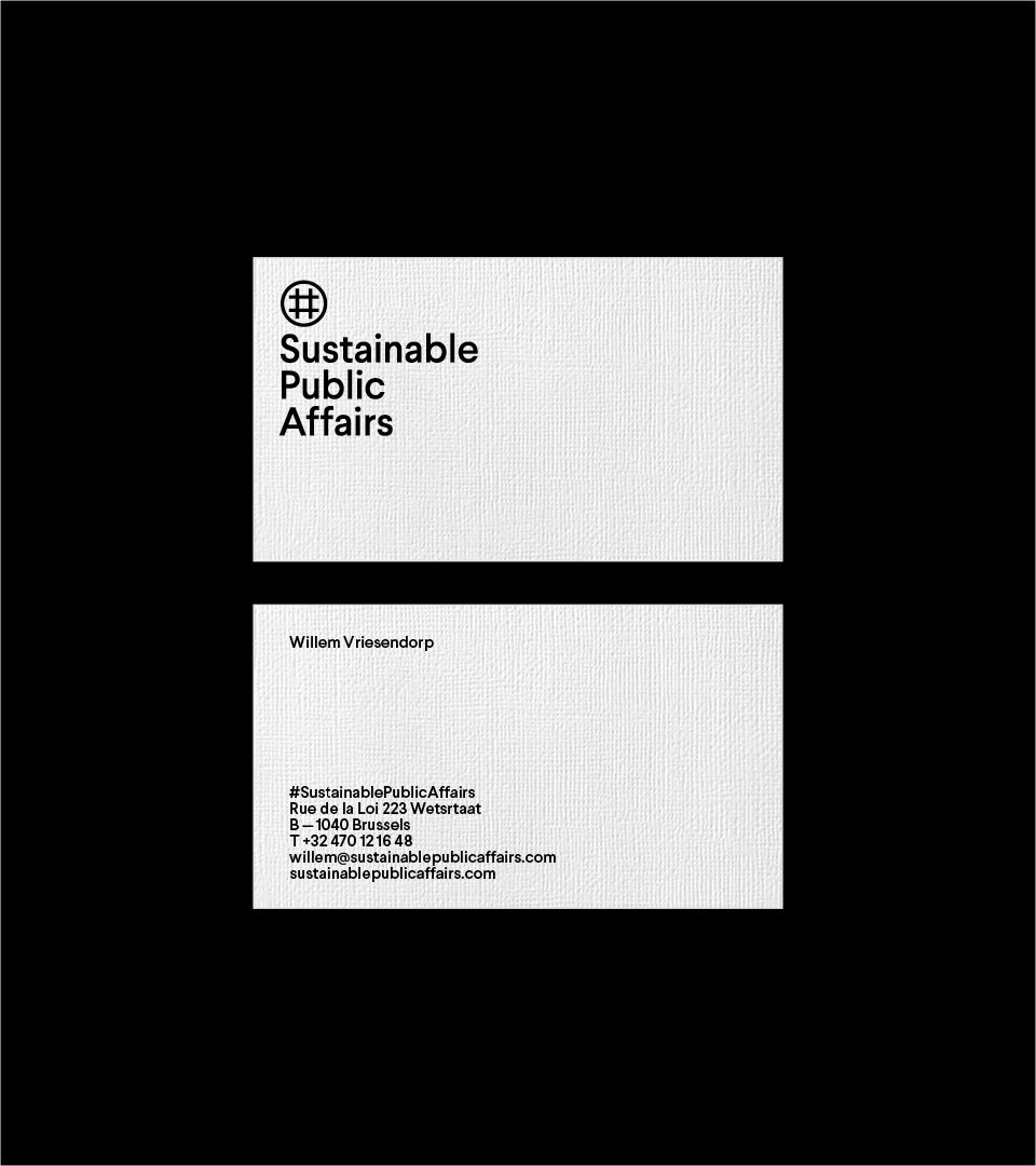
For Sustainable Public Affair’s identity, the result was to show their uncompromised approach : no color was used, only black and whites. No fuss identity and the use of symbols and short texts to emphasis on the crucial content. Transparency and a low key visual universe was the design solution.
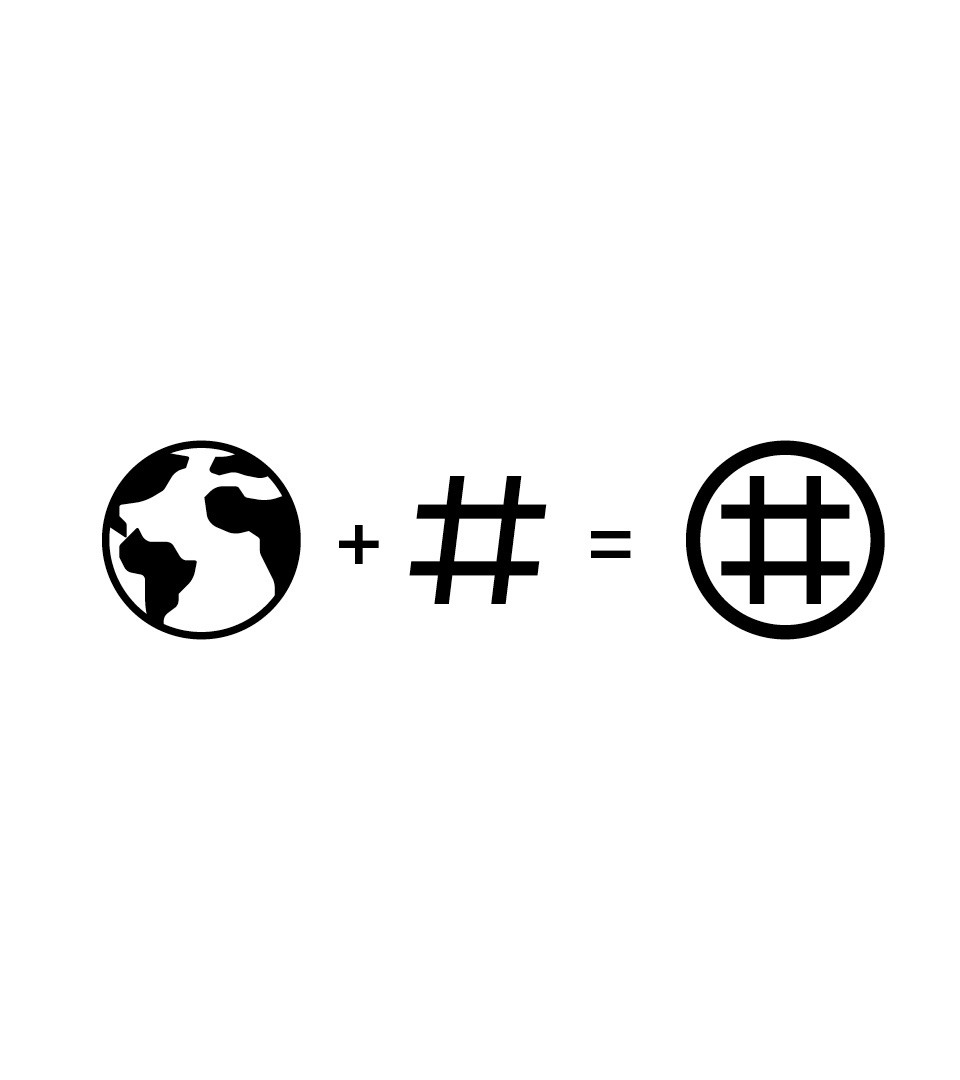
Planet + hashtag = a sign for changes
The logotype needed to sound like a modern rebellion. Using the #sustainablepublicaffairs hashtag as communication code, we mixed two symbols into one : the earth and hashtag. Together they form a singular modern design element translating the consultancy DNA.
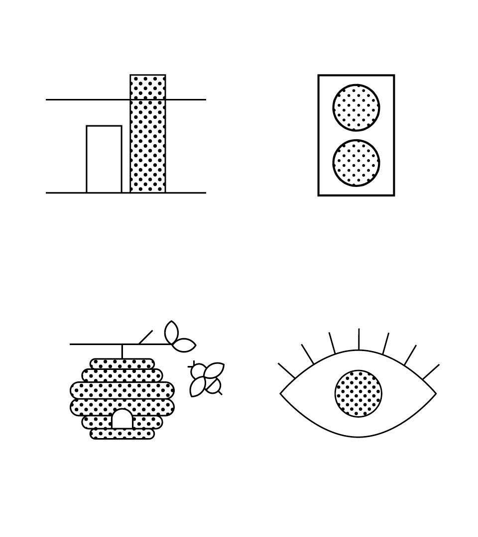
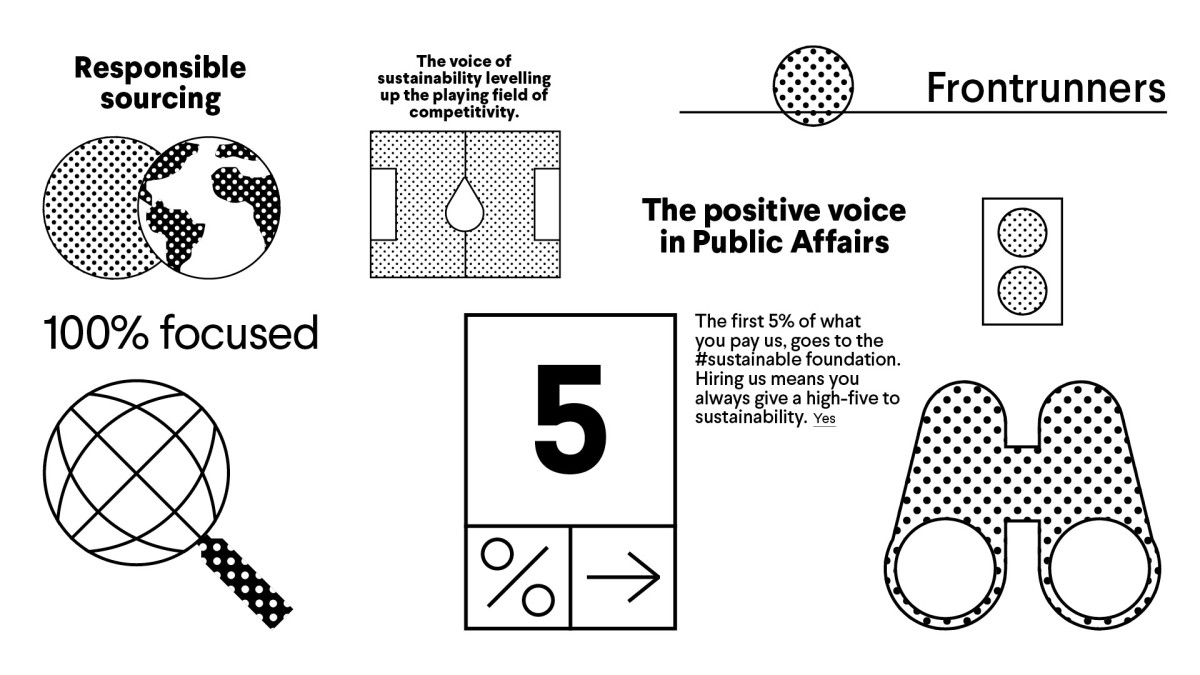
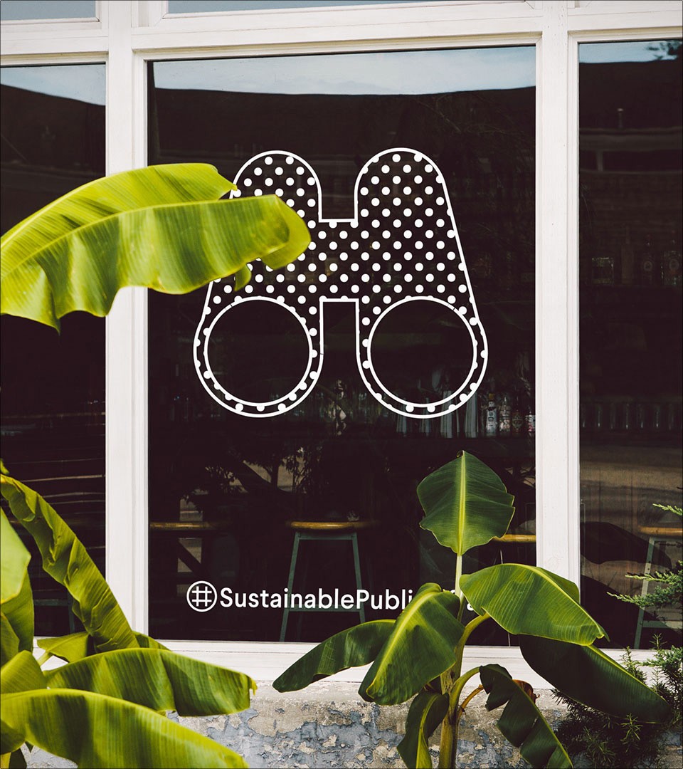
Icons with identity
To enhance the power of communication we have devised an iconographical alphabet referring to multiple issues treated by the consultancy such as sustainable sourcing, change watching, transformative industries. They all share the same design DNA as the logotype and its typeface. The result: a palette of creative communication.
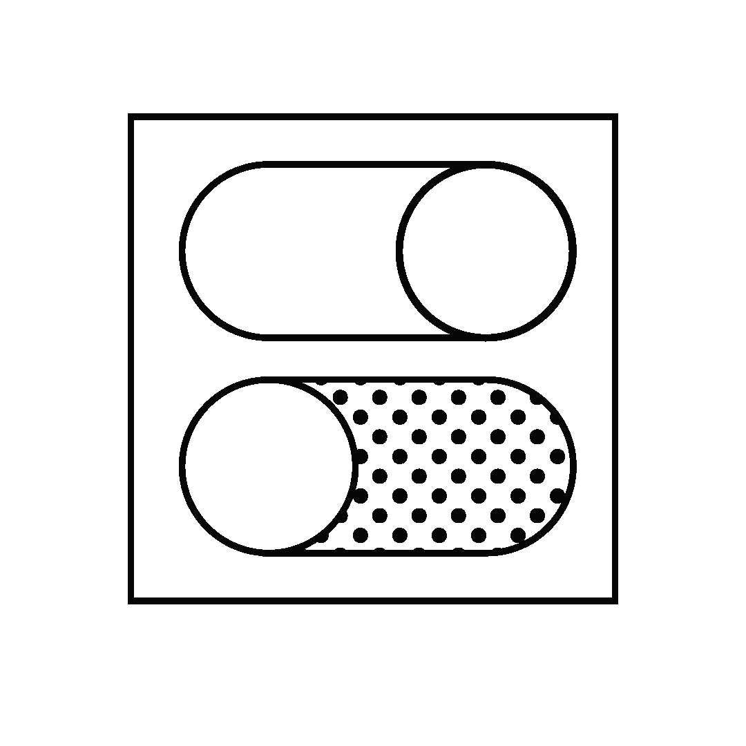
world in motion
Today, simple changes can make a change. Our collection of simple iconography combined with simple animations refer to a symbol of new ecological and economical reality.
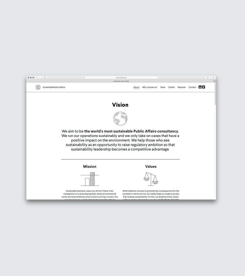
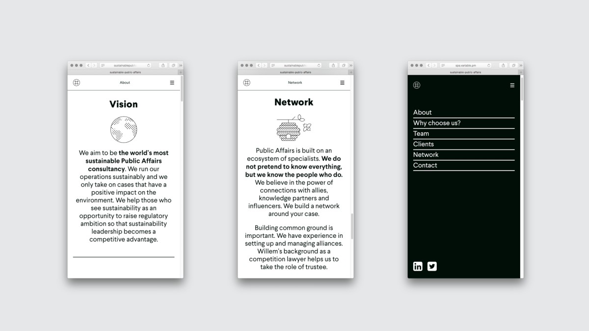
The website
The website has been created to inform & inspire by its striking simple design look & feel. To maximize resource efficiency, the same rule was applied to the website design: #SustainablePublicAffairs only works in black and white and does not use pictures. Furthermore, it runs on a green web hosting platform. For its content, a single scroll down page was adopted as an efficient tool.